


The right typography can turn a scroll into a stop — and a reader into a customer.
Typography design is about making text easy to read and aesthetically pleasing, whether on a website, billboard, or book jacket. It involves more than just picking a font — you need to choose the right size, spacing, and layout to make words visually appealing while communicating your intended message.
While typography has been shaping communication for centuries in forms like hand-lettered manuscripts, digital creators now use it to influence how people engage with content across various devices. Learn how you can optimize this functional visual element for the most successful website designs.
Benefits of typography in web design
Here are a few key advantages of adding thoughtful typography choices to your website:
- Makes text more readable and accessible — Well-structured typography makes site text more legible, helping visitors absorb information quickly. Proper spacing, contrast, and font choices also improve accessibility for people with visual impairments.
- Strengthens brand identity — Fonts convey your brand’s tone and personality. For example, a blocky, funky font shows your brand is energetic, while a classic serif typeface communicates a more formal demeanor. Using a recognizable typography style reinforces your brand’s visual identity, especially when you maintain the same style across all touchpoints.
- Guides user attention — Strategic typography choices, such as font hierarchy and emphasis, direct people to important content and calls to action (CTAs).
- Improves the user experience — Visually appealing typography is pleasing to the eye and reduces cognitive load, making interactions smoother and keeping visitors on your website longer.
8 website typography tips
Here are eight expert tips for optimizing typography in your web design, plus helpful examples.
1. Choose a distinct font design for the main message
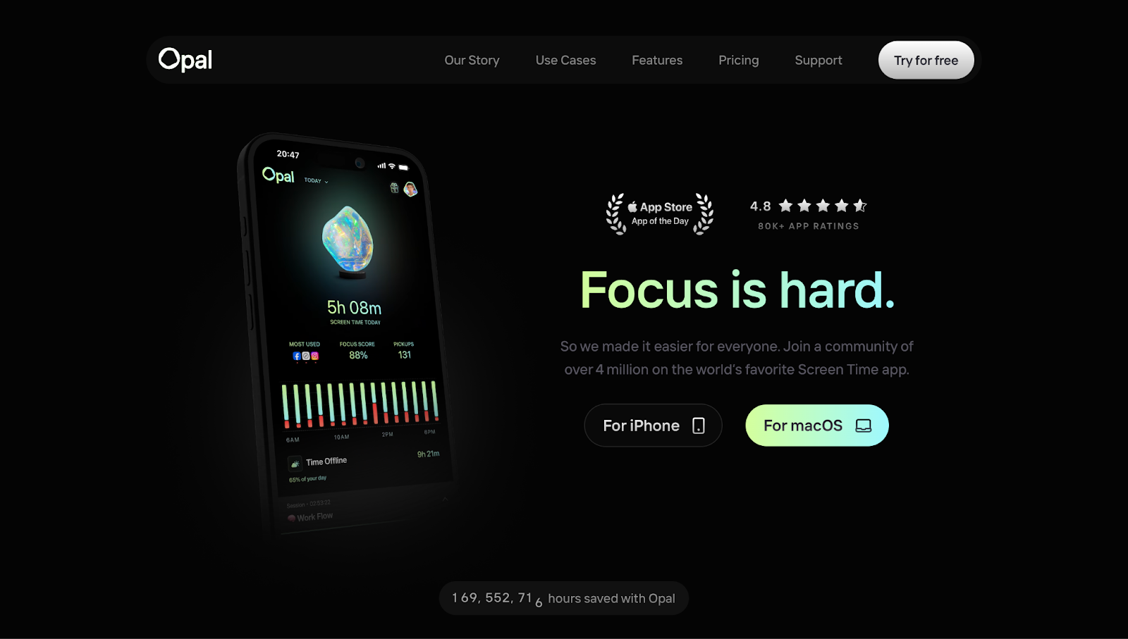
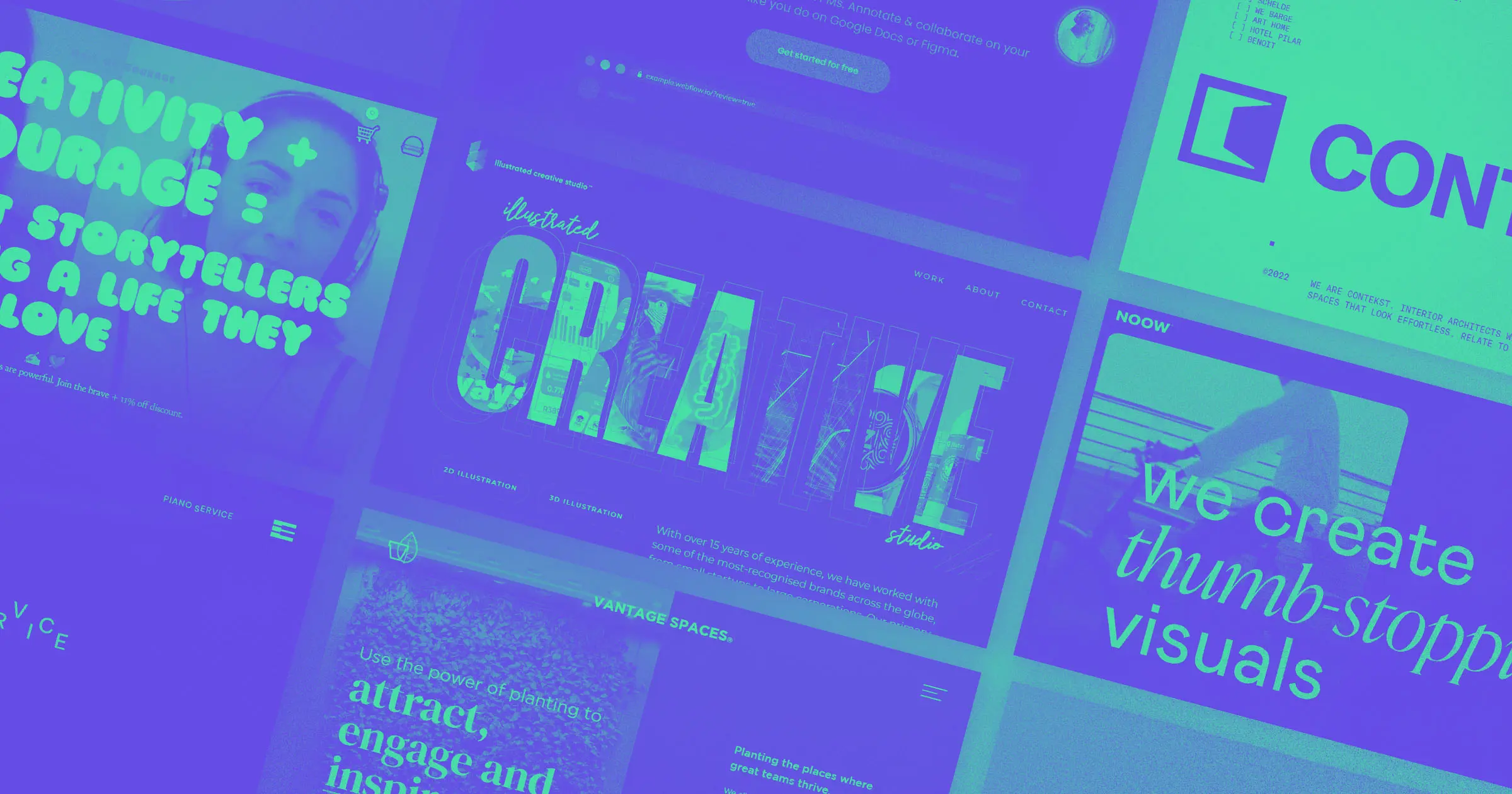
When a message needs to stand out, typography should be as bold as the statement itself. Our Life’s Work, for instance, uses large, high-contrast text on Opal's homepage to immediately capture attention, with the phrase "Focus is hard." The font's size and weight emphasize the message. It's also crisp and clear with its sharp edges, making the text highly readable and improving accessibility.
This approach is ideal for headlines, CTA text, and critical messaging that you want site visitors to read immediately. Opt for strong sans-serif or display fonts, high contrast, and ample spacing so people can absorb information at a glance.
2. Combine images into font design
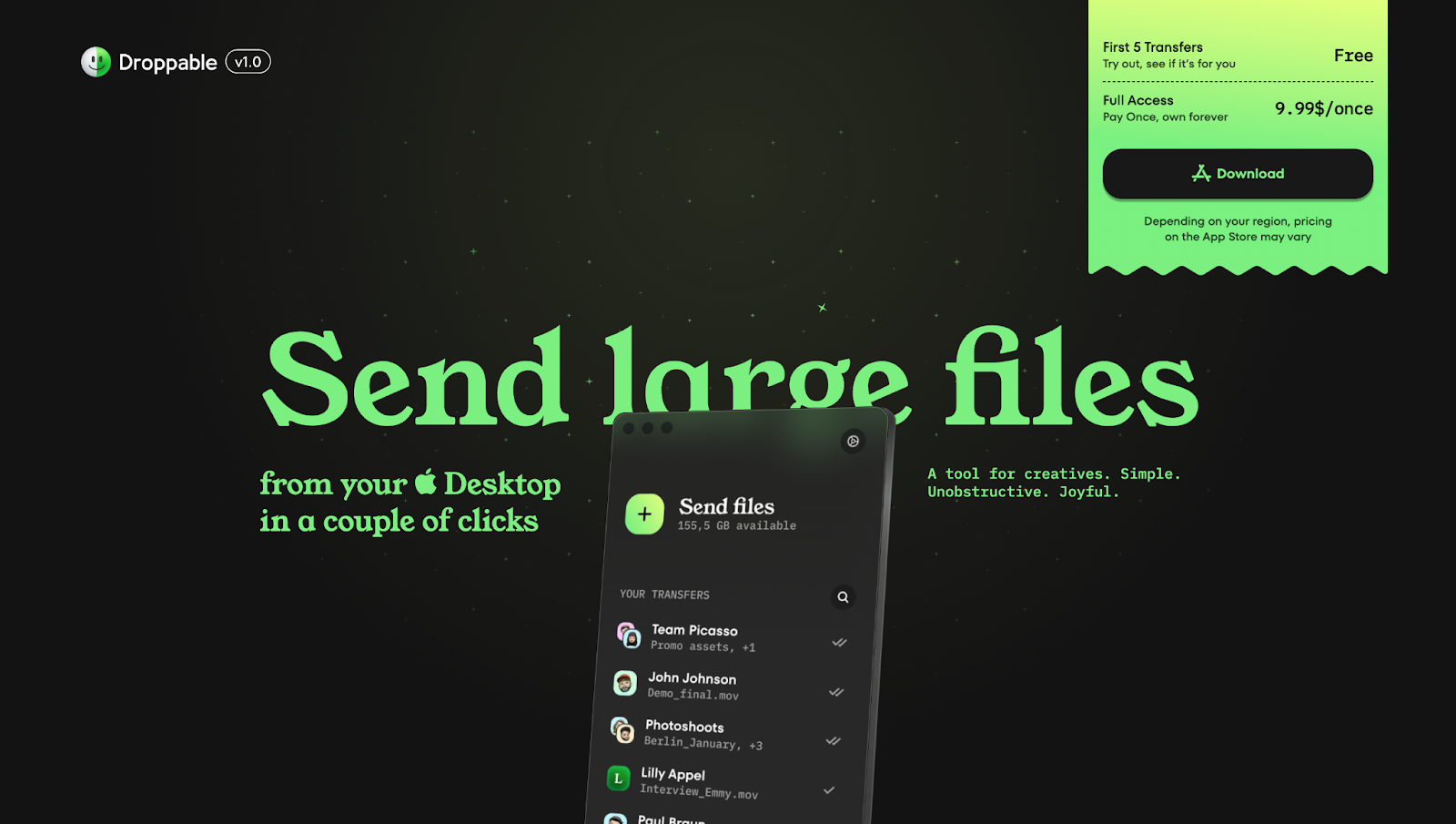
Typography design doesn't have to involve text alone. You can also play with visual elements like icons and emojis for context while adding a playful element to the page. For example, Droppable's website uses Apple's logo and emoji-style icons directly within the text, weaving in branding without compromising the text’s meaning. It gives the copy a creative feel while reinforcing the product's Mac compatibility.
This technique works well for layering personality into your design or visually highlighting ideas. Where your competitors might solely rely on text, you can use icons and small illustrations among letters to create a unique look. Just make the text readable and accessible across all devices.
3. Add a flourish of handwriting
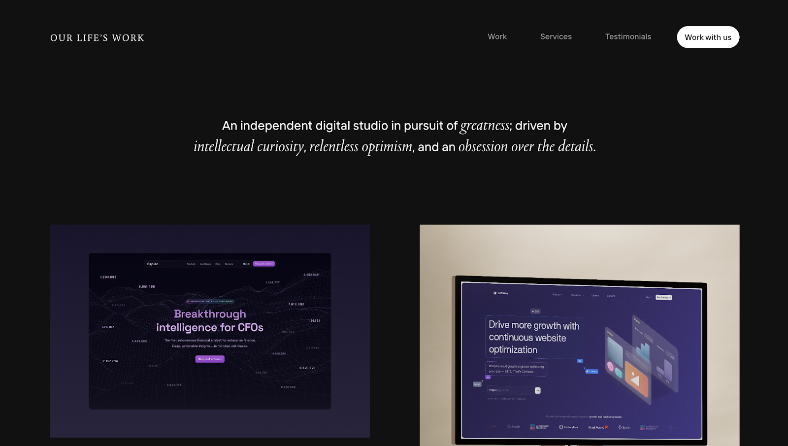
Handwritten-style typography adds a human, artistic touch to Our Life's Work's website. Italicized serif fonts mimic a person’s writing, so the messaging feels thoughtful, authentic, and warm.
This design choice also matches the agency's mission of pursuing greatness and being intellectually curious — inherently human emotions that people relate to. If you want to demonstrate that you’re a trustworthy, reliable, customer-centric company, mimicking handwriting is a simple yet effective design tactic.
Using script or italicized fonts is also an excellent way to emphasize important messaging on your site, evoke emotion, and add a personal appeal. It works particularly well for branding statements and testimonials — areas where a more genuine tone enhances the message's impact.
4. Use futuristic font faces
Futuristic fonts are ideal if you want people to know that your brand identity relates to unconventional ideas, progress, or a forward-thinking mindset. They work well for tech startups, gaming, and AI-focused websites, where typography isn't just about readability but telling potential customers that your brand is progressive or cutting-edge.
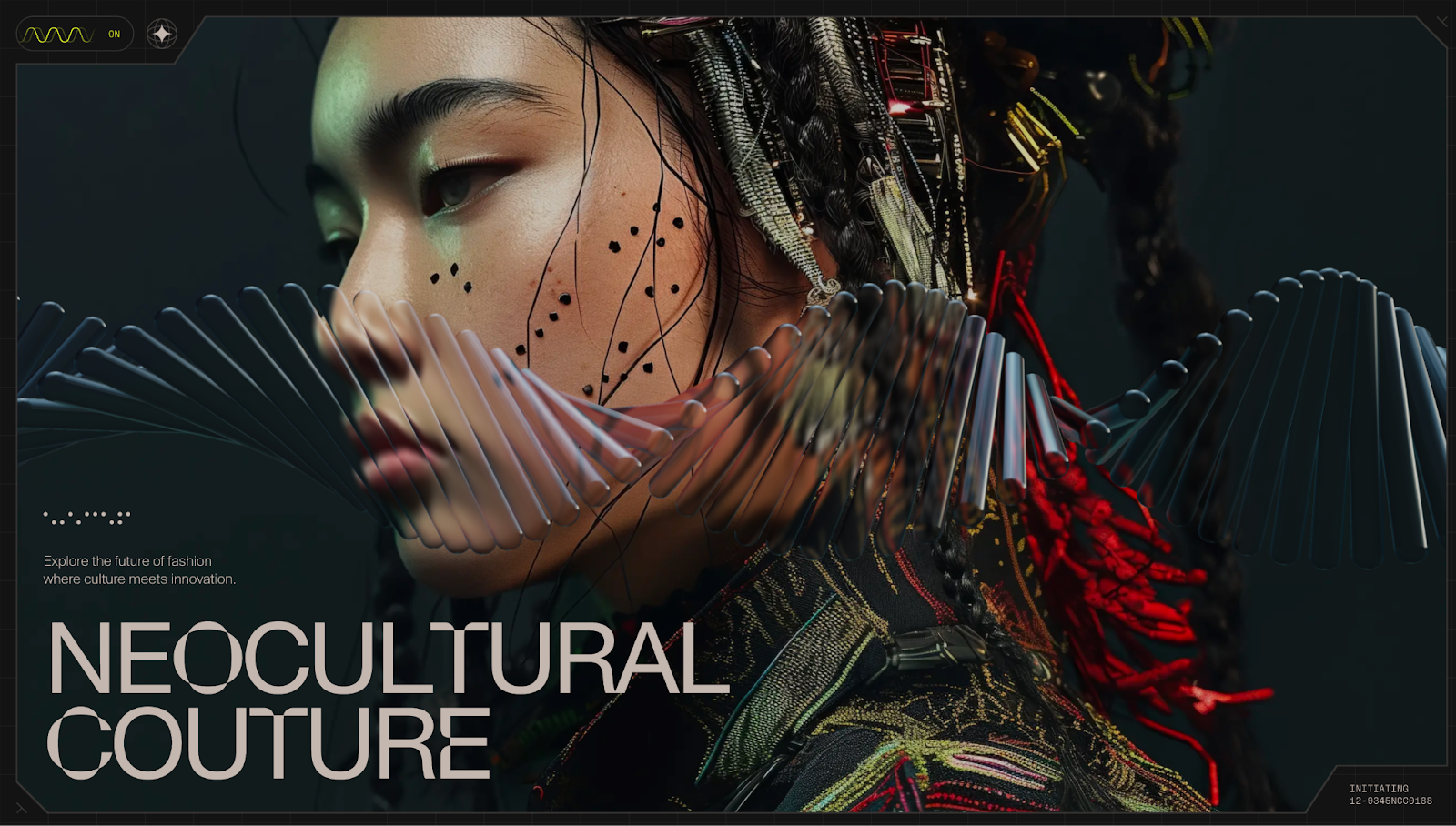
For example, the NeoCultural Couture website (designed by Jordan Gilroy) uses a futuristic, geometric typeface to reflect its avant-garde fashion concept. Throughout the site, the font's sharp angles, extended characters, and subtle distortions in letterforms give it an experimental feel. These elements tell visitors that the site doesn't conform to conventional design norms and that company and its graphic designers think outside the box.
5. Pick timeless and functional fonts
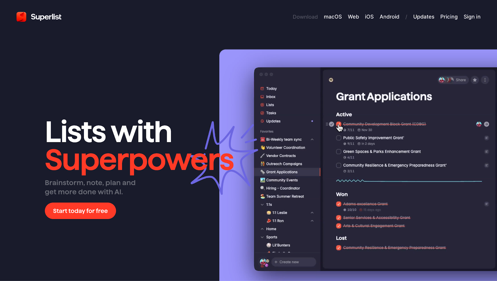
Superlist's typography has an old-school feel. The fonts are simple and legible, without any handwriting flourishes or futuristic experiments. These simplistic typefaces embody the essence of the site’s product: straightforward, functional, and productive.
For example, the clean sans-serif font is readable, while strategic bolding and color contrast emphasize key ideas like "Superpowers" and "Make with AI." This balance between function and visual impact makes the text easy to scan without it feeling overwhelming.
Plain fonts are perfect for apps, SaaS platforms, and project management tools when you want visitors to quickly understand what your product does. Consider using timeless, highly readable typefaces that people are familiar with — these choices make it simple to guide visitors through your site and encourage actions like subscribing or purchasing.


Ultimate web design
From 101 to advanced, learn how to build sites in Webflow with over 100 lessons — including the basics of HTML and CSS.
6. Try font designs inspired by the past

Het Kofferbak Collectief has a nostalgic, handcrafted aesthetic with typography reminiscent of vintage posters and travel journals. Designer Lucie van Baaren capitalizes on sentimentality to evoke the joy of traveling, encouraging people to sign up for the small-scale mobile music theatre.
Using historically inspired fonts can add warmth and character to your website. This approach works well for brands celebrating heritage and storytelling. If you want to create a sense of timelessness, consider fonts inspired by classic signage, typewriter text, or old print materials — just make sure they're readable and adaptable across devices.
7. Combine fonts
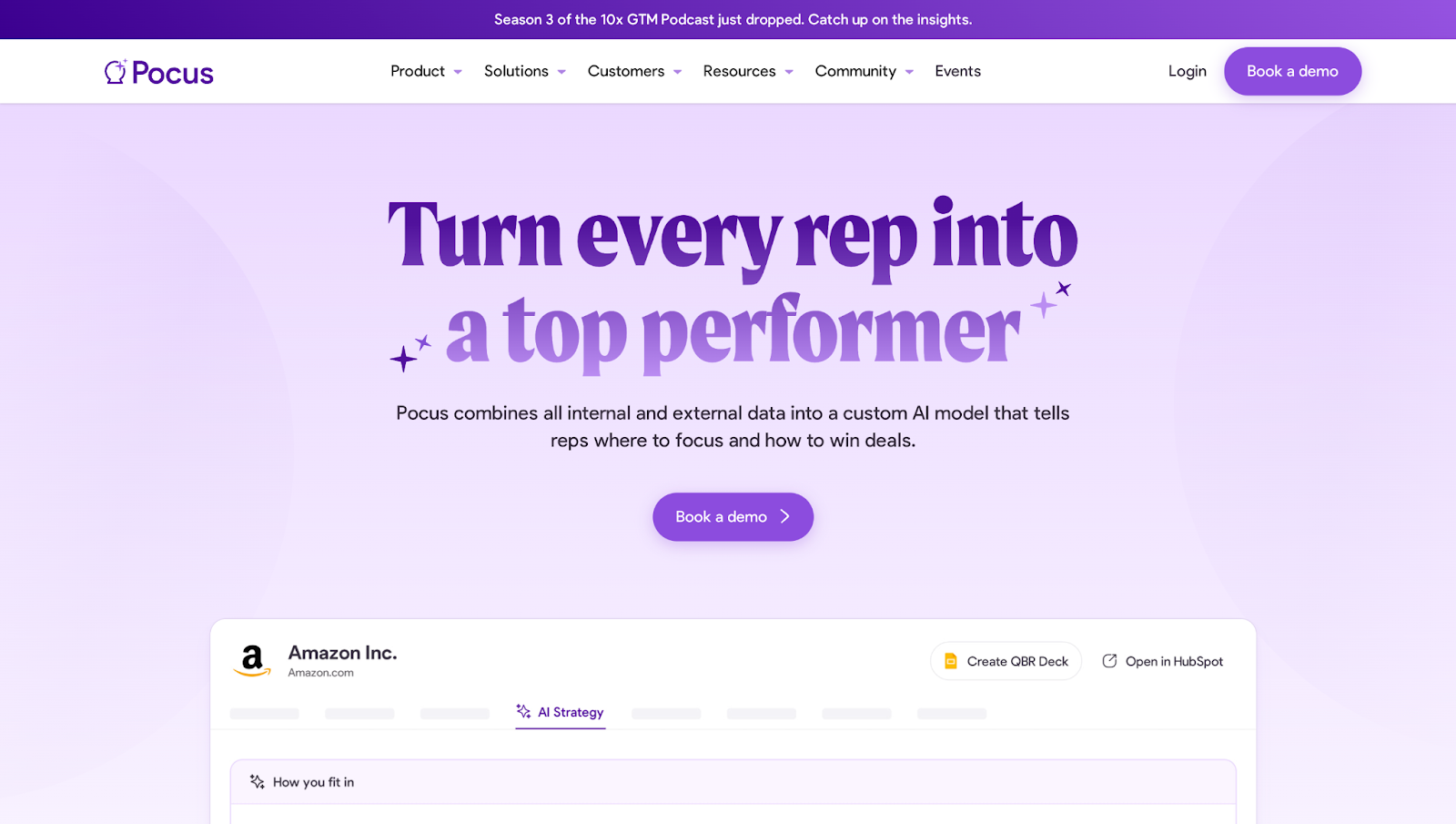
Pocus has bold, serif headings with smaller, sans-serif body text to create contrast and hierarchy for the site's structure. The serif font grabs attention and adds personality to the site, while the sans-serif body copy is more readable for important information.
Mixing different fonts like this separates sections and adds visual interest through variation. The approach works for SaaS websites, editorial layouts, and branding materials where structure matters, especially for guiding visitors' eyes from one element to another.
If you combine fonts, make sure they complement each other in weight and style — contrast has its place, but balance keeps the design cohesive. Here are several helpful websites for combining fonts:
- Fonts In Use — This crowdsourced archive shows typography in real-world applications, from websites to print media. It's a great place to explore font combinations in practical use cases rather than just theoretical pairings. If you're unsure how a specific typeface might work for your design, Fonts In Use provides examples across different industries, helping you choose tried-and-tested combinations.
- Bold Web Design — This interactive tool lets you visualize font pairings in a real-world context. Choose a font, and the site generates auto-mockups with complementary fonts — ideal for breaking out of repetitive typography patterns. If you find yourself relying on the same few typefaces, Bold Web Design helps you discover fresh alternatives.
- WhatFont — WhatFont’s Google Chrome extension shows you how people use typography across the web, displaying font names and their styles, weights, and colors. It's a helpful reference if you're looking to spot emerging trends or eye-catching fonts.
8. Design your own font
Creating custom fonts is an excellent way to make your projects or website stand out with something totally unique to your brand. It offers a fresh alternative to overused fonts, and designing your own style gives you complete creative control over branding.
You don't have to be an expert typographer to make custom fonts. Here are three tools to help:
- Fontself — This Illustrator and Photoshop extension makes font creation intuitive, even for beginners unfamiliar with Adobe's design products. You can turn hand-drawn letters or vector shapes into OpenType fonts that work across various applications, including Webflow. Fontself is an excellent choice for converting your lettering into a functional digital format with minimal technical hurdles.
- Glyphs — Designed for Mac, Glyphs lets you digitize hand-drawn sketches, work with a precise vector system, and create multi-layered fonts with OpenType capabilities. The platform also offers tutorials, giving you a solid starting point for exploring type design without getting overwhelmed.
- FontLab — If you're a more experienced designer, you can use FontLab as a professional font tool for total control over every detail. It supports multi-language OpenType fonts and offers advanced vector tools for lossless quality.
Transform your designs with stunning typography
Incorporating typography into your site isn’t as simple as copy/pasting a font into your design — you need to choose typefaces thoughtfully to shape how people experience your content. Whether you're pairing classic fonts or designing your own, the right typographic style creates a consistently memorable visual identity across channels.
Understanding essential typography tips lets you make more intentional design choices that leave a lasting impression on your visitors. Try Webflow's Font Generator, and bring custom fonts to your projects without relying on typographers or developers.
Get started for free
Create custom, scalable websites — without writing code. Start building in Webflow.