


You've built the app, now give it a stage.
Designing a mobile application is only the first step. The next step is creating a dedicated webpage to market your app, showcasing its benefits and UI, and acting as your sales pitch.
Read on to learn about app landing page best practices and discover some examples to inspire your own designs.
What are app landing pages?
An app landing page is designed to promote a specific mobile or web tool. Its main purpose is to introduce the app, explain what it does, and guide visitors toward a clear action, like downloading it or watching a demo.
Unlike a homepage, which might include multiple sections and navigation options, an app landing page highlights your app's most important features. It has visuals like screenshots or SEO-enhanced videos and often includes testimonials or press mentions to build trust with leads.
What are the benefits of an app landing page?
Beyond improved visibility, there are important reasons to have a dedicated page for your app, such as:
It gives your app a standalone online presence
App store listings follow strict templates. You’re limited in layout, design, and storytelling. A landing page, on the other hand, gives you complete creative control to tailor the user experience to your brand and audience.
A landing page gives your brand a standalone presence and lets you control the narrative of your product — you decide what people see first, what features to highlight, and what action they should take. Without a dedicated landing page, your app risks being buried under generic app store listings.
It drives traffic from marketing campaigns
Whether you’re running ads, sharing on social media, or building an email list, you need a destination for your marketing leads. Your app landing page is a central link that all campaigns can point to.
It increases conversions
Every visitor will land on your page and immediately ask if it's worth their time. A well-structured landing page quickly answers that question and nudges them toward a decision, like downloading the app or joining a waitlist.
With one primary call to action (CTA) and supporting content (like screenshots, features, and testimonials), your landing page builds momentum toward that next step. There's no competing navigation or distraction to pull users away, and fewer choices mean faster decisions. Landing pages strip away the noise, helping more people act quickly.
It helps you track user interest and behavior
Knowing how people interact with your landing page helps you understand where to make improvements and increases downloads over time.
With a landing page, you can connect analytics tools to see where people drop off, which sections get the most attention, and what content converts best. You can also use A/B testing to see which design elements perform better than others. This makes it easy to get data from website visitors, which you can use to refine your marketing strategy.
It improves SEO and discoverability
If your app only lives in an app store, it’s harder for people to discover it through search engines. A landing page gives you an opportunity to appear in Google results when people search for problems your app solves — even before they know it exists.
You can optimize your page with relevant keywords, descriptive alt text, metadata, and structured content that search engines can index. A well-optimized landing page puts your app in front of people actively looking for help. When your website pops up in search engine results pages (SERPs), new audiences become aware of your offering.
13 great app landing page examples
Here are 13 examples and templates of well-designed app landing pages. Use them as inspiration for your next build.
1. Finy
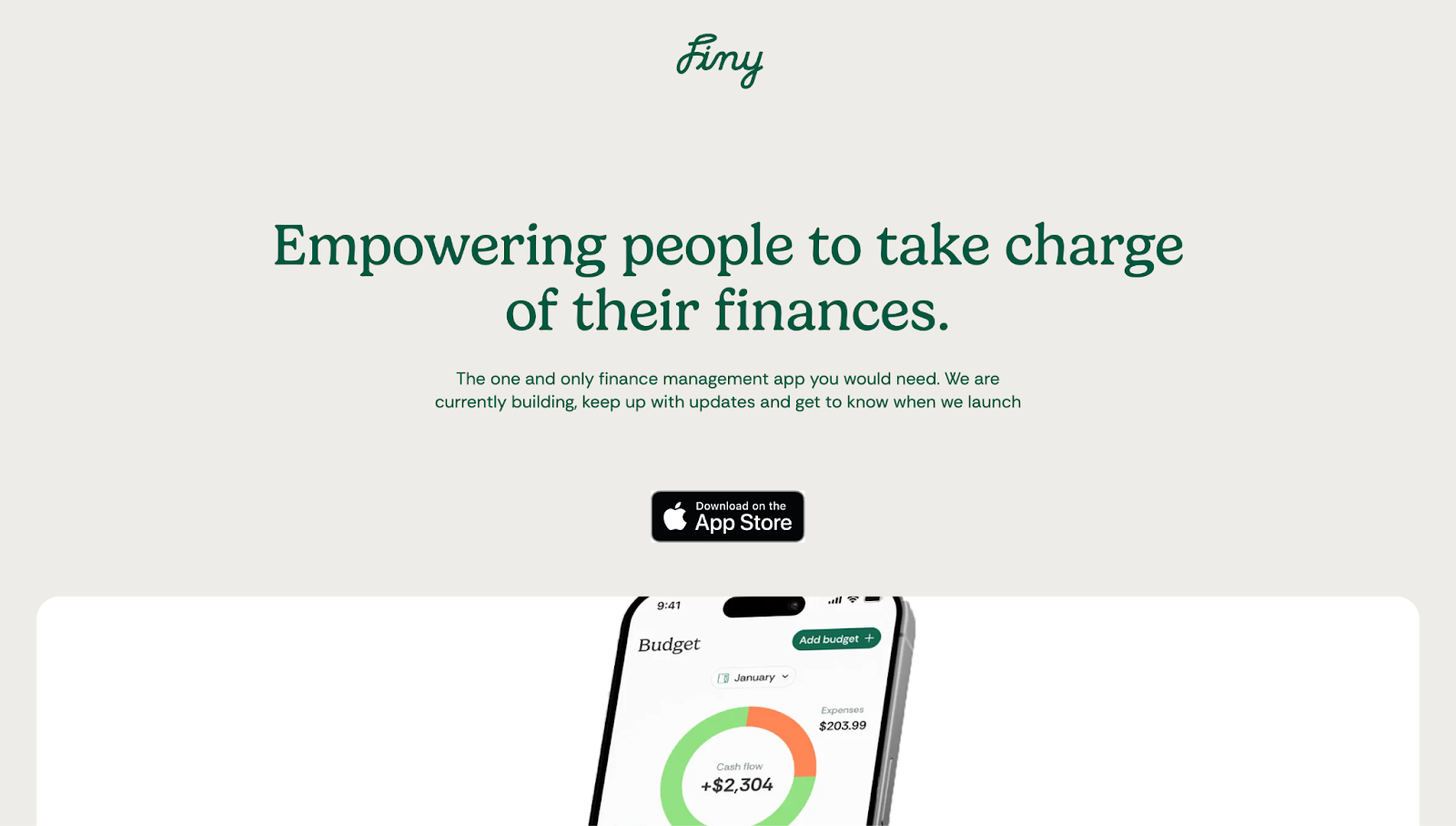
Finy's app landing page, created by Escape Design, opens with a confident headline that immediately positions the app as a user-centric digital product. The CTA is hard to miss due to the minimal layout, leaving no room for distractions.
Each feature explanation is paired with a clean UI mockup that shows the app in action. And the site's soft color palette and consistent typography add a calming ambiance, perfect for an app that helps people navigate potentially stressful financial choices.
2. Discover

Discover's landing page, designed by Antoine Giry, has a bold headline, “Share and recommend your best discoveries,” that communicates the app's value. UI cards pair playful icons and short descriptions with screenshots from the app, helping users visualize the experience.
Additional elements, like ratings and social media follower numbers, show that people vouch for Discover, meaning it’s a tried-and-tested app in the community.
3. Opal

Opal's landing page, designed by Our Life’s Work, makes a case for reclaiming concentration and focus in an increasingly digital-dependent society. It opens with a relatable pain point, "Focus is hard," and carries that empathetic thread throughout the site with stats, testimonials, and real-time UI previews.
The dark theme gives the design a modern appearance, while gradients add a pop of color to break the monotony. Glowing "gems" reward users visually for making progress, incentivizing them to continue scrolling through gamification.
Instead of just listing features, Opal frames them as lifestyle upgrades, like the "Bedtime Shield" or "Doomscroll Defense," turning productivity into something more personal.
4. FitnessAI

FitnessAI's landing page blends AI features with a no-nonsense gym aesthetic. The conversion-driven interface tells potential users they can skip personal trainers without compromising performance.
It builds on this promise with data-driven visuals, testimonials, and global usage stats. Repeated CTAs throughout the site and confidence-building copywriting like “Message us when you need advice from a real person,” also help reduce hesitation, encouraging fitness enthusiasts to try the app.
5. Village

Village, a template designed by Pexel Brains, opens its pitch with a large smartphone mockup: passive income through shared home ownership. The hero section adds a CTA button for more up-front visibility, with additional CTAs throughout the page.
While much of the body copy is placeholder text, you can add creative copy, fleshed-out feature descriptions, and authentic testimonials from real users to sell your app's message.
6. Dropset

Dropset's app landing page has a high-contrast, dark-themed layout, making text and visuals highly legible across the site. The page uses relatable gym terms, like “Not just reps,” to communicate directly to fitness enthusiasts, and screenshots to walk visitors through the app's features.
From linking supersets to rest meters, every section speaks to serious lifters, especially those who value detail and data tracking in their workouts. The CTA button stays sticky in the top corner of the page, keeping conversion top-of-mind without disturbing the user experience.
7. Cookn

Cookn's app landing page, designed by Kenrison Balootje, uses light colors and playful illustrations to create a beginner-focused user experience. The messaging implies that the Cookn app is all about fun learning, with expert-led lessons and gamified progress tracking to help home cooks level up. You can see what the app offers, with benefits like unlimited recipes, personalized content, and shareable progress.
8. Seen
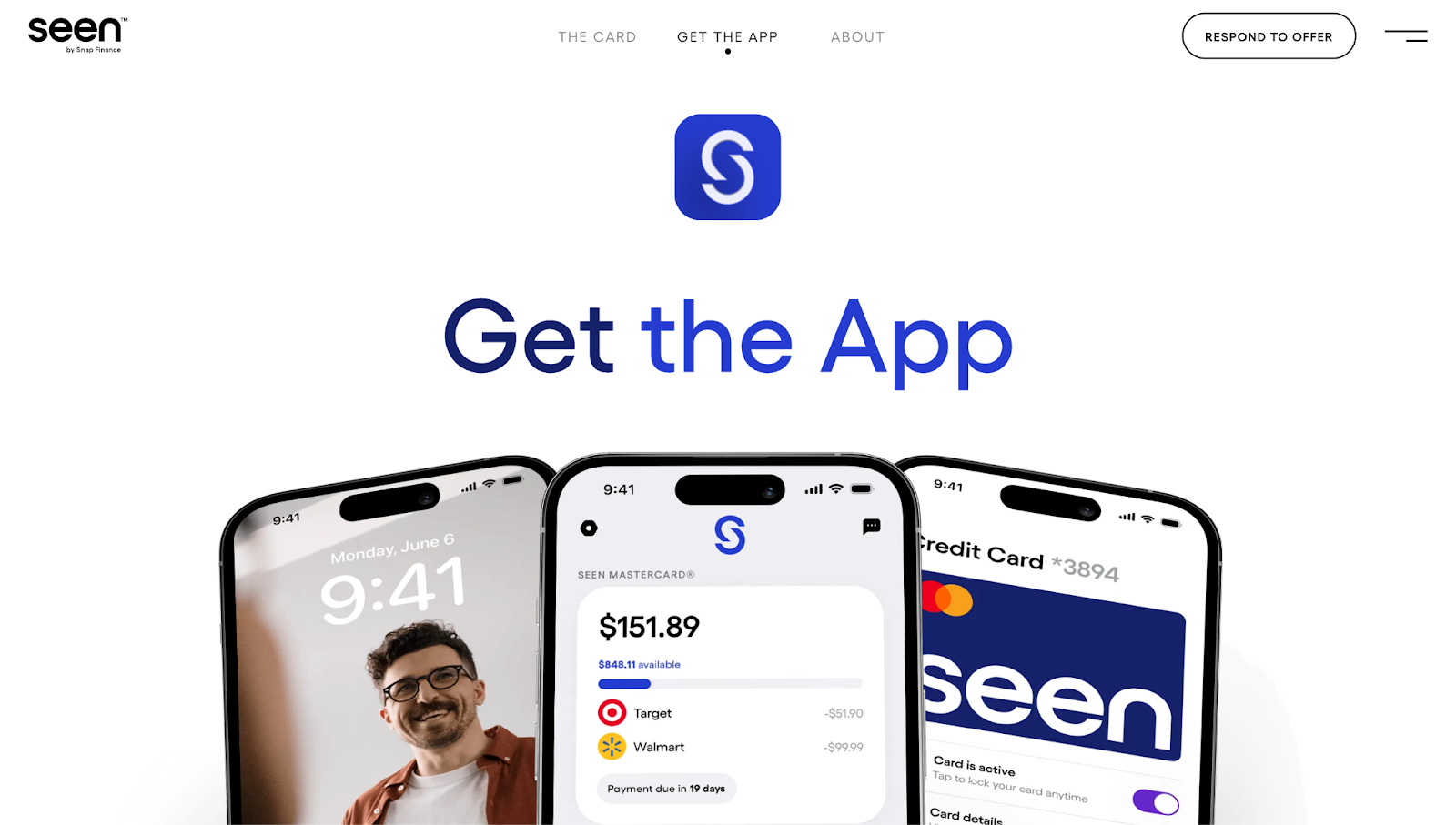
Seen's landing page opens with a huge "Get the App" headline front and center, followed by device mockups showing the app in action. You can see live credit balances, payment timelines, and card details.
With a short follow-up description and app store links, the site makes a strong first impression by delivering a chunk of value upfront. Subtle animations bring the user experience to life, and there’s a dedicated UI card for security to ease site visitors’ privacy concerns.
9. ArriveSafe

ArriveSafe's hero section features a video, description, and clear CTA of "Be safe on your way" to demonstrate the app's unique value proposition: real-time location tracking and emergency help.
Scroll-triggered storytelling breaks down how the app works with step-by-step visuals. Testimonials, media logos, and privacy features show that existing users find the app trustworthy, providing social proof for visitors.
10. Galileo
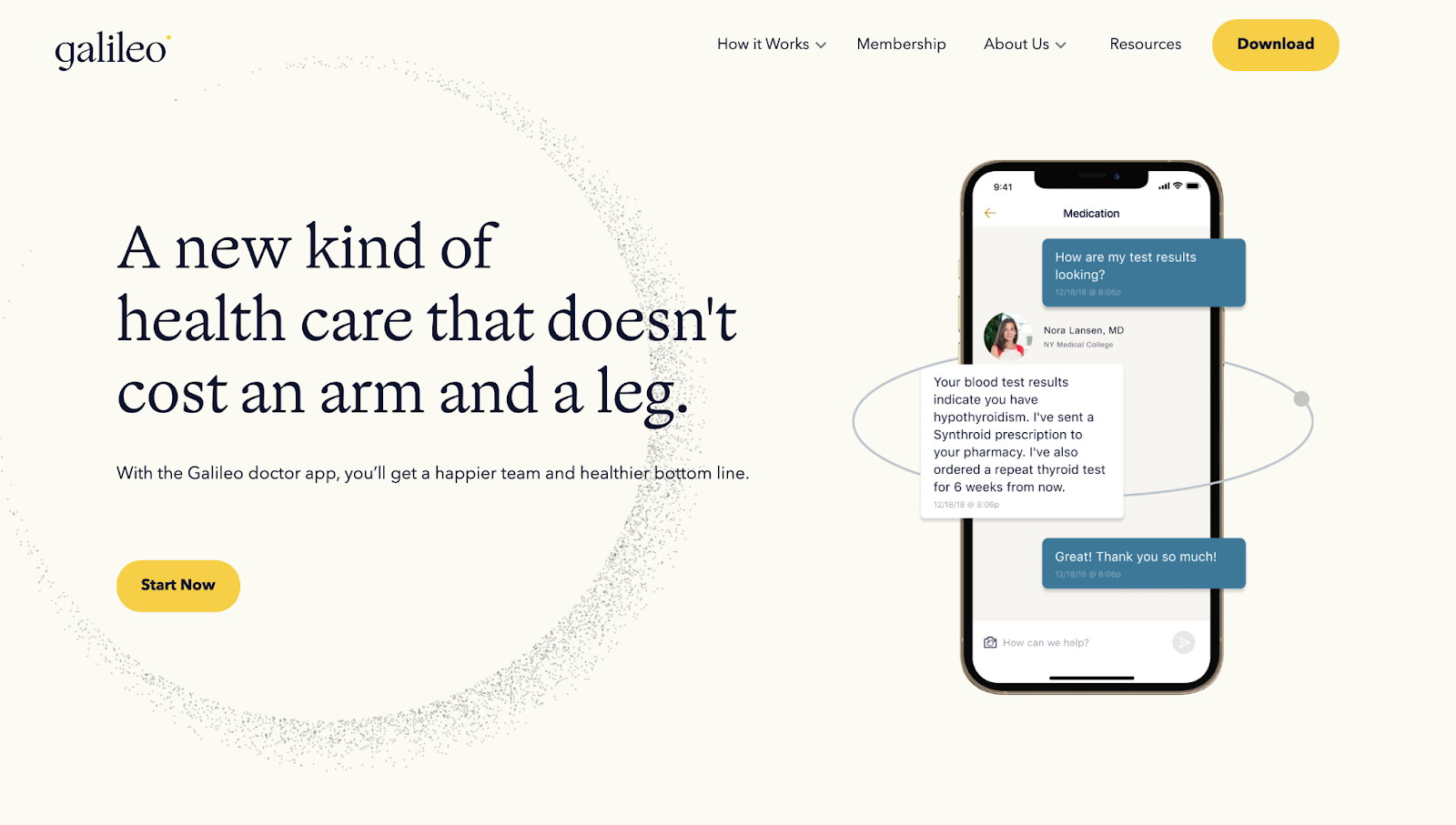
Melissa Mendez’s Galileo landing page uses calm, conversational language to tell visitors that healthcare is accessible and affordable through the app. The hero section shows the app working with a friendly chat interface, instantly conveying how approachable Galileo's services are. Hand-drawn illustrations of people make the experience seem more human. Toward the bottom, transparent pricing reassures cost-conscious users about the app's affordability.
11. Soft
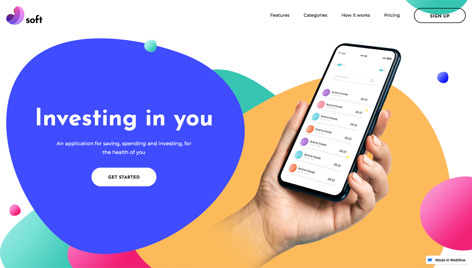
Soft is a Webflow landing page template by Ciprian Paraschiv. The design has bright colors and floating bubble-like elements, making the app seem fun and approachable. This is important for removing any hesitation, especially with a finance app that may have a steep learning curve for some. The copy is a placeholder, but the site's structure follows a logical hierarchy: benefits, UI previews, a feature set, and pricing. It's an excellent template for money management app developers who want to empower their users.
12. Aura

Aura's landing page uses soft, comforting gradients to echo the app's focus on calming and wellness. It opens with social proof in the form of reviews, awards, and expert profiles to build trust from the start.
The gradient continues with each section, reassuring visitors as they scroll. The landing page highlights benefits like better sleep and anxiety relief and displays elements of the app, such as guided meditations, coaching, and soundscapes. The site ends with a feature comparison, showing potential users why they should consider Aura over competitors.
13. Beeper
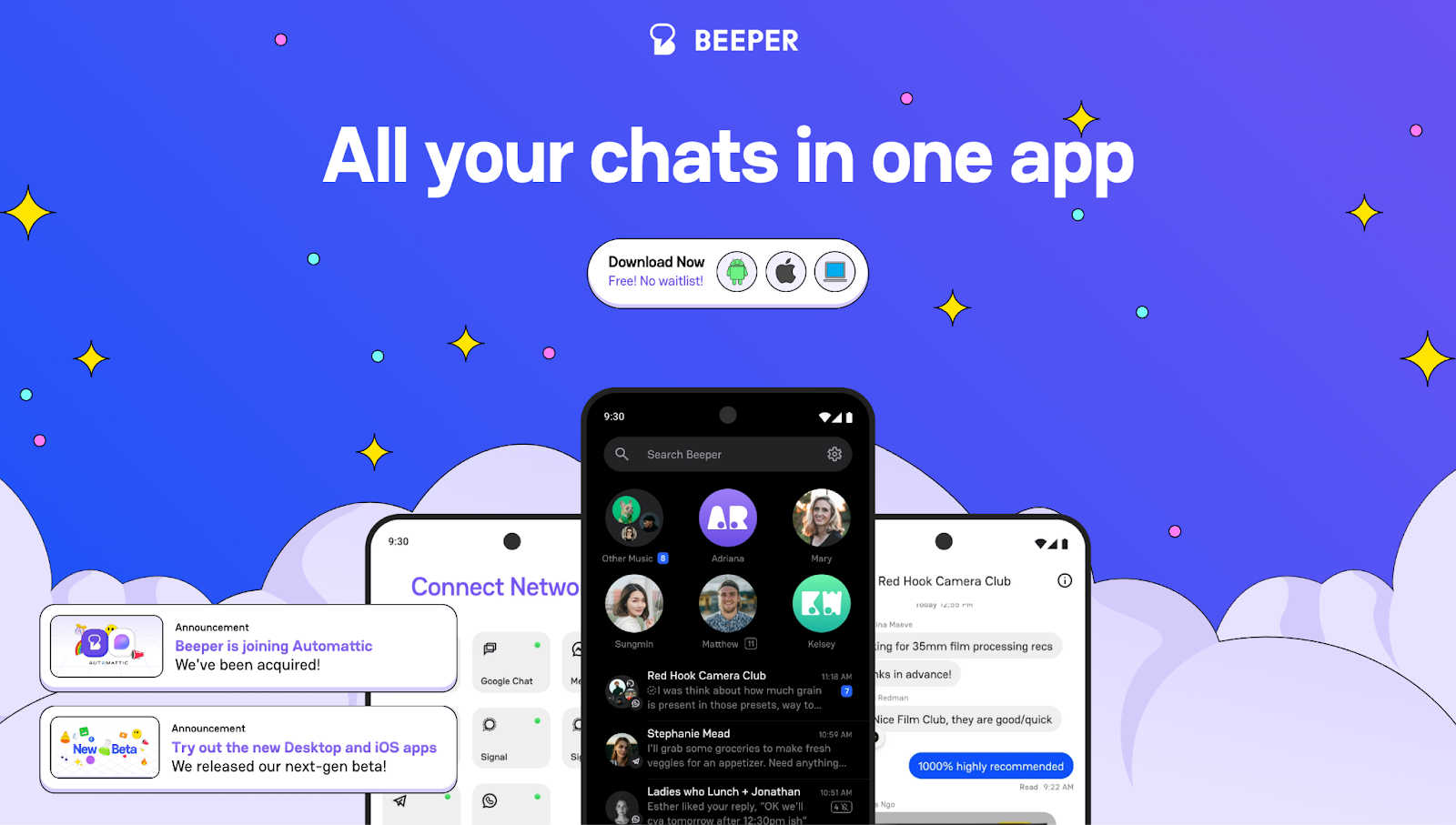
Beeper's landing page, designed by Hedrick, has playful emoji-like icons and bold typography. These elements give the site a modern, social media-centric appearance, which is apt for highlighting Beeper as an all-in-one messaging platform.
The header uses visuals to support Beeper's promise, with multiple devices stacked on each other, ultimately merging into one chat hub. If you still have questions, you can scroll to the bottom to find answers to common queries.


Launch with Webflow Templates
Choose from hundreds of professionally designed website templates for any industry or style. Customize visually, launch instantly — no coding required.
How to build an effective app landing page
Creating an app landing page is a design process that takes thoughtful planning. Here's how to begin building one:
1. Establish your page’s goal
Every app landing page should aim to get people to download the app, join a waitlist, or sign up for your services. Without a goal, your page can look scattered and become ineffective; visitors won't know what you want them to do, and they'll likely leave without taking action.
Before writing any copy or choosing a template, define your page's primary objective. Then, build your layout and content around it. A focused landing page minimizes cognitive load so visitors don't have to process multiple options. Instead, the content gently steers them toward one outcome, which increases the chance of conversion.
2. Write a benefit-driven headline
You have just a few seconds to convince a visitor to stay. A headline is your first impression, and it needs to quickly answer questions like what the app is and why people should consider it.
Write a headline that communicates your app's primary benefit — not just what it does, but how it improves the user's life. Depending on the scope and services of your app, you might consider headlines like:
- Improve your productivity and organization with (X)
- Use (X) to plan, track, and optimize your financial well-being
- Rest easy knowing that (X) keeps your vital data safe
After you’ve set up your headline, follow it with a subheadline that adds context or supports the claim.
3. Use visuals to show how the mobile app works
Humans process visuals faster than text. Screenshots, mockups, and demo videos help give people an expanded understanding of how your app looks and works. This reduces uncertainty and doubt, which are major barriers to conversion.
Use high-resolution images to display your app on real device mockups, such as phones, tablets, and desktops. Animated walkthroughs or screen recordings can be even more effective, especially if you want to highlight complex processes or unique features that require a demonstration.
When people see the product in action, it feels more real and attainable, boosting confidence that it will meet their needs.
4. Highlight key features and real benefits
Visitors need more than an aesthetic interface, they want to know how the app solves their problems. Listing features is a start, but connecting those features to real-world benefits helps convert interest into action.
Group 3–5 key features and pair each with a short, benefit-oriented explanation. For example, instead of saying "real-time sync," explain how your app "keeps your data up-to-date across all devices, so you never miss a beat."
Messaging like this speaks to the user's goals without sounding robotic. It shifts the focus from what the app has to what the app does for the user, helping them imagine how it fits into their lives.
5. Build trust with social proof
Social proof removes doubt, especially if your app is new or unknown. Testimonials, user reviews, and press mentions provide credibility and let people know your brand is authentic.
If possible, feature short quotes from happy users. Add star ratings or user counts, such as "Trusted by 10,000+ professionals." If you've been featured in media outlets or partnered with known brands, include their logos.
Seeing that others have tried and loved your app builds confidence. It taps into the main psychological principle of social validation: If it works for others, it's probably worth trying.
6. Make your CTA impossible to miss
The CTA is the tipping point between interest and action. A CTA usually comes in the form of a clickable button or link that tells people exactly what to do next, like downloading the app or signing up for a beta program. If it's vague, hard to find, or buried in a clutter of surrounding elements, you risk losing potential users when they're ready to engage.
To make your CTA pop, use a large, contrasting button that stands out from the rest of the page. Make the text action-oriented and lead with a verb, such as "Get the app," "Start your free trial," or "Join the beta for exclusive access." Place the CTA above the fold and repeat it toward the bottom for those who scroll.
Must-have elements for an app landing page
Each element of an app landing page plays a specific role in taking visitors from curiosity to conversion. Here's a breakdown of the essential components:
Eye-catching hero section
The hero section is the topmost part of your landing page — the "above-the-fold" area people see before scrolling. It typically includes your headline, a visual of your app, and your primary CTA.
While CTAs are mostly text-based, the hero image visually introduces your app. Visitors form snap judgments based on design and clarity, and a bold hero section makes your app feel exciting. When done right, it invites people to explore your landing page and try your app.
Compelling headline
The headline is the main text that sits front and center on your landing page, usually at the top of the hero section. Headlines are the first thing people read, and they set the tone for everything that follows. Visitors decide, within seconds of reading it, whether to stay or bounce.
When it focuses on outcomes in addition to features, it connects emotionally and provides a route to solving a pain point. It tells visitors what the app is, who it’s for, and what they gain from it.
Clear CTAs and download links
Your CTA generally needs to be the most visible and action-oriented element on the page. Even highly interested visitors may not take the next step if your CTA isn't apparent or compelling, so make sure it's easy to understand. A well-placed, well-worded CTA is like a gentle nudge, turning passive browsers into active users.
For app landing pages, CTAs are usually direct links, with recognizable store badges, that send people to your app's listing in the Apple App Store or Google Play Store. They allow users to immediately download the app on their device.
Key features and benefits
This section highlights your app's main features. You’ll want to break down your app's capabilities in an easy-to-digest format. You can use icons, UI cards, or bullet points. Keep in mind that people aren't buying a list of tools — they're buying outcomes. Instead of listing technical specs, tie each feature to a practical benefit to make it persuasive.
FAQ section
FAQs are frequently asked questions and short answers, typically near the bottom of your landing page. They cover common concerns like pricing, compatibility, privacy, and support. People often hesitate to convert if they're unsure about something, and proactively addressing doubts encourages them to try an app out.
FAQs provide quick, accessible answers without visitors having to leave the page or contact support. They also show that you understand your audience's doubts, strengthening your relationship with them and creating a positive impression of your brand.
App landing page design best practices
Making your app landing page easy to understand shouldn't limit your design choices. Here are a few best practices to consider when building:
Leverage interactions and animations
Subtle animations grab attention and make content feel more lively. Motion adds depth, which helps designs feel intentional instead of static or flat. When used well, animations create a rhythm that allows people to follow a narrative.
Use scroll-based animations for feature reveals, hover effects to emphasize CTA buttons, or fade-ins to introduce images. Keep animations smooth and lightweight, and avoid anything that distracts from your primary message.
Fine-tune layouts for mobile devices
Many people will visit your landing page on their phones, especially if your app is mobile-first or mobile-only. A responsive layout ensures your design looks and works seamlessly across all devices.
Clunky layouts and confusing navigation frustrate users, causing them to bounce. When everything scales gracefully, like buttons staying tappable and text remaining readable, visitors stay interested.
Design with mobile-first in mind, then adjust layouts for larger screens. Webflow’s visual breakpoints allow you to customize mobile, tablet, and desktop using scalable elements. Then, you can preview changes in real time to catch inconsistencies before publishing your site.
Showcase app features with grids and flexboxes
A clean, well-structured layout makes your content easier to scan and digest. And visual groupings, like UI cards or blocks, can help people understand features without being overwhelmed.
Use a grid or flex-based layout to present 3–5 key features. Break them into cards or blocks with icons, short headings, and one-sentence benefit explanations. Space everything evenly to maintain balance.
Webflow offers intuitive grid and flexbox controls so you can build responsive layouts visually. You can drag and drop elements while Webflow generates clean code in the backend.
Optimize for speed and performance
Slow-loading websites directly affect the user experience and SEO. People will drop off if they can't access your site, which signals to search engines that your site doesn't load fast enough to provide value.
Compress images, limit large video files, and reduce the number of third-party scripts using Webflow's content delivery networks. Use performance testing tools to identify bottlenecks and load non-essential assets only after the main content appears.
Use Webflow's CMS for dynamic content
If you want to regularly edit testimonials, blog posts, or feature updates on your app landing page, manually updating them can get messy. A CMS makes this process more scalable and manageable.
With Webflow’s CMS, you can create custom content categories, such as customer stories, product updates, or FAQs, and connect them to your landing page layout. This allows you to update content once and see it reflected everywhere.
Incorporate video demos
Videos are an excellent way to show how your app works. A short video can explain your interface, flow, and features in under a minute. This helps visitors visualize themselves using the app, making the decision to download easier.
Webflow supports native video embeds, custom video players, and background videos. You can integrate multiple visuals directly into your hero section or feature blocks without slowing down your site.
Build a landing page that converts
It’s hard to sell a great app without a great landing page. Every detail of your app landing page, from compelling CTAs to confidence-building copy, influences how people experience your product and whether they'll take the next step.
If you’re looking to blend design and function to make pages that convert, Webflow can help. Bring all your components together in a visual canvas, edit with a flexible CMS, and launch without hassles.
Start designing a high-converting app landing page in Webflow.
Build websites that get results.
Build visually, publish instantly, and scale safely and quickly — without writing a line of code. All with Webflow's website experience platform.