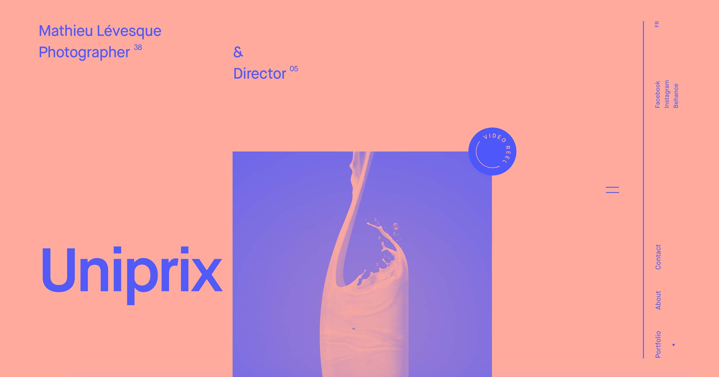
Finding a good website layout idea could be the creative spark you need to transform your site’s design to best represent your brand.
Your website layout can be as functional as it is masterfully constructed, but it must serve the greater purpose of selling your brand. Determining how to organize your site’s content can center your brand’s mission and convince customers to convert. Users form an opinion about a website in just 0.05 seconds, and design (including layout) accounts for about 94% of that first impression.
The importance of having a good layout
After the internet’s inception, web design reflected print media. Columns and rows followed rigid lines, with content and images anchored to fixed spaces — similar to a newspaper magazine layout. These uniform layouts limited the variation across websites. But as coding languages like HTML, CSS, and JavaScript evolved to improve loading times and site functionality, so did new website layout design possibilities, tools, and templates. Responsive design improves user experience and conversion: sites with responsive layouts typically see 11% higher conversion rates.
Regardless of the type of website, how you present content is just as important as the content itself. If you have elements that distract users or make it difficult to read important information, the user experience (UX) will suffer.
Layouts should be catered to the type of content you’re presenting. For example, a landing page for a sale should be organized in a way that makes it easy for visitors to learn about the products and make a purchase. However, a blog layout should focus on making the article legible with minimal distractions. 75% of people judge a company’s credibility based on its website design, and layout plays a major role in whether a site looks modern, clean, and trustworthy.
Let these 10 layout ideas help you build a website that resonates with visitors and creates a memorable experience.
1. Add depth with a parallax effect
Parallax scrolling adds depth to a layout design. The website’s background moves at a different pace than the foreground, creating a pseudo-3D effect. When done subtly — without overwhelming visitors with too much movement — it layers graphics, images, and text to make a page layout more dynamic and immerse visitors in the experience. People scrolling down will be encouraged to continue to follow the parallax effect.
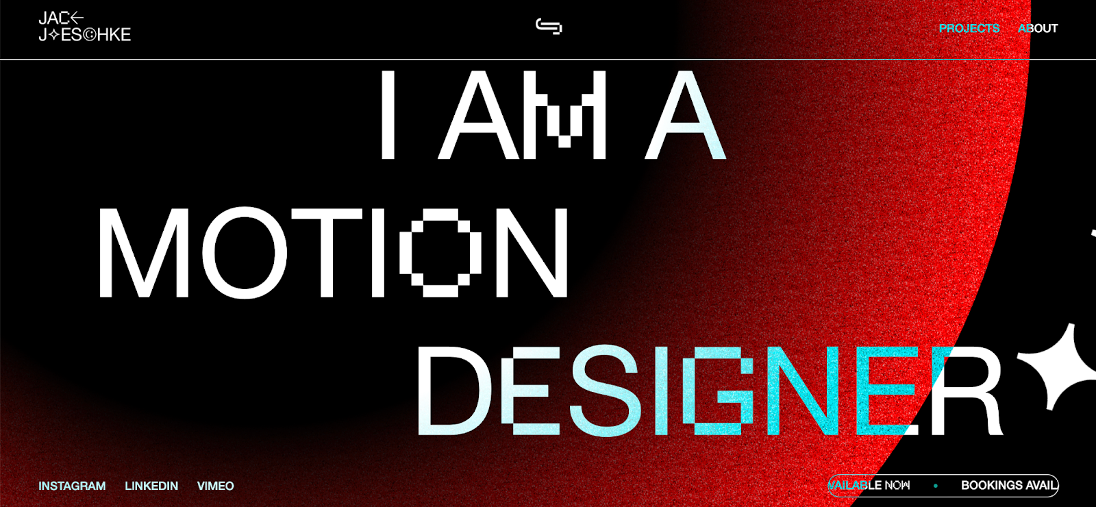
Jack Jaeschke, an Australian-based animator, motion designer, and film editor, combines illustration and video with parallax motion in his design portfolio. Colored, animated circles in the background add color and play as visitors scroll through Jack’s site to learn about his work. The dynamism of parallax offers Jack room to experiment with interactive design and showcase his creativity without distracting from the content.
2. Use overlapping elements
With the freedom given by modern web design tools, website layouts can expand beyond the self-contained columns of traditional layouts. Designers are free to stack the z-axis with design elements — a shift from the organized columns of print design with stacked elements — whether those elements are text, image, color, etc. Playing with boundaries like this eliminates the rigid format to create unexpected but engaging layouts.
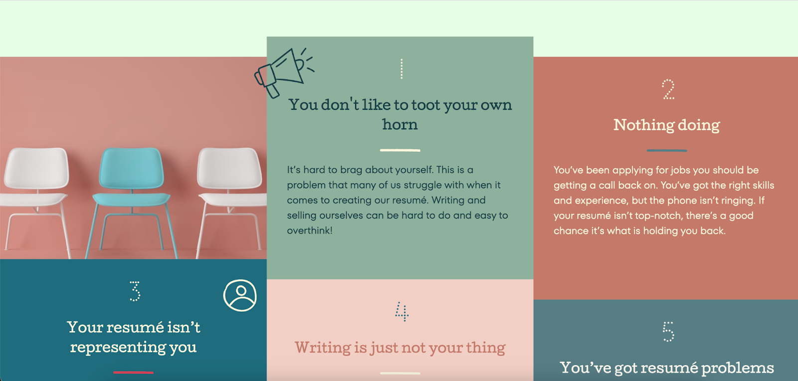
Slay My Resume’s site, designed by Stephen Voisey, overlaps different colored boxes of text to guide visitors through the site’s message. The owner of Slay My Resume, Ali Williams, helps job seekers refine their resumés and job applications to get hired. And Ali’s site keeps visitors reading, just like a good resumé. The site’s images and squares of color slightly overlap, transitioning the reader from section to section without interrupting the page. Visitors must continue through the site to finish reading what’s in one section while already starting to read what’s in the next.
This style can help your brand communicate more information in less space when bullet points are all the customer needs. For this site, the business proposition is clear in the section titled “5 Great reasons why you should hire a resumé professional. Site visitors can learn the highlights of Slay My Resume services while scrolling through a site with a pleasing, cohesive color palette and clear heading and reach out via a contact form at the bottom of the homepage.
3. Break up content with offset headers, subheaders, and columns
With some layout designs, less is more. Too many complex animations and other embellishments can add clutter to a design. Often, offsetting elements and columns are all a layout needs to capture enough attention to communicate a brand.
Like any non-traditional layout method, designers must balance the content and visuals. These elements can be offset or overlapping, but they still need to be logically connected to guide visitors.
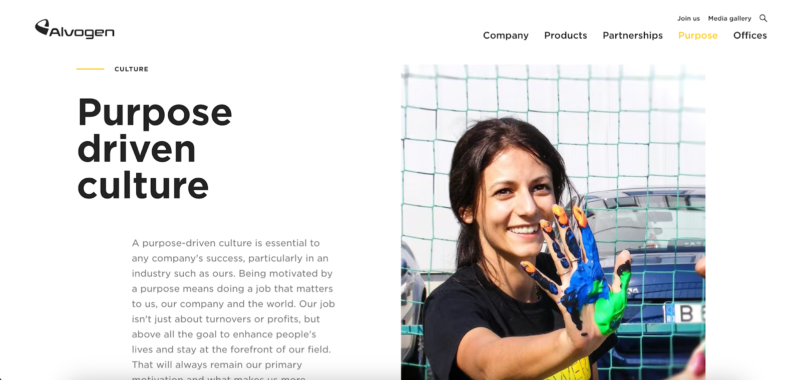
Alvogen, a pharmaceutical company, uses this staggered design approach, placing the text on the right with images on the left in some sections and swapping the organization in other sections. This creates a visual ladder effect, moving site visitors down the page.
4. Lay out content with horizontal cards
A horizontal layout is a simple way to keep a design from overcrowding. It also works well for smartphone screens where the structure becomes a vertical scroll.

Hypergiant, a company offering advanced AI software solutions for companies, uses horizontal cards for some of the most important content, creating a timeline-like flow to its website. Instead of the standard, newspaper-like format of a heading, then an image, then text, the horizontal display lets site visitors absorb each section in its entirety before moving on, like a photo gallery or slideshow. People won’t need to scroll up or down to read more information — the horizontal cards clearly present the site’s information in each snapshot.


The modern web design process
Discover the processes and tools behind high-performing websites in this free ebook.
5. Split screens
A split screen layout lets you break up big content blocks to maximize screen space. Dedicating each side of the screen to complementary content delivers a more comprehensive experience.
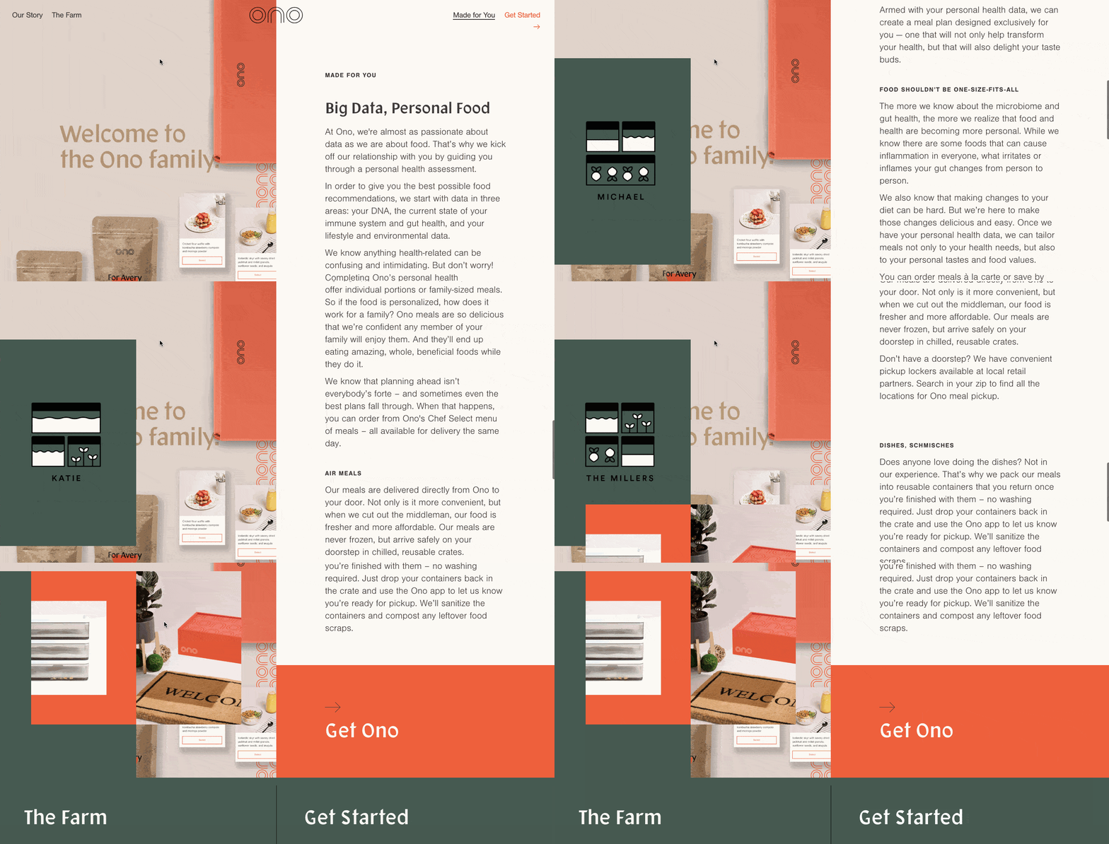
Food kit company Ono uses split screens with scroll-triggered animations for a UX full of color and movement. This creates a clear path to the eventual call-to-action (CTA) at the bottom of both columns, as site visitors must continue scrolling to read the text on the right side of the screen. As they scroll, new visuals emerge on the left to add variation and prevent readers from growing bored.
Split screens are another practical way to link related blocks of content together. Instead of a single web page with crowded content or requiring visitors to scroll, it neatly divides things into two.
6. Going big with giant copy
Giant copy, when done right, commands attention to make a loud declaration about a brand or CTA.

The giant headline and downward arrow on the homepage of digital agency Okalpha immediately encourages the user to scroll down to find out more. And the greeting — “Hey. We’re ok.” — acts as both an introduction and conversation starter, as though you’ve already asked how they’re doing. When site visitors scroll down to learn more about Okalpha, they’re met with a short description of the brand and what they do.
When using oversized type, make sure there's a clear intent behind the message, like a CTA. For this site, it leads to the site’s “About” section, inviting visitors to learn more about the agency and its work.
7. Opt for a horizontal scroll
Horizontal or side-scrolling impacts a website’s content organization and is often used instead of a vertical scroll to show off brand images and ideas.

Alfredo Briccolo’s design for Krasa Architecture, Light & Design does this well by using a side scroll to show off the firm’s portfolio.
To organize an effective side scroll, text, images, and other elements must be consistent and concise to fit the right messaging into screen size constraints. It creates the illusion of moving through a gallery or flipping through a book, making side-scrolling a compelling and unique way to navigate content. For Krasa Architecture, this layout allows visitors to sample past projects. Using a grayscale image for each project entices visitors to move their cursor toward the image — and hovering adds color to each image.
8. Inset sliders
Inset sliders break from design protocol and give a web designer more creative freedom by saving space. Traditionally, carousels or sliders break up a design, which could negatively impact accessibility and might move too quickly for visitors to absorb all content.
But designers are refining sliders, making them less intrusive while retaining their functionality. The goal is to create content that only takes a few clicks to explore so that people don’t have to navigate to various pages.

Refokus Slider Generator is a tool that can help you create custom sliders with static elements or CMS collection lists without writing a single line of code. This is especially helpful for ecommerce sites to showcase products without redirecting to a new page.
Save space on your site by adding visual content to a slider and letting people click through as they need. Pair each image with alt text to ensure the content is accessible to more visitors, and make sure the arrows are visible and intuitive so visitors can control the pace.
9. CSS grid
Like this smiley face made in Webflow, the CSS grid aligns elements on the horizontal and vertical axis grid layout.

A CSS grid allows designers to control element positioning horizontally and vertically, giving them more precise control over visuals and content. CSS grids are useful for experimentation, allowing for broken grid website layouts and other unique designs. Use a CSS grid layout for extra precision in designs.
10. The continued rise of brutalism
Responsive design, better-organized content, and refined navigation made cruising through the web a more polished experience. Brutalism bucks all conventional design trends, creating its own visual hierarchy.

This portfolio website by designer Joshua Garcia featuring an accordion of case-study projects favors a brutalist design style.
Brutalism pairs practicality with experimentation. As designers find new ways to innovate UX, brutalists are innovating new ways to make noise with disruptive navigation, mixed focal points, odd color schemes, asymmetrical layouts, grating visuals, and cryptic content. Joshua’s design uses bold, black text on an off-white background, separated with horizontal lines, to declare the site’s categories. Hovering over each phrase reveals a faded background image, and clicking leads to the samples of work.
This bold, jarring design is the perfect amount of unexpected that draws people in to learn more.
Test out a new layout today
Website development has evolved to allow more interactive and design-savvy brand websites. Webflow has embraced this evolution in design by offering templates at the cutting edge of website layouts. These layout ideas and Webflow's no-code design tools will assist you in creating a brand webpage that fully embraces modern website design.


