

For luxury brands, first impressions are everything.
The online experience you provide through high-end service and retail websites must be as grand as the products and services themselves. A well-crafted luxury brand website needs to attract affluent customers and reinforce your client's prestigious status.
Covering sectors like fashion, real estate, and travel, the following examples showcase how to build websites that create premium impressions at first sight.
Design elements to include in a luxury brand website
Here are some essential design components to include in your client’s brand website to evoke a sense of high-end appeal:
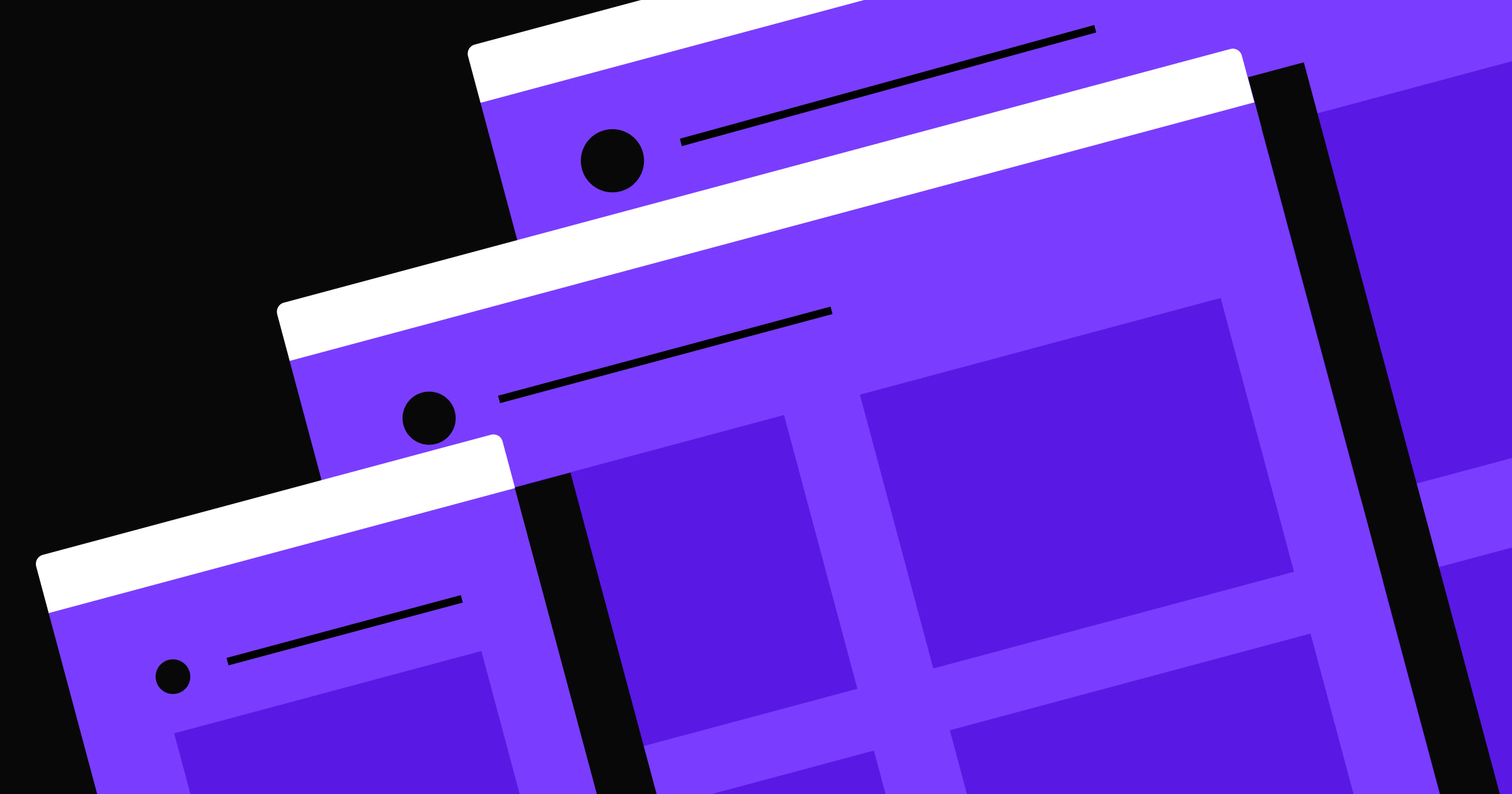
- High-quality visuals. Use professional, high-resolution images and videos to tell your client's story, provide virtual tours, and highlight the exclusivity of the brand's products and services.
- Rich colors and whitespace. Use rich, elegant colors like gold, black, and white to enhance the brand's image. A clean aesthetic with ample whitespace allows these colors to stand out.
- Responsive design. A responsive layout ensures your client’s website looks and functions consistently across multiple screen sizes and devices.
- Storytelling elements. Create narratives highlighting the brand's history, values, and unique selling points. Use language and visuals that evoke emotions, making visitors feel like they're part of an exclusive community.
- Interactive features. Animations, interactive galleries, and hover effects add dynamism to your client's website, giving them the edge over competitors with static layouts. It also adds a personal touch by allowing visitors to experience products and services virtually.
- Cohesive branding. Using consistent logos, fonts, and colors across your client's website reinforces their brand identity. To embellish the site, you can also add details like custom icons and elegant typography.
- Essential business information. Provide quick access to contact information, store locations, and customer service.
- Calls to action (CTAs). Strategically placed CTAs encourage visitors to take desired steps, like buying a product or signing up for exclusive offers.
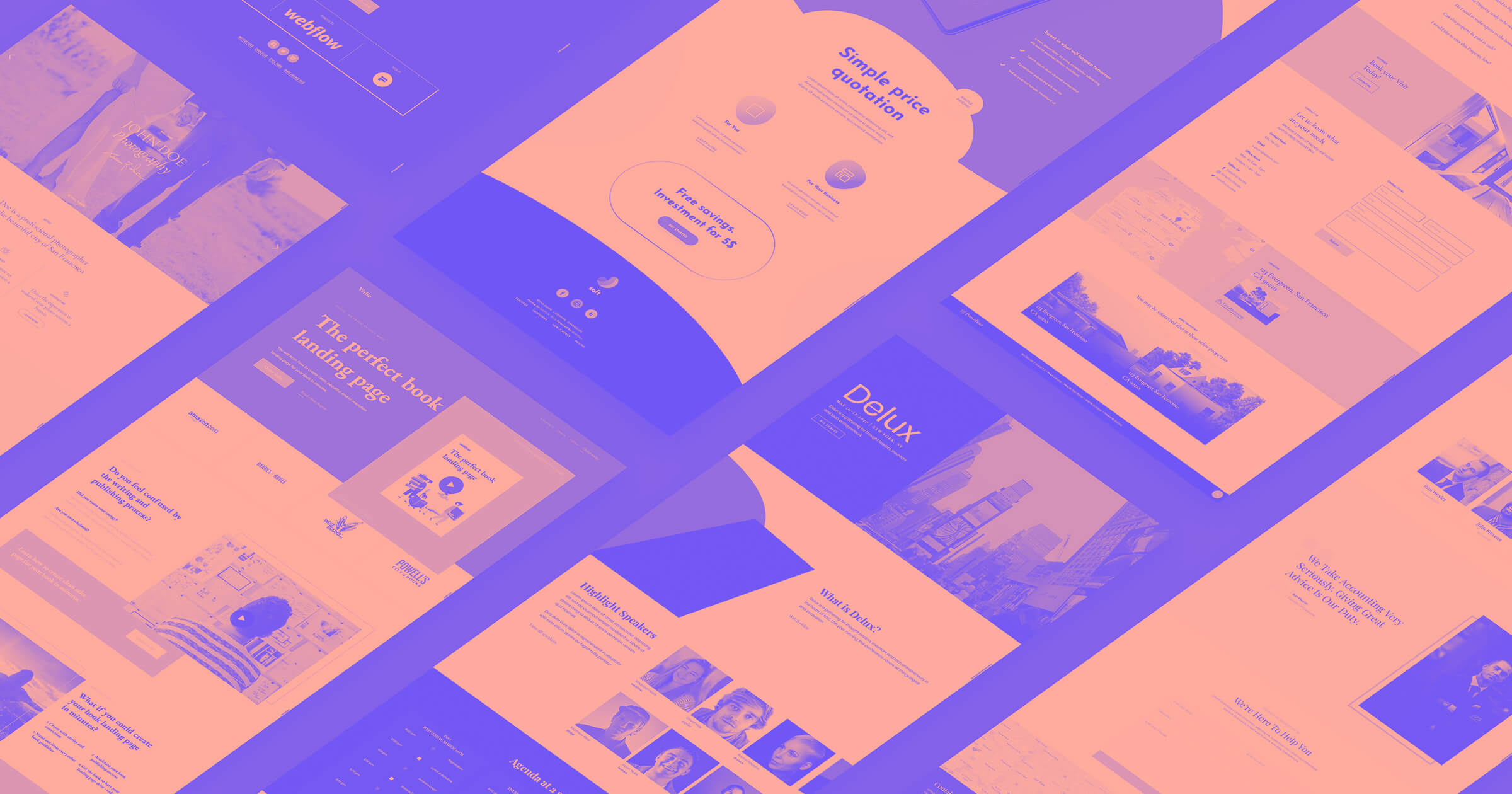
7 luxury website examples
No matter your client’s industry, you can take inspiration from these seven luxury brand websites to improve their site’s appearance and functionality.
1. WHITE PLAN
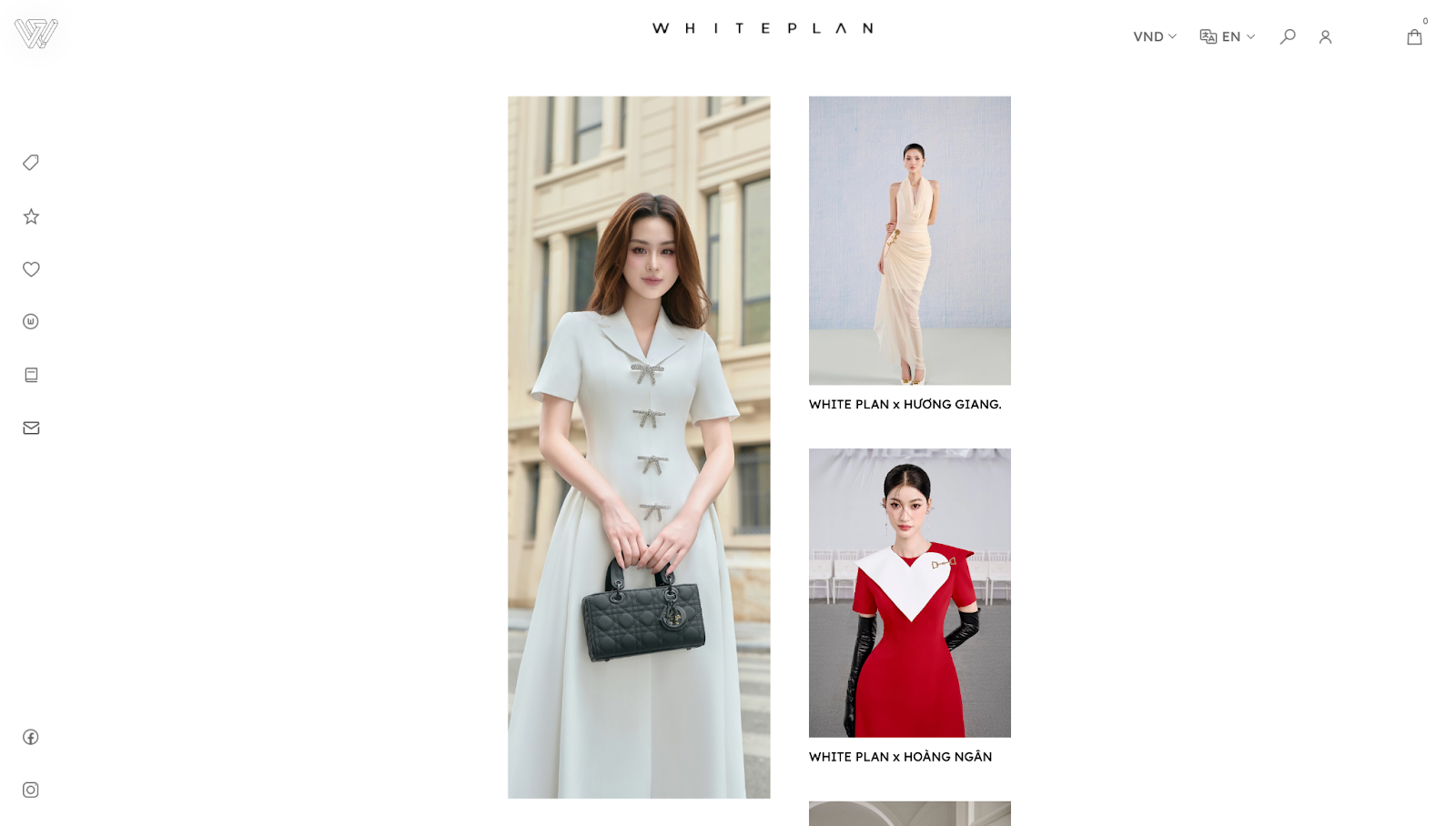
WHITE PLAN's website, made by SAYU. STUDIO, has a minimalist design that prioritizes high-resolution imagery showcasing the elegance and quality of the products. Hovering over these reveals more images, like opening a closet to find more clothes.
Ample whitespace allows the images to stand out, creating a clean aesthetic that nods to the brand's name and lavish identity. The light palette and delicate typography also contribute to the website's visual style.
The central area of the homepage features a clear, bold statement about the company’s mission, “Creating the space for the ladies to find her own path,” with a CTA button encouraging you to explore WHITE PLAN's luxury fashion products. A simple yet elegant floral illustration adds a touch of artistry without overwhelming the primary content.
At the bottom of the page is essential customer service information and a subscription option, ensuring convenient access to support and updates. Meanwhile, the hover-activated menu on the left side offers a quick way to navigate the site.
2. Emmanuelle Silk
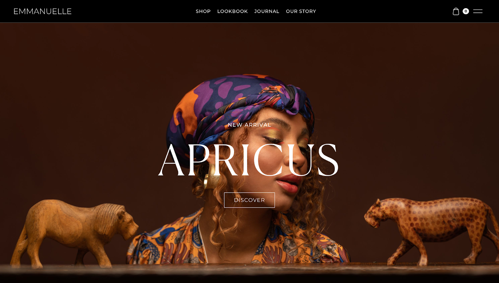
Emmanuelle Silk's site, designed by Dimitris Theofanous, features a striking hero image of a woman wearing a patterned silk scarf. Bold, all-caps typography instantly draws attention to the company's newest arrivals. Scrolling reveals a dark and rich color palette, including black, gray, and green. The black menu at the top of the screen is ever-present with high contrast, making it visible and readily accessible to navigate to different pages.
The luxury shopping website is organized into multiple sections, including a welcome message that adds a personal touch and tells the brand’s story through its latest collection, as well as a “Journal” section linking to the website’s blog and featuring the most prominent articles and topics.
Some of these areas link to separate pages within the site, such as the “Lookbook,” “Journal,” and “Our Story” sections. These pages highlight the website’s most important elements without neglecting any information.
3. Villiers Private
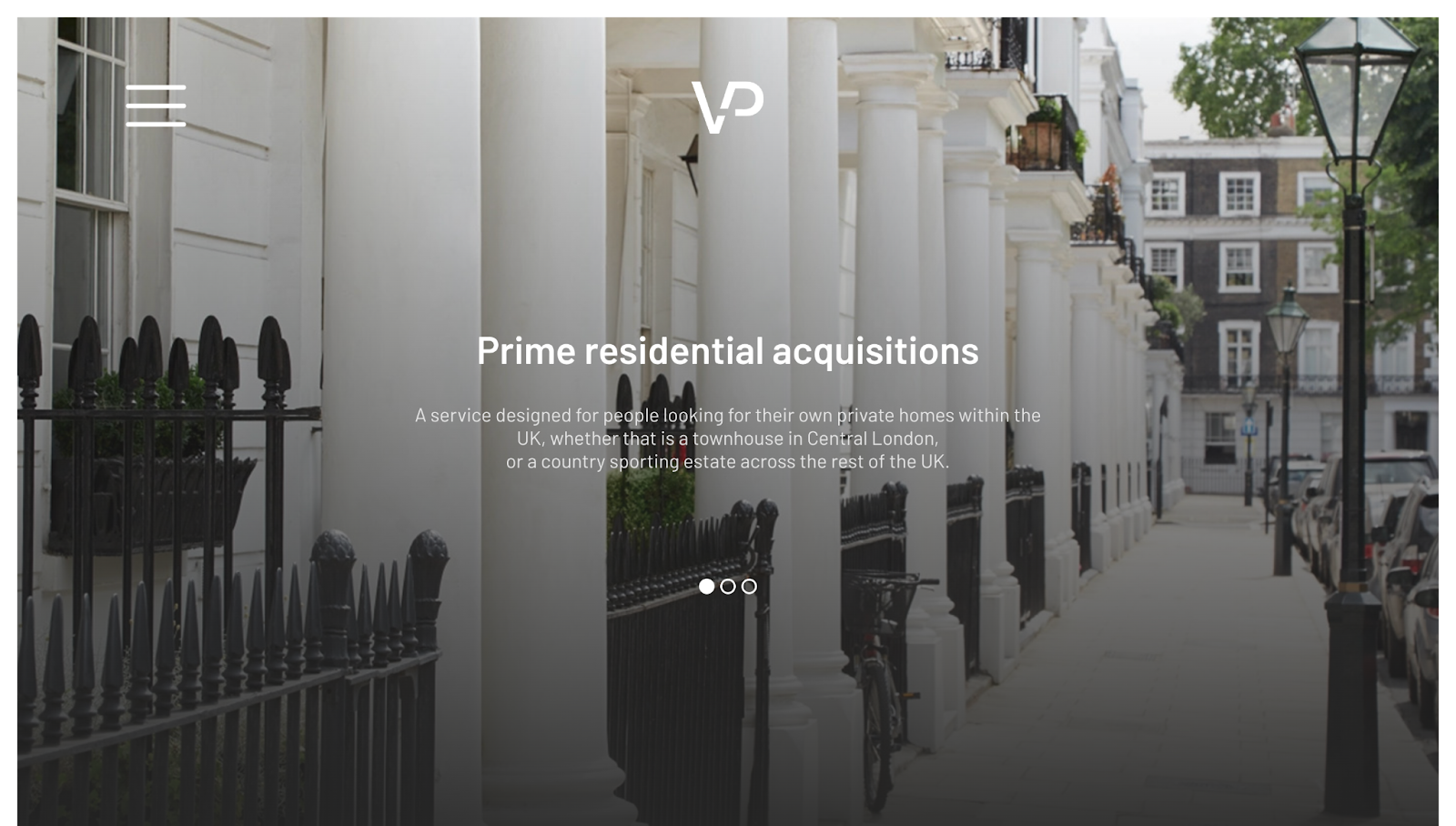
Villiers Private's website, created by Web Bae, exudes a lavish appearance through its clean layout, high-quality imagery, and focused messaging. The landing page features a slideshow with images of upscale UK residential properties, establishing the brand's high-end appeal as a luxury realtor.
The minimalist design with generous negative spacing makes the content stand out, and a monochromatic color scheme allows the images to pop while increasing text legibility. Each image has a "Get in touch" section at the bottom, encouraging you to take action if you’re interested in a listing.
A hidden menu, accessible via the hamburger icon in the top left, keeps navigation uncluttered while maintaining functionality. The "Villiers Jet Charter" option redirects you to related luxury services and promotes the brand's umbrella of offerings.


Ultimate web design
From 101 to advanced, learn how to build sites in Webflow with over 100 lessons — including the basics of HTML and CSS.
4. DAVINCI XXI
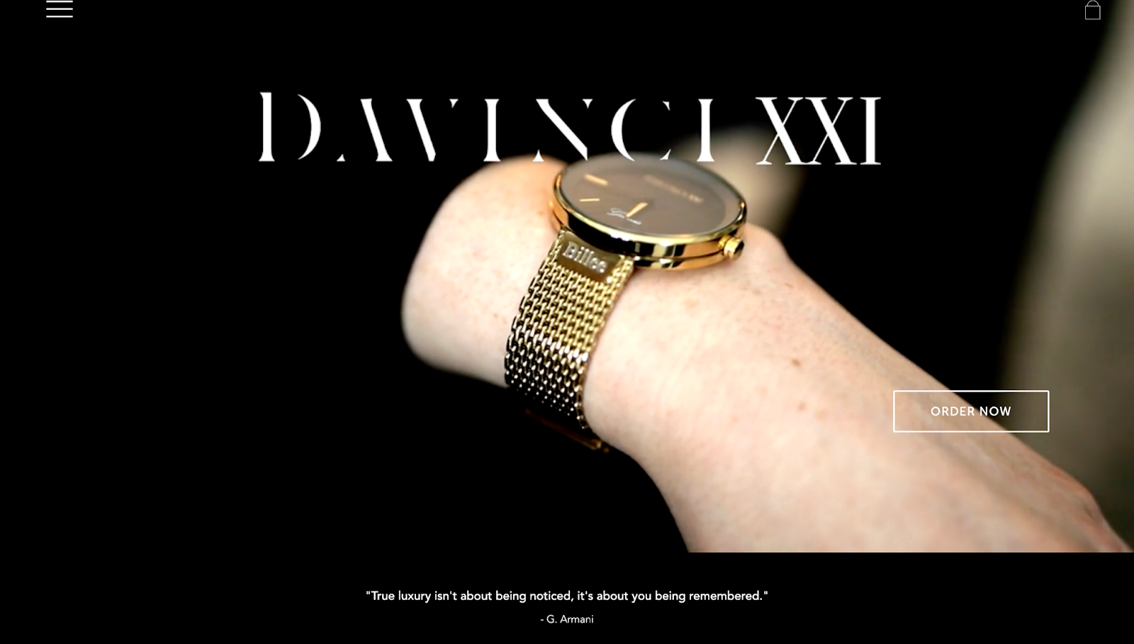
The DAVINCI XXI website, designed by Inca Olaogun, is elegant and monochromatic. A looping video with models showing off their DAVINCI XXI luxury watches on the homepage immediately grabs attention.
Upon scrolling down, you’ll find the company offers personalized services with customizable options and signature engravings, catering to their affluent market's desire for exclusivity. Testimonials and social media images serve as social proof, highlighting the brand's popularity and building trust with potential customers. Partner logos, including big names like Mercedes, also increase DAVINCI XXI's credibility.
Parallax scrolling effects break up the viewing experience and make various luxury collections stand out. In the top-left corner, a hamburger menu allows you to navigate to different pages quickly.
5. Ascension Luxury Catamaran
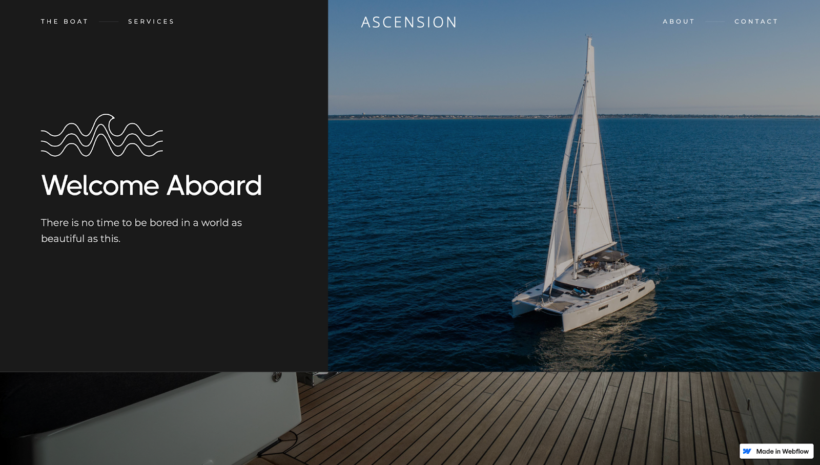
Ascension’s website, made by Juan Pablo Sanchez, has a single landing page design split into multiple sections. The sticky menu’s transparent background becomes black with white text, a contrast that increases readability. This menu boasts a responsive design that lets you quickly navigate to any part of the site.
The header image is a vibrant picture of Ascension’s catamaran yacht, immediately indicating the company’s value proposition of chartering a private boat. The following sections build on this value proposition, describing how the product’s supreme comfort creates a relaxing atmosphere for your family and friends. High-quality nautical visuals add to the marketing message of luxurious adventure.
Scrolling down reveals several parallax effects, creating an immersive experience with high-resolution, edge-to-edge images. Below, the “Our Services” and “Meet the Boat” sections showcase the yacht’s luxury travel features.
Near the bottom of the page, Ascension displays charter rates. This transparency means you don’t have to contact anyone to ask about pricing, which builds trust among potential customers. If you’re eager to learn more, you can fill out a simple contact form and click the “Send” button to inquire about their services.
6. Viice Versa
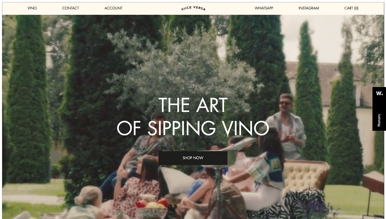
Viice Versa's homepage features a full-screen video showing friends enjoying each other's company while drinking the brand's high-end wine. This dynamic initial greeting captures and holds visitors' attention, while a large "Shop Now" button in the middle of the visual encourages action.
The menu at the top of the screen represents the site’s color scheme of solid, earthy tones that exude an elegant-yet-grounded sense. On the logo’s right, you can contact Viice Versa via WhatsApp and Instagram, making the brand feel accessible and relatable, or add wines to your shopping cart. On the left, you can contact the company through a form or sign in to your account. These sections allow you to shop or get in touch quickly and conveniently.
Selecting the "Vino" option in the menu takes you to an interactive carousel where you click arrows to display different wines. Your cursor turns into a small circle with the text "Check Vino" to learn more about the products. Clicking these products reveals an immersive and interactive scrolling experience with parallax effects, videos, and elegant typography.
A sticky "Add to cart" button at the bottom of the screen lets you add products to your cart as you see them, continuously encouraging you to shop as you browse.
7. Ishq Villas
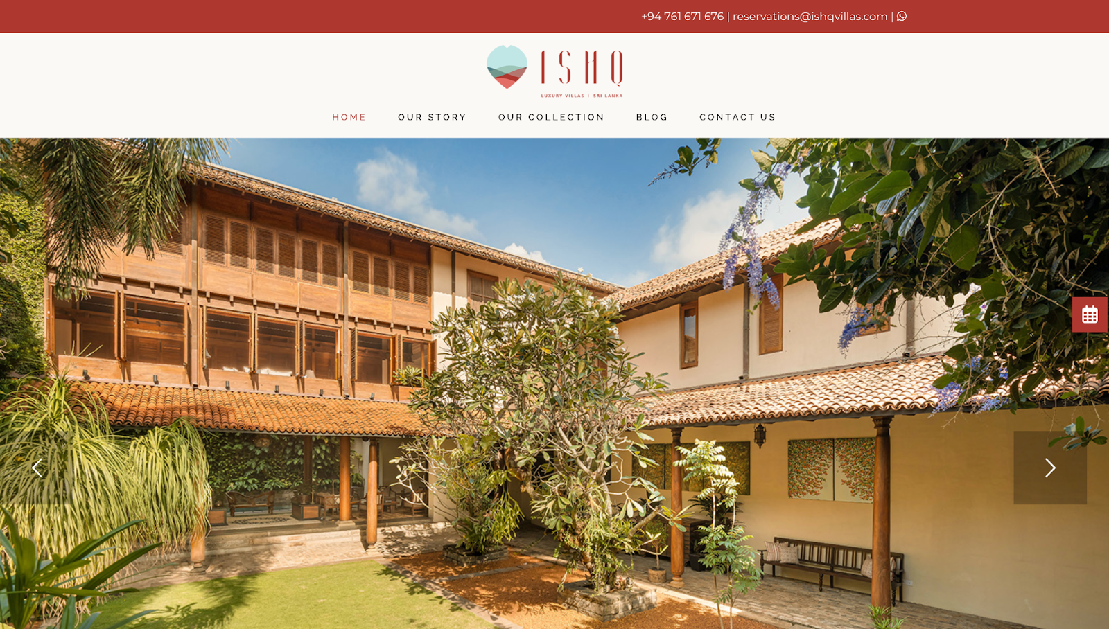
Ishq Villas is a luxury accommodations brand in Sri Lanka. Their website has a slideshow displaying various properties to showcase the company’s diverse offerings, a form for checking room availability, and a notification banner sharing the company’s contact details.
A white background and negative spacing make vibrant pictures of the elegant Villas stand out, and text is distributed throughout in a visual hierarchy to ensure you view every important component. For example, the homepage directs visitors to immediately think about booking a visit by nestling a “check availability” feature right under the stunning hero image — where you can’t miss it. The bottom of the homepage has a “Quick Links'' section, letting you conveniently navigate to any area. And the footer also has essential contact information, social media links, and payment options.
The minimalist design language and the footer are constant on every page. This design reinforces the brand’s visual identity while offering a quick way to jump to any part of the site.
Build elevated websites with Webflow
Communicating luxury is all about perfectly packaging premium features and products, and a well composed website is just the place to do it.
To attract high-end clients, you'll need an equally high-end website builder. With Webflow, you can make websites that are rich in appearance, functionality, and value.
Webflow’s visual design features mean you don't need to rely on developers to create sophisticated visuals and intuitive navigation. We offer options like quick stack elements, flexbox and grid layouts, and responsive design components to help you build sites your clients will be proud of.
Craft stunning websites for your luxury brand clients with Webflow today.
Get started for free
Create custom, scalable websites — without writing code. Start building in Webflow.