


Discover how elegant fonts combine style and substance to elevate the digital experience.
Your typography choices offer a preview of your style and personality before readers even read a single sentence. The web design fonts you select need to set the stage, giving a first impression that’s consistent with your overall branding and message.
If you want that impression to convey sophistication, these 12 elegant fonts add authority to nearly any design project.
What’s an elegant font?
Whether it’s a high-contrast serif font or flowing script paired with a classy color palette, elegant typefaces position your content as professional and refined. Here are some key traits that set these fonts apart:
- Graceful curves and clean spacing. Elegant fonts often use plenty of whitespace between characters and fluid lines that suggest motion.
- High-contrast strokes. Many modern elegant fonts use a dramatic contrast between thick and thin lines, adding visual interest and making the text feel more dynamic.
- Serif or script design. Serif fonts and flowing script are common in elegant fonts, as they make text look more cursive or handwritten.
- Formal and sophisticated feel. When a font combines the above traits, it can evoke formality and professionalism. That’s largely because it reminds readers of other content with similar styles, such as luxury brand websites and high-end editorial designs.
Why might you use elegant fonts in web design?
Elegant fonts do more than dress up a website — they also improve visual storytelling and shape the user experience. The right font choices can:
- Enhance brand perception. These fonts communicate quality and care, so they can make your website feel more trustworthy.
- Create visual hierarchy. You can use simple elegant fonts of varying weights and styles to create a visual roadmap through your content. For example, thin strokes and high-contrast serif fonts might highlight headlines, while sans serif typefaces make body text clear.
- Support readability and accessibility. The best elegant fonts balance style with legibility that keeps your message highly readable. They also look good and stay clear at small sizes, so your content is accessible and responsive to any device.
- Convey emotion. Typography can provoke specific feelings — a warm handwritten script reads different from a precise and mechanical sans serif font.
- Allow consistency across channels. Many elegant typefaces come in versatile font families with multiple style and weight options. This flexibility supports a consistent look while leaving room for variety.
12 elegant fonts for your website and other digital content
To help you sort through your options, here’s a hand-picked collection of classy typefaces that balance readability with sophistication.
Just keep in mind that since many elegant fonts are less common choices, they're not always natively supported by web browsers. This can impact page loading times when a visitor's browser has to download the font on the spot. So if you opt for non-traditional typefaces, choose web-safe alternatives to serve as fallback fonts.
1. Aguero Serif
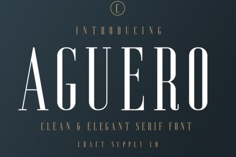
The Aguero Serif font family features high contrast and condensed letterforms that suggest vintage luxury. This typeface is distinguished by slightly squared character shapes and letters that mix thick and thin strokes. Aguero Serif offers a business-meets-glamor aesthetic that stays legible across most mediums, so it’s often used in headlines and banners.
2. Bolin Gerii
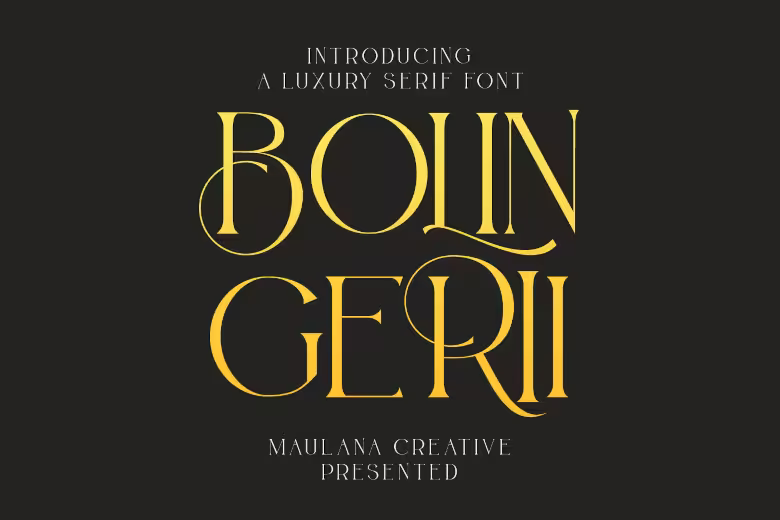
If you’re looking for a modern font choice that channels 1800s charm, this Victorian-inspired serif typeface is a standout option. Bolin Gerii uses classic hand-lettering along with smooth, thin lines, creating a sophisticated vibe that's still clean to read.
3. Chelon

Chelon is a simple yet elegant font with a sans serif design and subtle geometric influences. The minimal structure helps this typeface fit effortlessly into designs that aim for a professional but uncomplicated aesthetic.
4. Coldiac
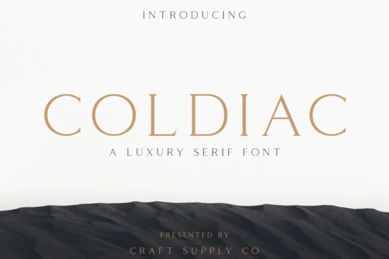
Coldiac is a high-contrast serif font defined by dramatic thick-to-thin line transitions and sharp serifs. The tall letterforms and generous spacing give headlines that use Coldiac an editorial vibe.
5. CS Brenda
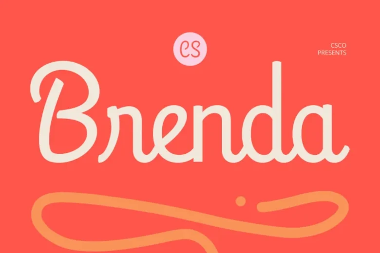
For projects that require a softer touch, this script font offers a contemporary take on formal calligraphy. CS Brenda is a minimalist typeface that evokes traditional femininity thanks to rounded, embellished letters and a hand-drawn style. The resulting effect makes CS Brenda ideal for lifestyle brands that want to feel approachable yet high-end.
6. Last Royal
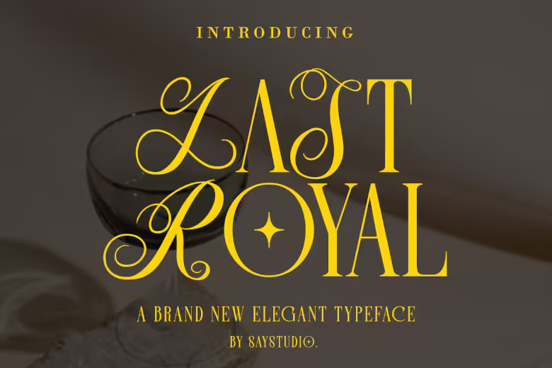
This hybrid typeface combines the structure of a serif font with the flair of a prominent, large-capital script. By playing with letter spacing, you can use Last Royal as an attention-grabbing centerpiece for luxury packaging or premium website headers.


Get our 100 video course on web design — for free
From the fundamentals to advanced topics — learn how to build sites in Webflow and become the designer you always wanted to be.
7. Miora
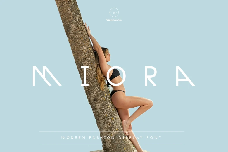
Miora is a modern elegant font that starts with classic letter proportions and adds an eye-catching slant to certain letters. This sans serif typeface is also packed with ligatures and alternates, making it a strong foundation for a memorable visual identity.
8. Mollani
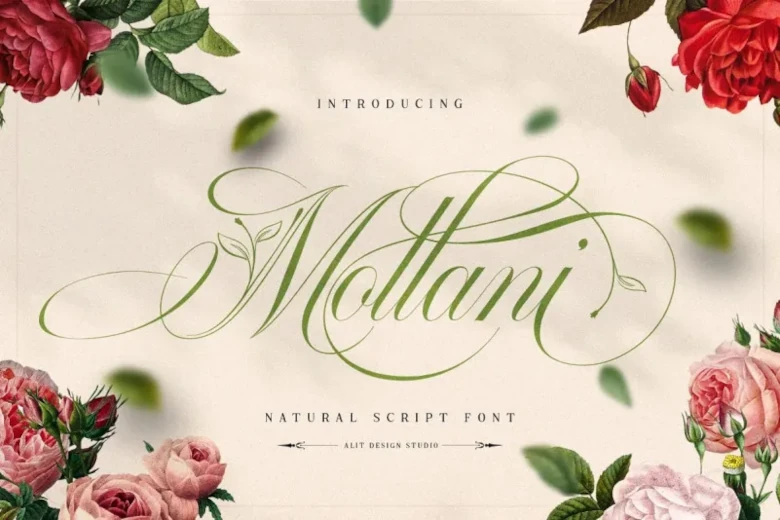
Inspired by nature, Mollani weaves elegant leaf ornaments directly into its sweeping, calligraphy-like strokes. This font will give your content a very distinctive personality — just avoid using it for more than a few words, as it takes up a lot of space on the page.
9. New York
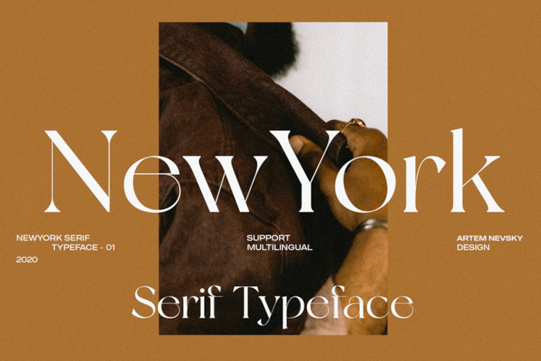
New York’s serif typeface offers optimal readability without sacrificing style. The large, rounded letters capture the spirit of traditional print typography while remaining clear at smaller sizes, so New York is a good pick for long-form editorial content.
10. Rimons
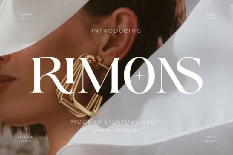
Designed for luxury brands, Rimons is a playground of artistic ligatures and gentle curves. This display font creates natural connections between letters, so your text looks like it was custom-drawn by a calligrapher.
11. Roxie Rossa
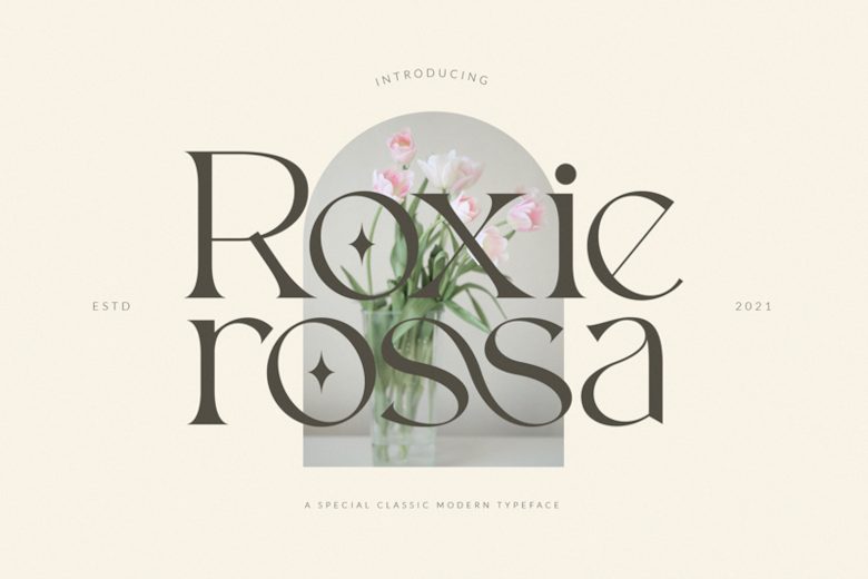
Roxie Rossa is a delicate typeface that delivers a classy look through high-contrast strokes and smooth curves. Thanks to its refined yet approachable character, this font works well in luxury branding and editorial headlines.
12. Troye
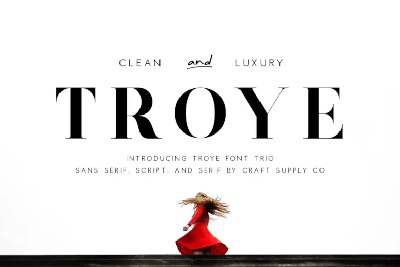
Troye is a versatile font family trio that includes a modern serif font, a clean sans serif option, and a fluid script alternative. Whichever flavor you opt for, the low-contrast strokes and simplified structure make this typeface useful for maintaining a cohesive brand design across platforms and channels.
Elegant fonts pairings for dynamic designs
Designers pair professional fonts for a variety of reasons, such as to create visual contrast, establish hierarchy, enhance readability, or support brand identity. The fonts above work well as solo centerpieces, but if you want to experiment with multiple contrasting fonts, these combinations are great starting points:
- Playfair Display and Montserrat. This classic power couple balances old with new — Playfair Display brings a high-contrast, editorial serif flair for headings, while Montserrat offers a clean, geometric typeface for body text.
- Cormorant Garamond and Lato. Cormorant Garamond is an elegant typeface with fluid curves, while Lato provides a stable anchor thanks to its simple, no-fuss design. This contrast between a formal serif and an approachable sans serif suggests that your site is professional but not stuffy.
- Libre Baskerville and Source Sans 3. Libre Baskerville is a classic font that's been optimized for the screen, and its bold letters pair nicely with the clean lines of Source Sans 3. Together, these typefaces work well on content-heavy sites, helping to maintain a premium feel while staying highly legible.
- Canela and Avenir. Mixing a flared serif typeface like Canela with a geometric staple such as Avenir makes for an avant-garde look, thanks to the strong contrast. This duo signals that your brand isn’t afraid to break the mold.
- Bodoni Moda and Open Sans. Bodoni features sharp, vertical stress and hairline serifs that echo luxury brand styles, while Open Sans is neutral and very readable. You can draw attention to key elements like headers and calls to action with Bodoni, and avoid distractions in longer text with Open Sans.
Elevate your brand with the right fonts and design tools
Great website design relies on intentional choices that align with your goals, and typography is a good place to start. The perfect font sets the tone for everything else, so make sure it’s reader-friendly and expresses your brand identity.
If that sounds a bit challenging, Webflow gives you the tools and creative freedom to bring the sophisticated styles you imagine to life. WIth full control over page design and experience, you can implement a complex serif typeface or delicate script while maintaining high performance and accessibility. You can even use the Webflow Font Generator to play around with unique elegant font options.
Find out how Webflow gives you the confidence and creative freedom to execute ambitious web designs fast.
Get started for free
Create custom, scalable websites — without writing code. Start building in Webflow.


