


Great websites cater to visitors’ interests by delivering what they need with precision and speed.
Simply having a website and optimizing it for search engines isn’t enough to attract and retain visitors. You must also understand and anticipate what your users seek, then create an environment that draws them in and keeps them engaged.
To truly connect with your audience and distinguish your site from the competition, your web design and development must pivot around customer-centric principles. By having intuitive interfaces, responsive designs, and resonant content, you cultivate an online journey that engages and satisfies your audience — and keeps them coming back for more.
Here’s how you can improve user experience (UX).
Factors that contribute to a great site experience
Whether you have a dedicated UX designer or a combined user interface (UI) and UX design team, it’s important to distinguish UX from UI design.
While UI focuses on a website’s visual aspects — such as layout, graphics, and overall look and feel — UX design delves into how users interact with your website. This includes understanding user behavior, optimizing site functionality, and ensuring content meets audience needs.
Check out these factors that contribute to UX.
Navigation
Efficient site navigation enhances customer experience by ensuring seamless movement through your site’s content and providing quick access to needed information. Optimal navigation minimizes user friction by enabling users to find what they’re looking for with less effort.
For example, a mega menu on a design agency’s site can effectively organize and display services in a structured and accessible layout. It offers users a quick overview of all available options and encourages them to explore other offerings. By implementing intuitive navigation and keeping visitors engaged on your site, you improve UX, boost conversion rates, and minimize bounce rates.
Performance
Site performance, or the speed at which your web pages respond to user interactions, is critical in shaping UX. Slow-loading pages can frustrate users, which risks them bouncing from your site, and this can negatively impact your website’s search rankings. In contrast, improving your website’s performance lets users access information more quickly, contributing to a positive UX.
To improve your site performance and speed score, leverage techniques like lazy loading and content delivery networks. Implementing these strategies accelerates page load times, streamlines site interactions, and ensures faster content delivery. This enhances user satisfaction and decreases the chance of visitors leaving due to delays, ultimately keeping users engaged with your site longer.
Design
Your website’s visual and interactive elements, such as layout, colors, and overall aesthetics, are key components of UX design. Thoughtful design enhances your site’s aesthetic appeal and intuitiveness, which increases user engagement.
For example, UX designers often use whitespace, contrasting colors, and visual hierarchy principles to streamline the user journey. These elements create a more frictionless experience and guide users through your site. By carefully considering each design aspect, you ensure your site captivates visitors and provides a better digital experience.
Content
Tailoring your content to align with user needs and preferences ensures visitors readily find valuable and relevant information.
For example, employing a well-structured content hierarchy complemented by engaging visuals significantly enhances readability. This strategic approach makes content accessible to a broader range of visitors while encouraging users to spend more time exploring various content offerings on your site.
Benefits of improving user experience
By prioritizing UX, businesses can unlock several key benefits that positively impact their bottom line and customer relationships. After all, improving UX is pivotal in shaping customer satisfaction, loyalty, and overall business success.
Check out these benefits of improving UX for your website.
Reduced user friction
Designing a user-friendly interface minimizes customer frustrations and invites deeper engagement with your digital platform. When customers can accomplish their goals with less effort — whether making a purchase or seeking information — it reinforces positive brand perception and promotes customer loyalty.
You might add a pop-up with a text field instead of hoping visitors scroll to the bottom of a page and click on a call to action (CTA) button. The pop-up prompts users to enter their email address and click “sign up,” streamlining the subscription process and reducing friction.
Increased profitability
Enhancing UX directly influences conversion rates and customer retention, subsequently improving your bottom line.
When your site’s user journey caters to individual needs and preferences, you forge a stronger connection with your audience. Personalizing the experience shows your audience that you value and understand them, which can encourage longer site engagement. This tailored approach keeps people engaged and increases the chance of additional purchases, boosting your overall return on investment (ROI).
Consider the impact of personalized product recommendations. By aligning recommendations with user preferences, you significantly increase your cross-selling and upselling opportunities. It’s a strategy that elevates the customer shopping experience, drives higher sales, and enhances profitability.
Minimize assistance expenditures
Optimizing UX reduces dependence on customer support resources. When your website lets users find content or solve issues independently, it reduces customer support ticket volume, which enhances operational efficiency.
You might incorporate comprehensive frequently asked questions (FAQ) sections or interactive tutorials on your website that address user queries and problems. This approach decreases operational costs while enhancing customer satisfaction. Providing self-help options empowers visitors to resolve their concerns without direct assistance, streamlines their site experience, and reduces your support team’s workload.
Enhanced customer loyalty
A satisfying UX fosters trust and loyalty toward your brand and business. By consistently meeting user expectations and offering genuine value, your website encourages people to become repeat customers, contributing to sustained revenue. These loyal customers often advocate for your business and offer social proof that attracts new visitors. It’s a virtuous cycle where positive experiences lead to advocacy and draw more customers.


The 2024 State of the Website
Discover key challenges today's marketing teams are facing, as well as opportunities for businesses in 2024.
8 sure-fire ways to improve your website’s UX
Improving your site’s UX is crucial for standing out in a saturated digital landscape. Here are eight techniques to improve user experience to align customer preferences with your business goals for a more engaging and efficient website.
1. Conduct user research
User research is foundational for understanding your audience’s requirements and behaviors. It also infuses empathy into your UX design process by tailoring your website to address real user needs.
To better understand your audience, consider using these user research methods:
- Contextual inquiries. Engage directly with users in their natural environments, on-site or virtually, and encourage them to share their experiences or challenges. You might visit a user at their workplace or conduct a virtual meeting to observe their interactions with your website or app. This method provides deep insights into their behavior and needs, which helps you tailor your website accordingly.
- Card sorting. This technique involves users categorizing content into groups that make sense to them. You could ask users to sort various website topics into categories they find intuitive. This process helps optimize your website’s information architecture and user journey, making both more user-friendly.
- Persona development. Develop user personas based on research findings from different target audience segments. If your website targets small business owners, you might interview several such individuals to understand their challenges, goals, and preferences. These marketing personas guide your design decisions to ensure your website meets your audience’s needs and preferences.
2. Leverage analytics
Analytics transform qualitative insights from user research into quantitative metrics. This helps you identify behavior patterns, optimize user flow, and enhance your UX design process.
For instance, you can use:
- Click and scroll heatmaps. Heatmap tools like Microsoft Clarity visualize where users click and scroll on your website. You might discover that users frequently click on a specific homepage section, indicating high interest. This insight can guide you to place important CTAs or key information in these hotspots to improve engagement.
- Conversion funnel analysis. Platforms like Google Analytics track user progression through your site’s funnel stages. Suppose you observe a notable drop-off on a specific page on your website. You can leverage this data to refine that page’s UX design. Simplifying navigation, adding clearer product descriptions, and enhancing the page’s loading speed reduce friction and improve the overall UX, increasing the likelihood of conversions.
3. Create user-centric feedback loops
To build an effective online journey and refine user flow, establish continuous feedback loops with your target audience. By actively seeking input during the UX design process, you stay attuned to evolving needs and align your digital offerings with user preferences. And incorporating user-centric feedback lets you continuously optimize your site and consistently enhance the experience for site visitors.
Here are some user-centric tools to consider using:
- Surveys and questionnaires. Implement surveys or questionnaires at different user journey stages to gain insights on satisfaction, navigation ease, and pain points. For example, a survey when a user is about to leave your website can provide insights into their experience. Direct feedback helps you identify improvement areas — like adding responsive designs or better menu navigation — for higher customer satisfaction and loyalty.
- User interviews. In-depth one-on-one interviews with users at various journey touchpoints offer deep insights into their motivations and pain points. An example could be interviewing visitors who abandon their shopping carts. Understanding their reasons can lead to targeted solutions, like simplifying the navigation or offering more payment options, thereby reducing cart abandonment rates and improving conversion.
- Usability testing. Usability and user testing let you observe visitors interacting with your website in real time. Watching users navigate a newly redesigned website section can reveal unexpected usability issues, accessibility design issues that make the site difficult to use for people with disabilities, or interface inconsistencies that lead to confusion. Addressing these issues based on feedback can make the site more engaging and satisfying to visitors, encouraging repeat visits and longer engagement times.
4. Simplify your layouts
Web design trends come and go, but an uncluttered, clear website never goes out of style. Keep your layout simple so your content takes center stage. If your site visitors can scan your content, they’ll be more likely to find what they need — and less likely to bounce.
The keys to a clean, clear layout include:
- Strong content strategy and information architecture. Develop a content strategy focused on user needs to structure your site effectively. A tech news website might organize articles by relevance and popularity to guide readers to trending topics and offer a smooth browsing experience.
- Effective white space usage. Using ample white space around text and images improves readability and draws focus to items you want visitors to notice. Consider a professional design portfolio website where white space highlights each project, making the portfolio more engaging and navigation more straightforward.
- Clear visual hierarchy. A distinct visual hierarchy directs attention to crucial elements on your site. For instance, a technology news website might use prominent headers for breaking news, drawing attention to the latest updates and inviting more engagement.
Grandify’s website has ample white space with crisp text and a minimalist yellow-white color combination that highlights the brand’s visual identity. The site may look simple at first, but it packs in all the essential information a homepage should have, like their product offering and clientele information, and guides potential customers through the company’s unique value propositions.

5. Experiment and test
Directly involve users in evaluating your website’s UX by conducting user testing sessions. This proactive approach allows you to gather real-time feedback on specific elements of the user journey, identify pain points, and validate your UX strategy’s effectiveness.
Besides user testing, consider A/B testing to experiment with different layouts, images, fonts, text, and CTAs to determine which elements resonate with your audience. This way, you won’t have to guess what works because you’ll have solid data from your test pages.
6. Educate your visitors with guides and resources
Providing informative and clear resources is timeless, regardless of your niche. That’s why long-form content, known for attracting readers, tends to rank higher in search engine algorithms. Increased user interactions signal to search engines that your content is valuable and pertinent, improving your domain authority and your page’s likelihood of appearing in relevant searches.
Better visibility in search results directly contributes to better website search engine optimization (SEO). As more potential customers discover your content, the likelihood of converting them into actual customers increases, improving your overall conversion rate.
7. Design for compatibility
Research shows that 80% of users browse the internet using mobile devices. It’s also common for users to interact with the same site across multiple devices, often simultaneously. This behavior underscores the need for adaptive web design that ensures consistent and seamless browsing experiences regardless of the user’s device.
To implement adaptive design, consider the following strategies:
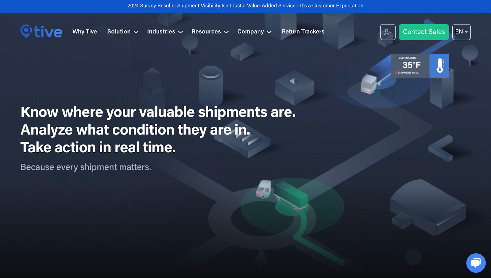
- Responsive layouts. Responsive web design adapts your website to fit any device’s screen size. Unlike mobile optimization, which creates a separate mobile site, responsive design maintains a single, SEO-friendly version that automatically adjusts to fit various screen sizes. A well-designed responsive website, like Tive’s, will reorganize its content and images to fit a smartphone screen, improving navigability and interactivity without constant zooming or scrolling.

- Cross-browser compatibility. Test your website on multiple browsers to ensure compatibility. This involves testing and tweaking your site to work equally well on Chrome, Firefox, and other browsers so you can prevent issues where some features behave differently on specific platforms.
8. Connect customers with humans
Bots powered by artificial intelligence (AI) — especially those equipped with conversational capabilities and natural language processing (NLP) capabilities — are highly effective website tools. They can engage with site visitors, automate responses, and provide customer support. But this technology isn’t a substitute for human interaction.
While bots excel in handling routine queries, they fall short in understanding complex customer needs and emotions. AI personalization can enhance UX by providing tailored recommendations and responses based on users’ behavioral data, but they lack the genuine empathy and adaptability that human interactions bring.
For example, a bot can efficiently handle initial inquiries and guide users through common issues. But when a situation becomes complex or emotionally charged, connecting with a human representative ensures that customers receive the nuanced understanding and personalized assistance they need.
As such, striking a balance between AI efficiency and the empathetic touch of human intervention is essential. Bots can efficiently manage routine questions, freeing human resources to handle more personal and sensitive situations where empathy is invaluable. This balanced approach enhances the UX by ensuring every person feels valued and supported throughout their journey on your site.
Kick-start your UX redesign with Webflow
Following these steps not only helps you understand your audience’s behaviors and preferences but also lets you optimize your UX to serve them better. By strategically aligning your design choices with these insights, you create an experience that fosters lasting connections with your users.
Dive into your UX redesign with Webflow Enterprise, a visual development platform that helps you build and maintain fast, reliable websites that grow to meet your business’s ever-evolving needs.

Build with Webflow
Webflow Enterprise gives your teams the power to build, ship, and manage sites collaboratively at scale.