Great marketing agency websites have the power to build trust, showcase expertise, and act as a stellar lead-generation tool.
For many potential clients, your site is their first impression of your digital agency’s capabilities. Before they see your portfolio or speak to your team, they’re judging your creativity, skill set, and expertise based on your website.
A well-made website shows that you understand design and strategy beyond buzzwords — and that you can deliver the same for others. Read on to learn what attracts clients and find inspiration from the best marketing agency website examples.
What makes a good digital marketing agency website?
A digital marketing agency website should showcase your creativity and convert visitors into clients. While every creative agency will (and should) approach it differently, here are a few common elements of successful websites:
- Striking, on-brand website design. Your site should reflect the creative quality you deliver. If creative web design is part of your services, your website is proof of concept. Bold animations, legible layouts, and intuitive navigation show you understand what a client might want and that you’re capable of delivering it.
- Services and offerings. Visitors should understand your specialties within seconds of landing on your site. With smart marketing web design, you can highlight your main services on the homepage, with more details on dedicated service pages. This clarity helps clients quickly match their needs to your solutions.
- Proof of results. Case studies, portfolios, and testimonials demonstrate how you’ve helped clients succeed better than just stating the facts. Highlight quantifiable outcomes where possible, and use visuals like charts, graphs, and award badges for people skimming. You can also use behind-the-scenes footage of past campaigns to share your creative process.
- About us and team profiles. About pages introduce your agency’s story and mission statement. And adding team bios and photos reveals the human side of your agency, helping potential clients feel more connected to your team.
- Resources and thought leadership. Blogs, newsletters, resource centers, and content hubs establish your team as experts. It shows you’re forward-thinking and knowledgeable about your industry, giving visitors more of a reason to trust you.
- Calls to action. Strategically placed calls to action (CTAs) like “Book a demo” or “Start a project” guide visitors toward the next step. Add consistent, standout CTAs across your site so visitors don’t miss opportunities to convert.
- Contact options. Make it easy for prospects to get in touch. Share your email, phone, or physical address details, and use forms for quotes or proposals. The smoother your contact page is and the fewer clicks it takes to contact you, the more inquiries you’ll likely get.
9 examples of great marketing agency websites
Analyzing how the best agencies design their websites can help you identify what resonates with real-world clients and give you website ideas of your own. Here are nine standout examples of marketing agency websites that create engaging user experiences (UXs) with smart design choices, clever conversion strategies, and unique branding.
1. Hyperflow
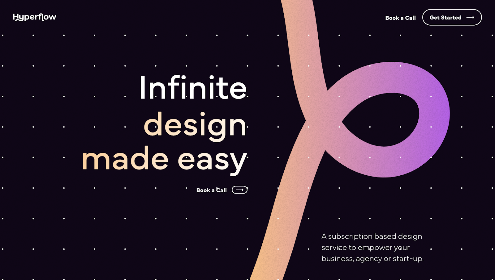
Hyperflow’s website has a front and center animated hero image that rotates through words like “Unlimited,” “Extraordinary,” and “Infinite,” finishing the sentence with “... design made easy.” The looping ribbon graphic leads viewers down the page to streamlined service information, encouraging potential clients to keep scrolling. And the site’s dark mode contrasts well against its light-colored text, improving readability while keeping a popular modern aesthetic.
All the information a potential client needs is available on Hyperflow’s homepage. CTAs like “Book a Call” and “Get Started” appear in the header, so you see them as soon as you land. There are pricing tiers with monthly and quarterly plans, recent work previews in the middle of the page, and an FAQ in the footer. This essential information at a glance shows proof of work and encourages clients to contact the agency.
2. Gitwit
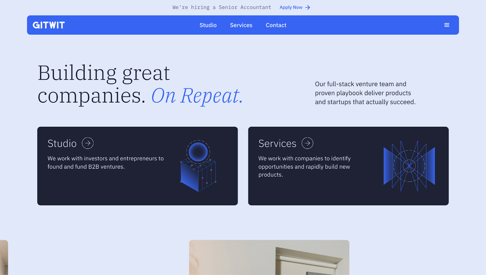
Gitwit’s homepage opens with a short and witty statement: “Building great companies. On Repeat.” The copy, paired with their site’s blue-heavy color scheme, immediately gives you an idea of Gitwit’s brand identity — professional but down-to-earth, with a focus on tech.
Across the page, vivid images with minimal text let visuals lead. Viewers can get lost in text-heavy websites, so image-forward design helps Gitwit hold potential clients’ attention. Gitwit displays multiple case study CTAs, a newsletter signup, and other resources regarding workshops and tools to foster conversions and build trust with potential customers.
3. Graphite
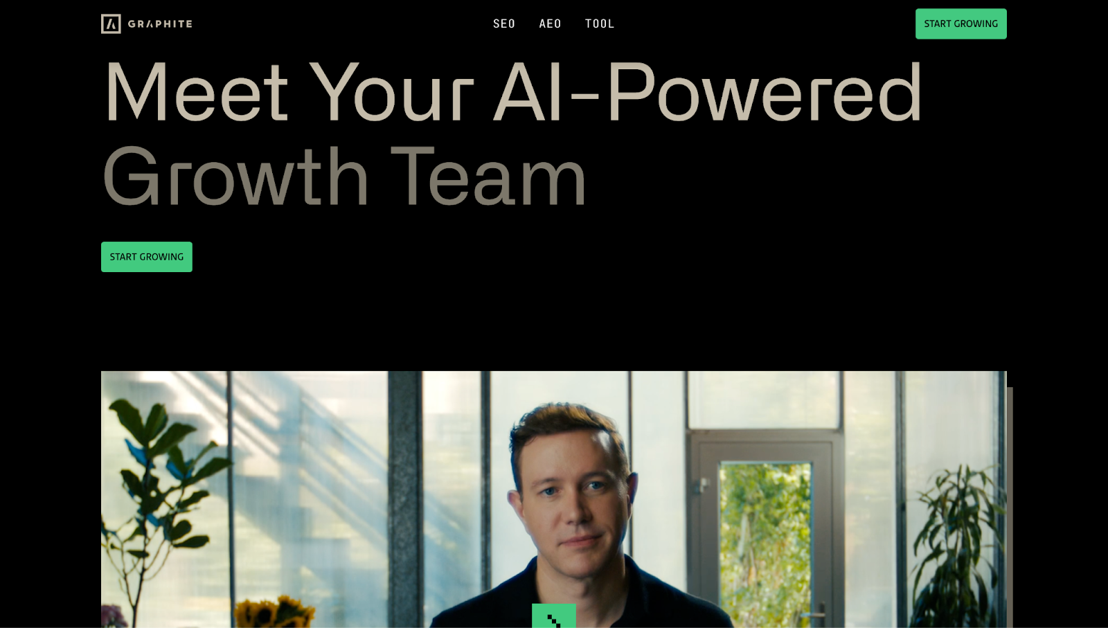
Graphite’s website greets you with “Meet Your AI-Powered Growth Team” for a friendly virtual handshake as soon as you land on the page. The layout is modern and minimal, with a dark background and green accents leading viewers from one important piece of information to the next and making text easy to read.
Graphic data and simple messages like “We like charts” break up sections to make content modular and complex information more digestible. Plus, the graphs provide real search engine optimization (SEO) visit data from clients before and during their work with Graphite to visually explain how Graphite helps companies grow their performance over time.
4. Widehue

Widehue’s website opens with a full-screen looping video of their projects, immediately showing proof of their work. Text seems to be the dominant element, but hovering over the words reveals hover-triggered bubbles with more work and CTA phrases like “See more” and “Brief us,” indicating which actions potential clients can take. The flagship projects sit within their own generous white space with images, while other projects in their portfolio are presented in a text-based list.
To drive the agency’s value home, Widehue shows how they’re a premium design solution by listing various awards, recognition, and clientele with testimonials from some of the client companies’ executives. After presenting their best work and selling the pitch, when potential clients are convinced, several pricing tiers sit at the bottom of their design consulting website.


Launch with Webflow Templates
Choose from hundreds of professionally designed website templates for any industry or style. Customize visually, launch instantly — no coding required.
5. 3WH

3WH’s design team packs most things a client needs to know into their website’s header, so important facts about their marketing agency are front and center. The introduction emphasizes words underlined in bright blue on the site’s black background, like “demand,” “leads,” and “sell,” followed by a blue “Get started” CTA button. This way, potential clients know exactly how to take the next step.
However, the most eye-catching element on this page is 3WH’s world map infographic. At a glance, it shows their global appeal as a creative agency, with pie charts and graphs quantifying their impact around the world. To further this, a “How we are different” section details their specific services, and toward the bottom of the page, you’ll find case studies from real projects with testimonials from several clients serving as social proof.
6. Buff Motion

Buff Motion’s website opens with the statement, “We’re a motion-first creative studio for brands and agencies.” It’s immediately apparent what the design agency does, and designer Ben Hammond follows it up with a header full of short videos showing Buff Motion’s work in action.
Subtle interactions between the text and visuals give Buff Motion’s website motion and energy, mirroring Buff Motion’s “motion-first” brand philosophy. As viewers scroll, the site differentiates major sections with alternating light and dark backgrounds, which holds attention and makes CTAs highly visible, especially when they’re repeated in strategic spots like the footer.
7. Bindery
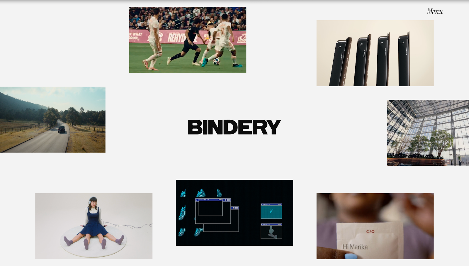
Bindery’s website, designed by RNR Creative Studio, opens with seven miniature proof-of-concept videos circled around the header, effectively telling a story while expressing their offering. With powerful quotes describing Bindery’s brand mission and high-quality animated buttons and video clips, the site is a gallery of projects that lets the work do the talking.
Even with all of those moving elements, the layout isn’t overwhelming. The thumbnails in the featured work section are spaced out with minimal clutter, so each project has its own space to shine. Further down, the studio services section appears in a bulleted list that’s easy to glance at and still understand.
At the bottom, a grid of client logos shows Bindery’s portfolio of satisfied customers, positioning the company as not only a production studio, but also a creative partner that helps companies tell their best stories.
8. Example

Example’s marketing website starts with a brief description of their branding in bold typography — “An earned-led culture agency” — paired with imagery representing their work across the travel, entertainment, and consumer brand industries. It immediately shows exactly what Example does, as well as their contemporary and trend-setting approach, while the distinct service sectors further down the page clarify what clients they support and how.
Between project thumbnails, Example focuses their portfolio on their roster of clients. Statements like “We help [company] create moments” and “... amplify experiences for [company]” act as placeholders, where company names dynamically flip through to show Example’s range of past clients. While there aren’t many details on their clients’ success, the volume and quality of samples is enough to impress.
9. Truus
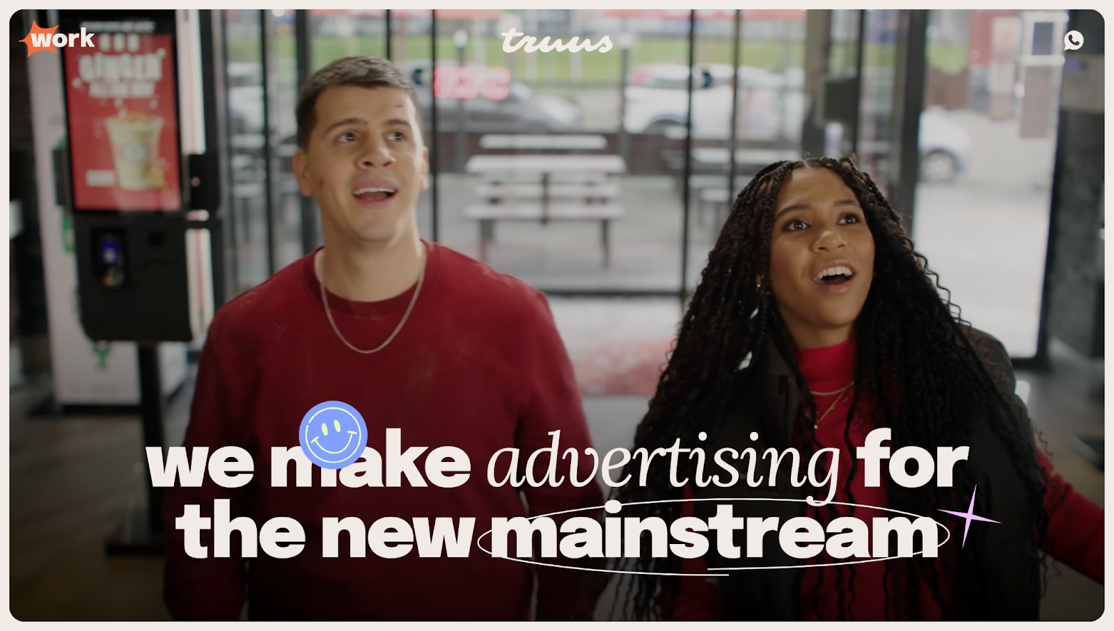
Truus’ website, designed by Dennis Snellenberg, brings out the agency’s playful personality with punchy animations and visuals. To showcase their strengths as an advertising and marketing agency focused on video content, Truus’ website begins with clips from actual ads and behind-the-scenes footage. This smart choice to share both their creative process and results means clients can immediately identify if Truus’ style will align with their needs.
By positioning themselves as “an agency built for the future from TV to TikTok,” Truus’ messaging and copy emphasizes the demographic range of their clientele. And the entire site is dynamic — hover-triggered graphics, moving copy, and UX and user interface (UI) cards encourage you to get in touch.
Launch your digital marketing agency website with Webflow
Whether you’re launching a website for a new agency or updating your existing website, the best sites attract clients using thoughtful design that shows rather than tells. Demonstrate your team’s marketing skills in practice with things like visual representations of your mission, concise text that gets the point across quickly, and strategic conversion elements to turn visitors into clients.
With Webflow, you can build a digital marketing agency website that perfectly represents your brand from scratch or by using readymade, cloneable templates. Get your website in front of new eyes with Webflow’s built-in SEO tools, and capture visitors’ attention with responsive design. Host your site directly on our platform to prevent hiccups and get new leads as soon as possible.
Build your marketing agency website with Webflow.
Build websites that get results.
Build visually, publish instantly, and scale safely and quickly — without writing a line of code. All with Webflow's website experience platform.