A well-designed consultant website is like an online business card.
Customers seek consultants to guide them on the right path and grow their businesses. Whether you're an independent consultant, a small business, or a full-fledged agency, an effective consulting website is one of the best ways to attract new clients. It provides quick links and forms for contacting you, allowing you to close the deal.
Read on to discover the essential elements of a consulting website. Plus, explore consulting website examples to kick-start your next project.
What makes a good consulting website?
An effective consulting website emphasizes your brand's unique value to attract potential clients. Here are the key web design elements you can add to underline those services and make your site stand out:
- Value propositions tell visitors what services your company offers and how you can solve specific problems, giving them a reason to stay and explore your site.
- Professional, modern designs and logical hierarchies improve navigation and present information in an easily digestible layout.
- Real-world results such as case studies, client testimonials, and industry insights tell potential customers about your company’s success and give them confidence in your problem-solving abilities.
- Contact details like forms and scheduling options conveniently allow potential clients to reach out. If you’d like to offer round-the-clock customer support, add a chatbot to your website.
- Mobile-friendly, responsive websites have a consistent look and performance across multiple screen sizes for a smooth user experience. Sites that have a slow load time lose over 40% of visitors who will abandon if a page takes longer than 3 seconds to load, especially on mobile — costly for consulting firms relying on lead generation.
- Search engine optimization helps your consultant website rank higher in search results, making it easier for potential clients to find you.
- Branding elements like consistent color schemes, logos, and fonts create a memorable, cohesive appearance that reinforces your company's brand identity. This design strategy can improve brand recognition and recall, helping you stand out against competitors. Plus, these design elements make your site feel professional and trustworthy.
- Calls to action (CTAs) such as "Book a consultation" or "Get a free quote!" encourage visitors to sign up for services. Conversion-optimized CTAs should be compelling, action-oriented, and easy to spot across your website. A redesign that improves clarity, adds strong CTAs, and optimizes mobile responsiveness has been shown to increase lead generation by 25% or more in consulting-style/business service websites.


The marketer’s website
Our free ebook exclusively for marketers. Discover how no-code eliminates developer bottlenecks and empowers modern marketing teams to truly own the website.
7 best consulting website examples to inspire your next design
Here are seven examples from multiple industries that combine functionality, marketing techniques, and modern website designs for consultancies.
1. Ladder
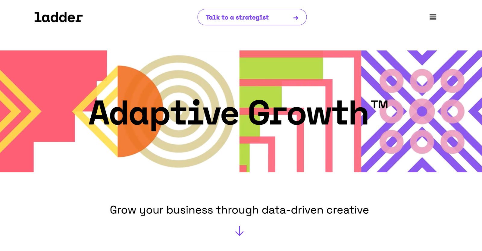
Ladder is a marketing consultancy firm that emphasizes creativity alongside data-driven decision-making. Their website opens with a clean white background and a main header that reads, “Adaptive Growth.” Four colorful, dynamic shapes appear behind this phrase, reflecting the header’s theme of transformation, as these shapes continuously move and change.
Scrolling down reveals an interactive headline that cycles through a few variations to catch site visitors’ attention. It reads, “How adaptive is your marketing…” and dynamically fills in with the words “team,” “strategy,” and “creative.” This engaging feature shows visitors that Ladder takes a comprehensive approach, tackling all aspects of a business’s improvement strategy.
Below this feature is a list of prominent previous clients, including Facebook, Nestlé, and Booking.com. Ladder's relationship with these major companies enhances their credibility and trustworthiness.
The rest of the page highlights key priorities for Ladder’s consultants, such as retention, conversion, and traffic. Emphasizing specific metrics is a compelling sales tactic, as potential clients will see they can expect measurable results by collaborating with Ladder.
2. June15 Consulting
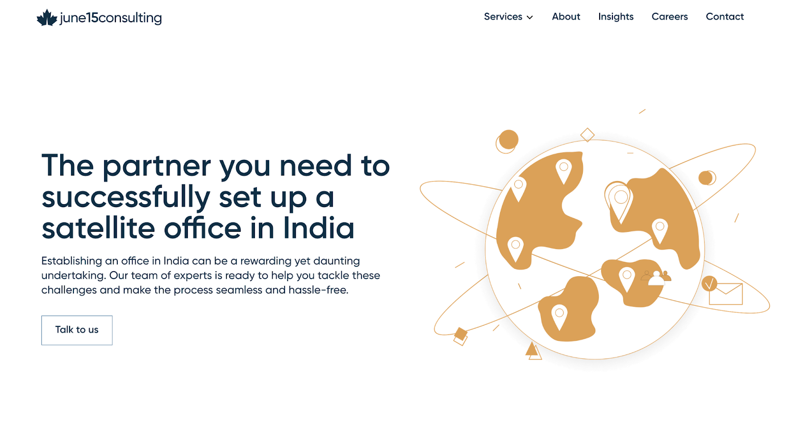
June15 Consulting is a Canadian firm that specializes in helping organizations establish satellite offices in India, and BTB Studio designed their website. The homepage prominently features an illustration of a globe adorned with location pins, immediately conveying the firm’s global reach.
Several phrases on the homepage suggest that working with June15 will provide a customized, luxury experience, such as “bespoke services” and “white-glove approach.” The design echoes this sentiment with a minimalist layout and a gold-and-white color palette.
The next section features eight boxes describing the company’s services, and clicking on each leads to a landing page that provides more detail. With this layout, potential clients can quickly scan for the solutions they need and then dive into the specifics to see if June15 is the right fit.
The site also highlights its main value propositions through a four-step process:
- Objective Evaluation
- Tailored Strategy
- Expert Execution
- Ongoing Assistance
This structure underscores June15’s commitment to thorough service at every stage. By clearly outlining their process, June15 helps readers understand what to expect, reinforcing clients’ confidence in partnering with the consultancy.
3. Over J Consulting
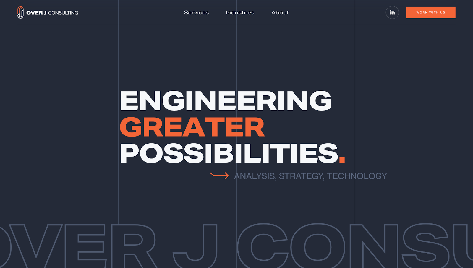
Over J Consulting's website, created by Neil Deramchi, has a consistent color scheme, with orange accentuating the primary navy-white combination. This color scheme reinforces the company's visual identity. The dark background also helps the lighter elements stand out.
The homepage's bold text, "Engineering Greater Possibilities," immediately grabs readers’ attention and emphasizes the company’s foundation in engineering. To support this foundation, an arrow points toward "Analysis, Strategy, Technology" — a nod to the firm's approach to business consulting.
High-quality images support the text, including logos of past clients and satisfied customers. Toward the bottom, an "Our Team is Your Team" header tells potential customers that Over J Consulting takes a collaborative approach to finding business solutions.
4. Empathy Consulting
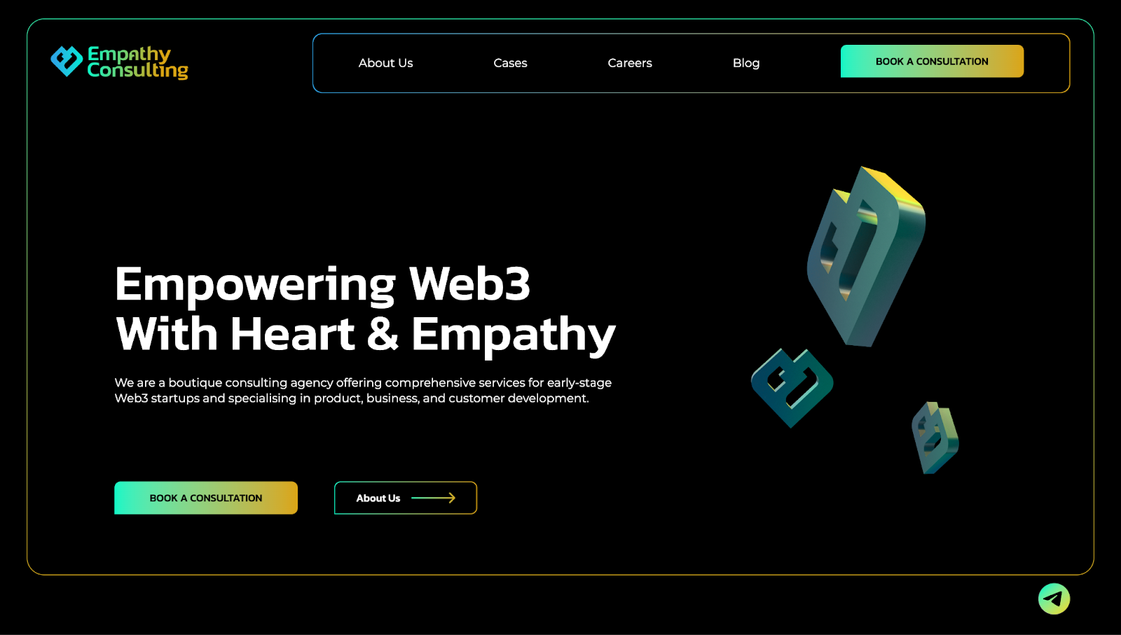
Empathy Consulting specializes in Web3 startups, and Dmitry Frolov gave their website a futuristic design to match this focus. For example, Dmitry used gradients and floating 3D elements to add depth to the landing page. He also combined a black background with bold typography to improve readability and a block-style layout for quick navigation.
Empathy Consulting’s pages create a digital identity that successfully conveys their credibility and user-centric offerings. Readers can explore the brand’s expertise in multiple areas, such as NFTs and crypto wallets, and learn more about past clientele. The brand pairs its blockchain innovations with humanizing messaging, such as "People First. Web3 Next," to connect with readers on a personal level.
5. My Prosperity Tree
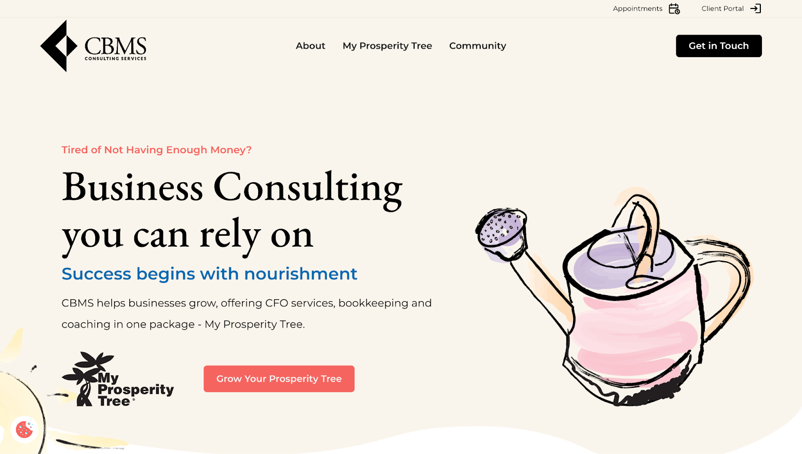
My Prosperity Tree's website uses a thoughtful metaphor to explain the value of their consulting services. In addition to the bold heading "Success begins with nourishment," the site features a dynamic illustration of a watering can sprinkling a plant to represent how the company's services can help businesses grow.
Brian Punger added consistent visuals of "nourishment" and "roots" to reinforce the idea that the consultancy’s services provide a foundation for long-term success. The scroll-triggered animations, emotional appeal, and hand-drawn elements create a personal and trustworthy atmosphere, making complex business processes feel approachable.
A dedicated section for certification badges adds credibility, and clear CTAs make it easy for potential clients to reach out. To encourage even further interaction with the brand, the site features links to "The My Prosperity Tree Show," a free podcast about business and consultancy-related topics.
6. Product Rocket Consulting
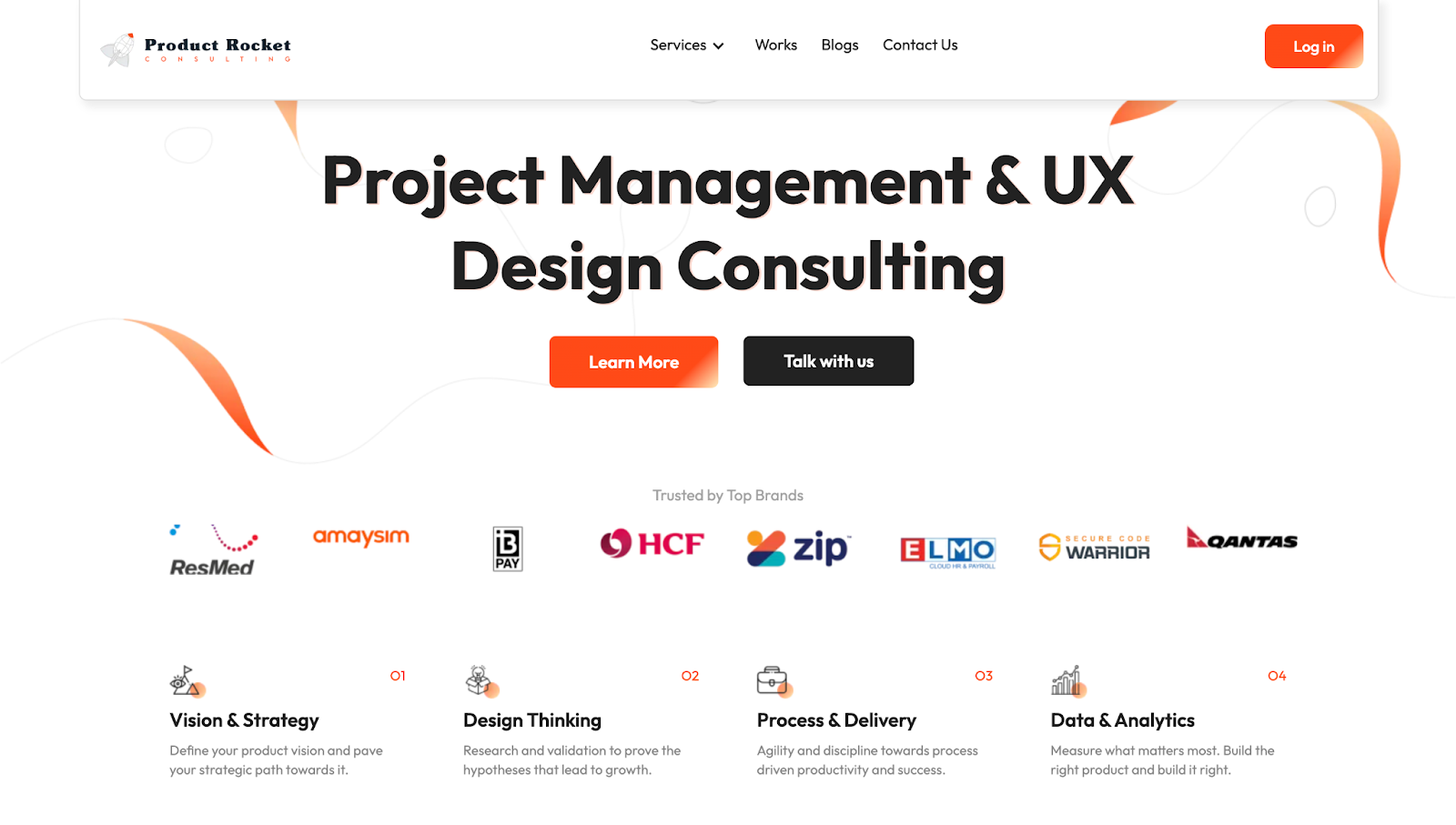
Product Rocket’s website exemplifies how aesthetics can drive user engagement. Australian marketing agency Locally designed the page using an orange, black, and white color combination. The orange accents in buttons and hover states add energy and urgency, encouraging you to explore or take action.
In addition to the aesthetic, the site is functional and provides visual feedback to user input. For example, hover effects and rising elements grab your attention as you scroll, telling you which block or CTA button your cursor is on.
But the brand’s website isn’t exclusively focused on good looks. To add credibility to Product Rocket's expertise, client testimonials, case studies, and blog posts have dedicated sections strategically placed to support their value props. By blending eye-catching designs with proven expertise, Product Rocket positions themselves as a confident leader in marketing solutions.
7. Feature Avenue
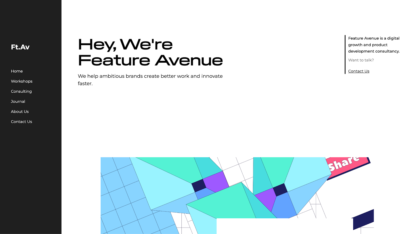
Feature Avenue's website stands out with an unconventional layout. The menu is on the left rather than the top and remains static, while the content on the right changes depending on the page you're on. The structure captures attention, looks modern, and shows creativity — three traits of an effective, forward-thinking consulting agency.
As another unique user interface element, The No Code Shop included a yellow progress bar at the bottom of the page so you know where you are within the site. This element adds a pop of color that matches other design elements on the page.
Bold typography, interactive thumbnails, and a minimalist design communicate the brand’s consultancy services. Dedicated web pages help visitors learn more about the company’s services without distractions. This format ensures visitors can quickly absorb information and understand the value of the company's offerings.
Captivate and close clients with Webflow
A consultancy website is crucial for expanding your business, from generating leads to converting them. With the right design tools, you can scale your company or independent consultant website to reflect your value and attract more clientele.
Webflow's visual design environment allows you to build stunning websites without relying on developers, giving you complete control over your brand's online presence. With our platform, you can build with real content, construct responsive pages, and create customized layouts. These features will help you launch engaging, interactive websites that showcase your expertise as a consultant.
Start building with Webflow today.

Get started for free
Create custom, scalable websites — without writing code. Start building in Webflow.


