


The best responsive web design techniques use different screen sizes to their advantage.
Responsive web design means your pixel-perfect layout appears as you intended for every person who checks out your site. A responsive website adapts to different viewport sizes to ensure every visitor gets a consistent user experience, whether they’re on a desktop or a mobile device like a smartphone or tablet.
This article provides a list of the best responsive websites to draw inspiration from. You’ll also learn how responsive design works and find some best practices to use as you implement it.
What are the responsive web design basics?
Responsive website designs are versatile — they shift with different screen sizes so every user can access the information they need in a seamless experience. There are several ways to apply this style, like flexible grids that reorganize layouts responsively and media queries that serve a curated version of the site based on the user’s screen size.
Responsive design is different from adaptive design, despite both improving the user experience across devices. Adaptive design uses multiple fixed layouts tailored to specific screen sizes for more control over each experience. Responsive web design uses one primary layout that adjusts to fit any space — even ones you haven’t accounted for — for a more flexible site better suited to new advances in technology as they come.
Which method is right for you depends on how complex your layouts are. Using a website builder like Webflow that offers built-in website responsiveness tools can help you determine the best approach.
Key responsive web design terms
All of the web’s most responsive examples use the same design elements to create their distinctive functionality. Here are the most important responsive design terms to know:
- Flexible grids, often called flexboxes, are CSS grids that automatically reorganize rows and columns to make the best use of available space.
- Viewport refers to the visitor’s screen size. Using CSS, you can size elements relative to the viewport’s dimensions or use it to create breakpoints.
- Breakpoints use CSS media queries to mark layout changes at a specific screen size. For example, you can build more expansive layouts for viewports that are at least 1,024 pixels wide and tighter ones for smaller viewports. The user’s viewport size determines which version they see.
- Max-width is a CSS property that sets an element’s maximum width, typically in a relative unit like a percentage (like “max-width: 30%”). You can also use it to establish breakpoints for different viewport sizes (like “max-width: 479 pixels” for video players).
- Relative units help to size elements compared to the size of something else, like max-width. For example, an image with a max-width of 20% will take up no more than 20% of the container it’s in, regardless of its resolution. Other relative units include rem and em, which scale with font size, and viewport width (vw) and height (vh). This allows features to size themselves appropriately for each viewport.
- Containers are elements that hold other elements, like headings, images, and buttons. Wrappers are a type of container used to style elements within them. For example, a basic container might reserve space in a layout for an image gallery, and a flexbox wrapper nested inside it contains all the actual images that need to be reordered or resized within the larger container.
- Three-dot/hamburger menus are buttons that hide interactions like navigation menus or customization options that would otherwise take up too much screen space.
- Mobile-first is a common perspective in web design that prioritizes the mobile user experience (since over half of all internet traffic comes from mobile devices). Designers who make responsive websites with this approach often start with the mobile layout, then scale it up for desktop viewers.
16 responsive web design examples
To see responsive design in action, resize your browser window as you open each of the following 16 examples. If you want to dig deeper to see how the designers pulled it off, you can open the inspection window (F12 in Chrome, Develop menu in Safari) to inspect the site’s HTML/CSS.
Here are 16 excellent examples of responsive website designs to draw inspiration from.
1. ThreeSixtyEight
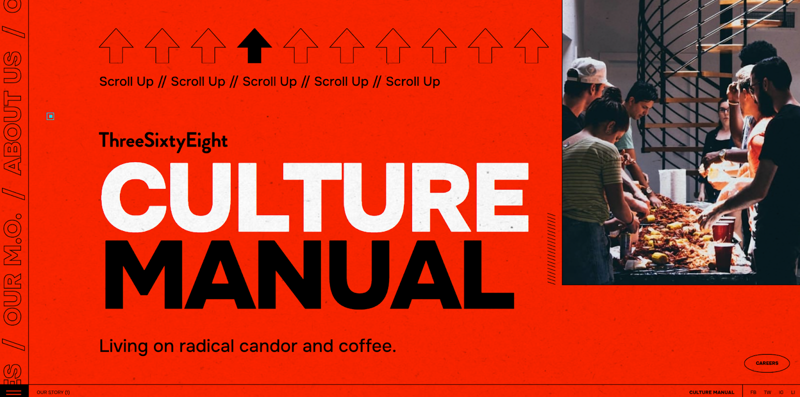
ThreeSixtyEight’s full-sized website features a unique way to move through the portfolio: They reversed the scrolling direction so you have to move up from the homepage. Later, the page includes a gallery that slides diagonally across the screen. These unusual parallax effects and other deliberately unconventional design choices are mirrored in the mobile version but scaled down to fit the narrower space.
Looking at the HTML, ThreeSixtyEight used relative units to achieve this consistency between devices. Every container uses vh units to scale to the viewport height, seamlessly transitioning the layout to a smaller screen size.
2. Plantible Foods

The Plantible Foods site by We Met Before has very little padding to economically use the screen’s whole width. Since phone screens are taller than they are wide, the side-by-side containers are reordered vertically on mobile instead of desktop’s horizontal ordering.
In the CSS for the page, We Met Before built in several media queries to create breakpoints at 992 pixels, 768 pixels, and 479 pixels. These breakpoints align neatly with the transition from desktop to tablet to mobile, ensuring that everything scales appropriately.
3. Fable
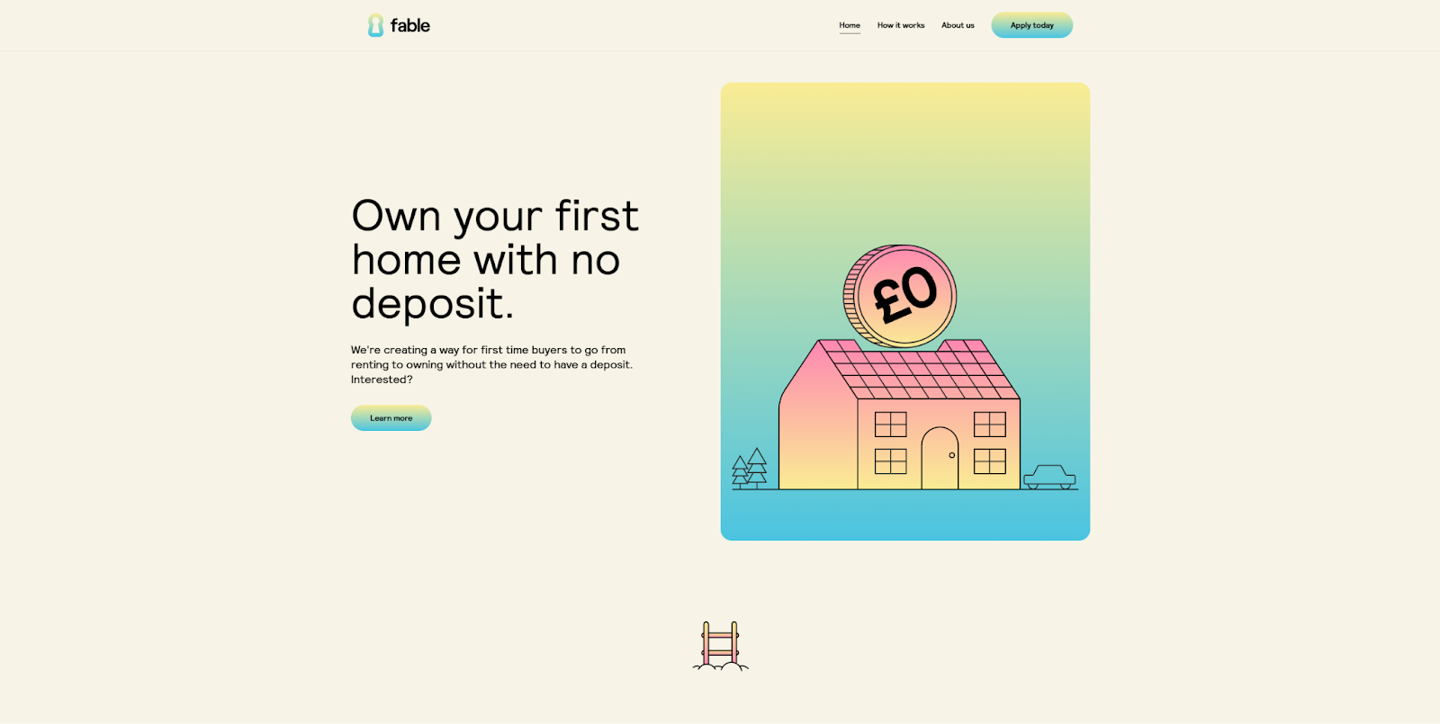
The Fable site by Vimalan Vijayasekaran uses flexboxes to keep the desktop and mobile versions orderly and readable. Containers lay out each section, and flexbox wrappers manage the text and call-to-action (CTA) buttons or images within them.
As the screen size decreases, each flexbox automatically reorganizes its content to make the best use of the available space. That reorganization always happens with the same visual hierarchy: Text goes to the top, followed by interactions, CTAs, and finally images. This keeps the most important content in front of the viewer no matter how they’re looking at the page.
4. Hellofolk
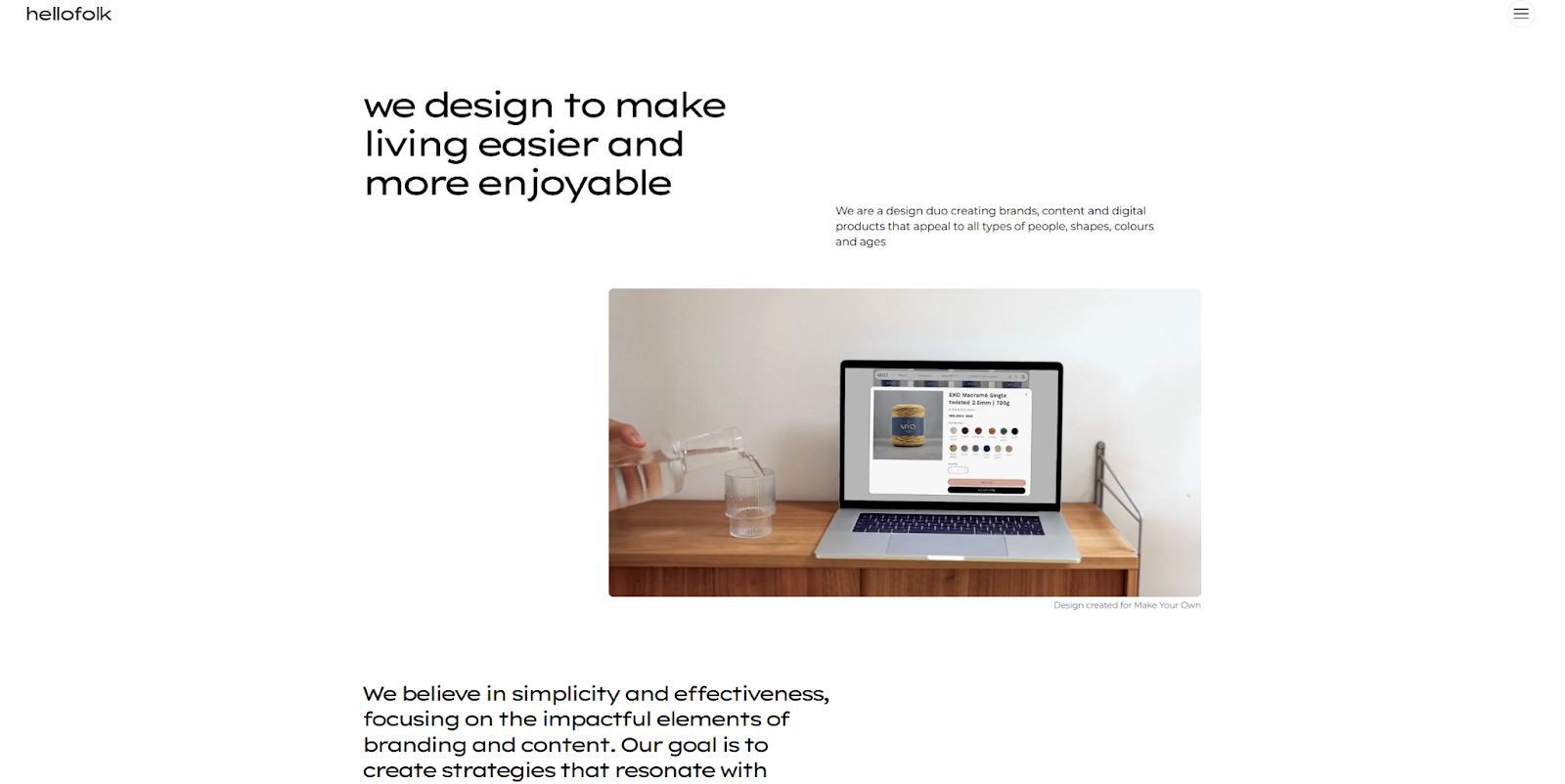
Hellofolk made their website responsive with a light touch. They created breakpoints for desktop, tablet, and mobile screens that only change visuals slightly for the user. Moving from desktop to tablet reduces the amount of padding between images and text. On mobile, everything collapses into a vertical list because the designers used a simplified flexbox property called inline-flex, which lets containers change size in response to the width of the text inside.
To achieve these effects, Hellofolk’s designers assigned padding values in rem units and reduced the number of rems for smaller screens. These elements keep the website easy to read and Hellofolk’s simplicity-focused brand identity clear.
5. Raca Design Studio
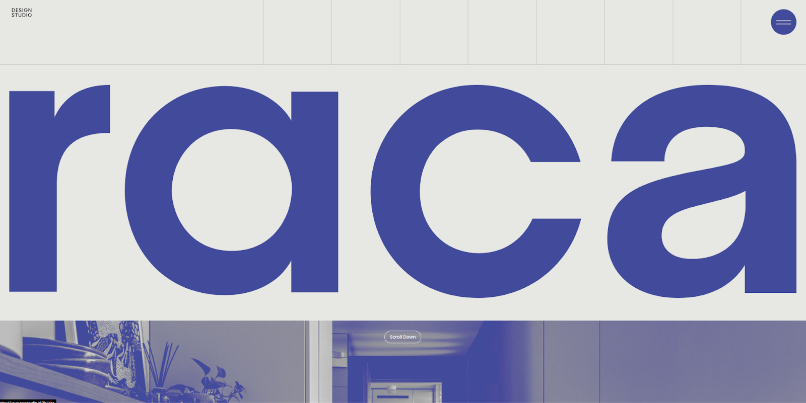
The Raca Design Studio site by Marcin Mikołajczyk uses a minimalist aesthetic, which is the most convenient style to make responsive. That’s because minimalism relies heavily on white space. You can use percentages to indicate how much of that white space each element can take up and scale that portion as needed for different screen sizes.
At larger breakpoints, smaller percentages ensure elements never take up too much of the layout. Meanwhile, on smaller screens, they increase those percentages to allow elements to take up more of the white space. The only exception is the hero section at the top of the homepage, which always takes up the full width of the screen, featuring a big, bold visual that sets the tone for the brand.
6. History of Animation
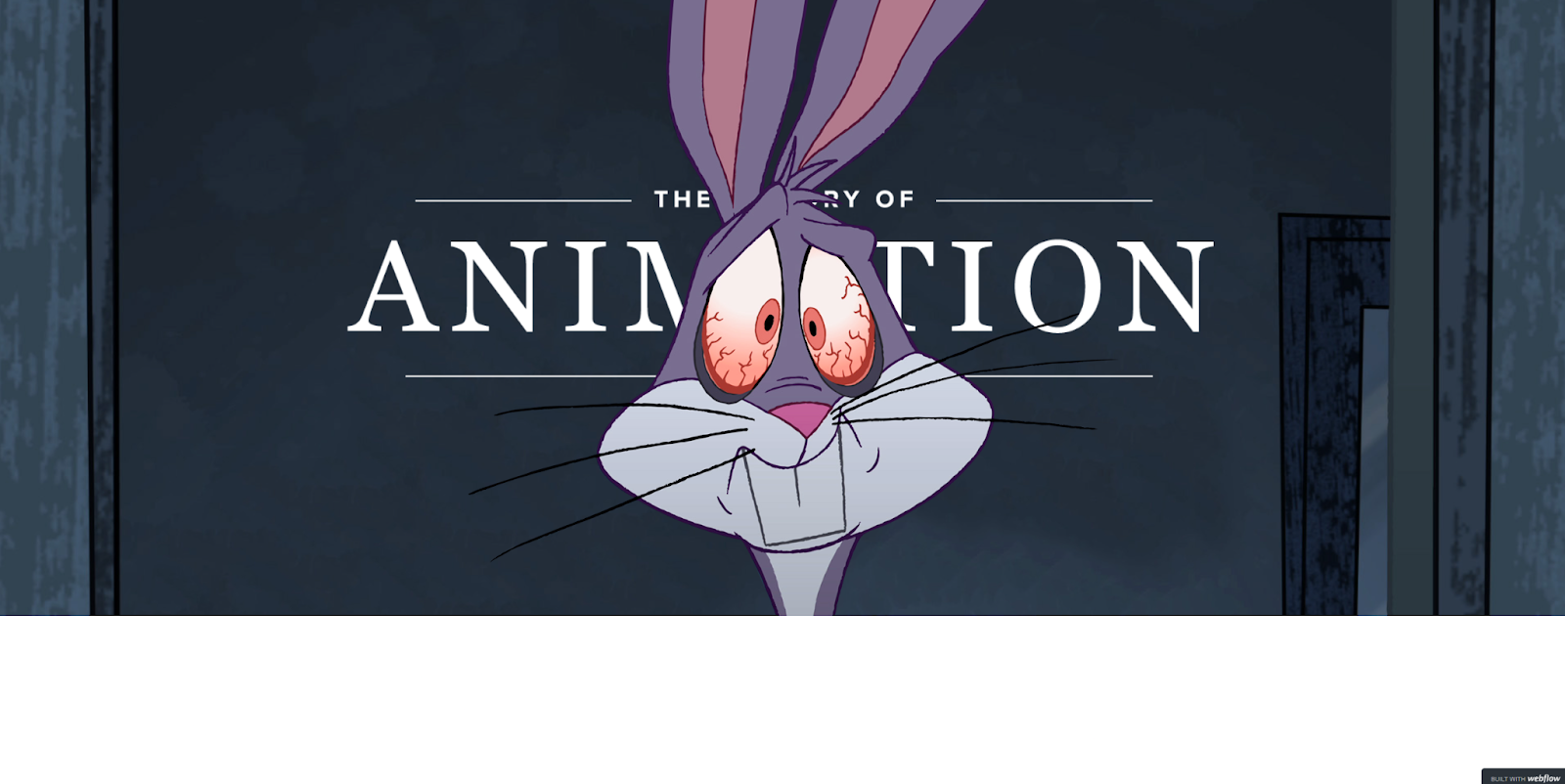
Rather than flexboxes or relative units, Roy Tsue’s History of Animation website uses breakpoints to restyle every CSS class with absolute units. For example, headlines on viewports wider than 479 pixels have a line height of 52 pixels, while viewports under that limit scale down to 40 pixels.
While this method provides more granular control over your responsive design, it can cause some technical issues at certain resolutions. Absolute units like pixels don’t scale like rems or percentages, so the website won’t display correctly on a 4K monitor, where a 40-pixel line height is an infinitesimal portion of the screen, for example. If you use this method on your client websites, you’ll have to create additional breakpoints for these kinds of exceptions.
7. Hello Bello’s State of Parenthood
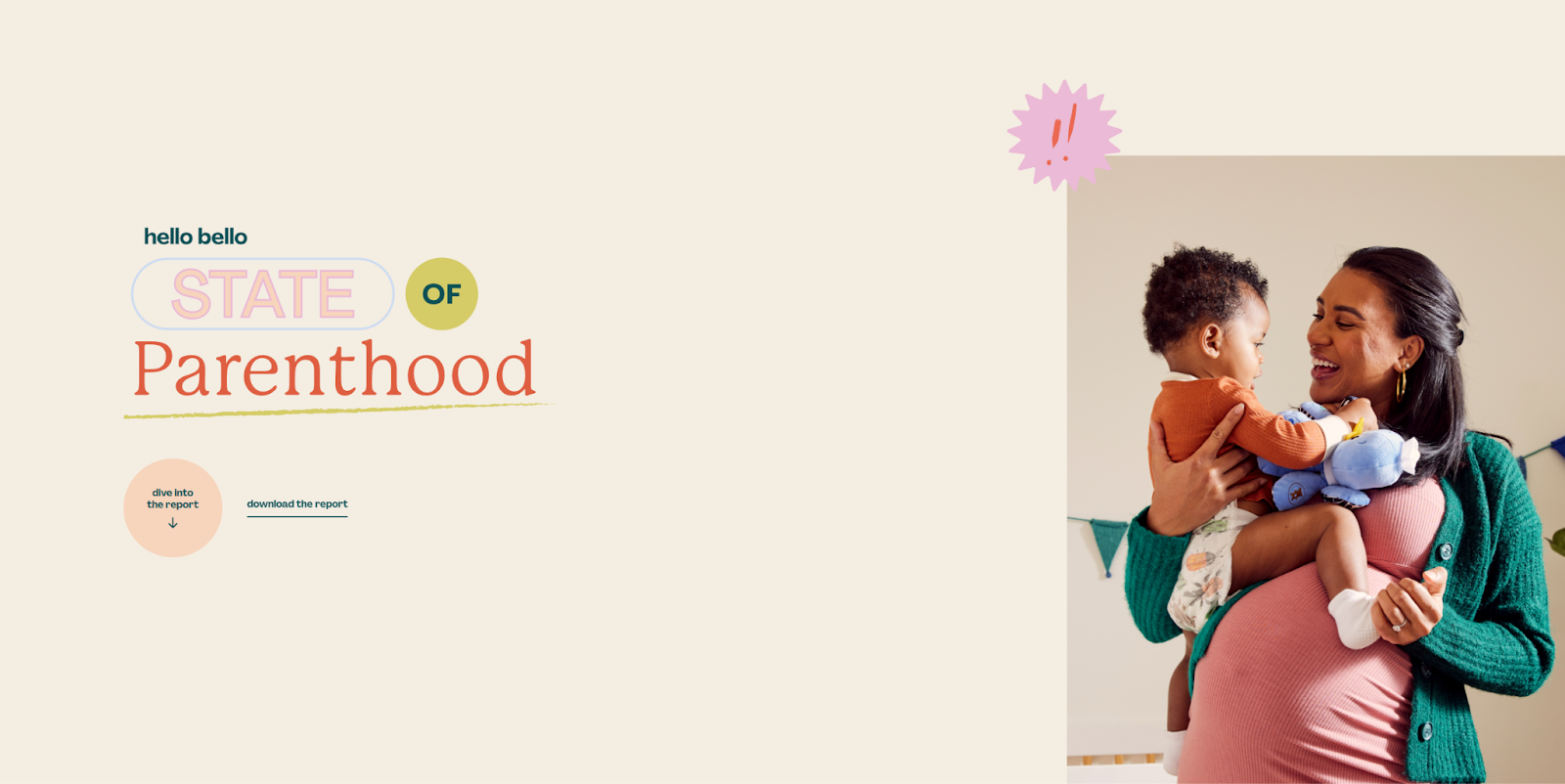
Hello Bello’s State of Parenthood is a responsive one-page website made by the Brains team. Like previous examples, they use relative units and breakpoints, but when viewers visit from a device below the max-width of 767 pixels, the sticky navigation menu on the left turns into a “Jump to a Section” menu at the top of the page.
Behind the scenes, sticky navigation and “Jump to a Section” are actually two separate menus, and moving between breakpoints hides one and reveals the other. Switching navigation methods like this ensures your readers can always conveniently access everything on your site regardless of screen size.


The modern web design process
Discover the processes and tools behind high-performing websites in this free ebook.
8. Brand Appart

Brand Appart’s agency website highlights their flair for animation and quirky visuals. Several scripts run on the page. On mobile devices, their cursor-sensitive scripts become touch sensitive, and the navigation bar collapses into a hamburger menu. Otherwise, the vertically aligned layout stays much the same.
With all the animations and scripts running on this website, load times are a chief concern. If you plan to get this complex with your device-responsive scripts, add a loading screen to give them time to initialize, and use lazy-loading images to improve load times.
9. Lando Norris

Built by OFF+BRAND, Lando Norris’ awwwards-winning website features several animations and interactions, but it starts with a brief loading screen to give everything the chance to load so viewers don’t face lags. Animations, galleries, and lists on this site scale up with screen size, becoming less condensed and more interactive.
OFF+BRAND also added a notification instructing mobile device users to turn their devices vertically because you can’t navigate the website in a landscape orientation. It’s a unique limitation, but one that works well with the vertical layout and its carefully designed interactions. It’s a great reminder that you can put some guardrails up in your design, as long as doing so ensures the user has the best experience.
10. Parable

Diego Toda de Oliveira streamlined Parable’s website responsiveness during the design process. They neatly ordered all the text and foreground images with flexboxes that take up a generous portion of the screen on mobile and adapted font sizes to keep text readable. Aside from a few smaller layout shifts and adding a hamburger menu for navigation on mobile, the experience is the same across devices. That’s one benefit of keeping your designs simple: There’s less to account for on different screen sizes.
11. Eagle’s Nest
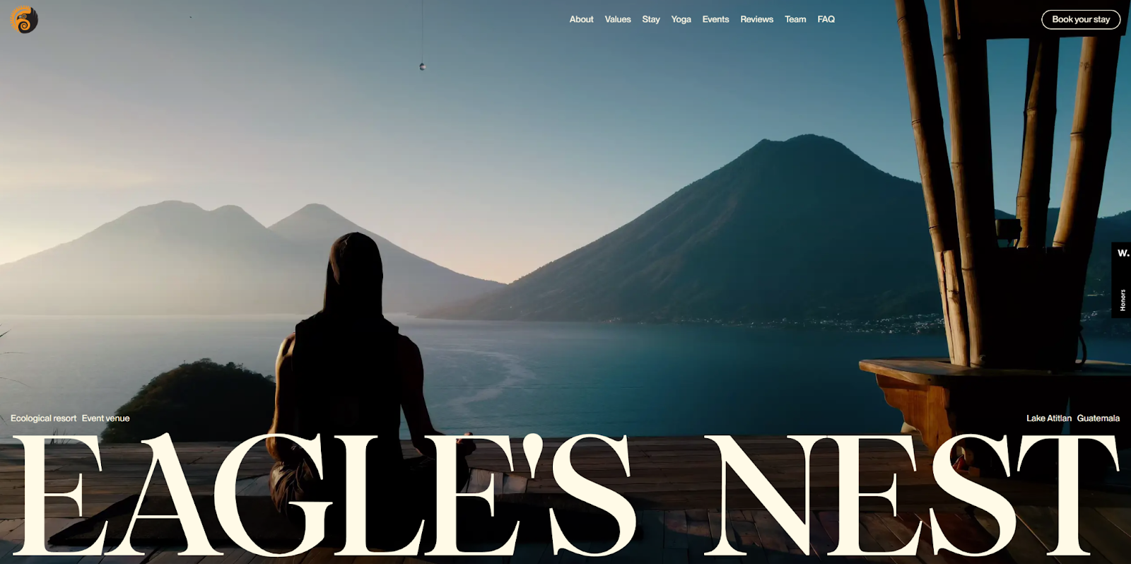
The Eagle’s Nest responsive website by Serge Syutkin relies heavily on full-screen visuals and scroll-sensitive animations. Every scroll summons another impressive visual or thoughtful quote, which all move at a relaxed, readable pace. This calm flow of visuals and text conveys the peaceful vibe this site is after, tying the subject matter to the design. It can serve as an excellent template if you’re looking to create a similar experience.
12. DeepJudge

The DeepJudge website uses adaptive design strategies to make significant changes on smaller screens. While the desktop version features several animated visuals with some light interaction, like black lines that turn orange when you hover over them, the mobile version replaces those visuals with static images. That way, smaller, less powerful devices have less to load.
For a more responsive website-friendly approach, consider hiding animations at a specific breakpoint or removing them entirely.
13. Quin

The designers behind Quin’s website used a lot of horizontal space in their layout, and the portrait orientation could make it harder to transition the website to a mobile screen. The tabs of the first visual wouldn’t be viewable on mobile without responsive design, for example. The designers smartly solved this problem using timers that automatically transition through these tabs across devices. You can further enhance this strategy in your designs by adding buttons so viewers can manually navigate through tabs at their own pace.
14. Hurt Feelings

The Hurt Feelings website has generous vertical margins on large screens to frame and center their creative visuals. On mobile, the designers removed those margins to take advantage of smaller screens. Instead, flexboxes vertically reorder elements. The page’s typography is unusual, so font size is the last thing to shrink to keep the page readable. If you use text and fonts in inventive ways on your websites, consider putting text at the end of the visual hierarchy.
15. Wispr Flow

The Wispr Flow website relies heavily on swirling animations that depict “flowing” text, a central theme of their brand. To keep those visuals present in their responsive designs, each page is relatively short. That way, the animations all move smoothly while page load times stay low.
If animations are similarly crucial to your client’s brand, consider creating a larger number of small pages and a sticky navigation menu to make transitioning between them faster.
16. Adnaut

The Adnaut website by Everything Flow is almost identical across devices. As the screen gets smaller, everything falls into a consistent vertical visual hierarchy: headers, body text, then images. When potential customers come back to Adnaut’s website on a different device, they’ll still know where to find things like Adnaut’s five-step approach interactive graphic, for example, which shrinks into a tabbed menu on mobile.
You can achieve the same effect by always putting elements within a flexbox in the same order. That way, when the website adapts to a smaller screen, everything falls into place predictably.
Responsive web design best practices
To create the best responsive websites for your clients, apply the following takeaways to your web design process:
- Design for diverse devices. Start by creating the mobile experience, then scale it up for desktop users. It’s harder to scale down complex layouts, so starting with mobile means having a well-designed website even on the smallest possible screen.
- Use relative units. Rely on percentages and ems to create layouts that stay consistent within breakpoints. Twenty percent of a screen looks the same whether it’s 600 pixels wide or 760, but 120 pixels does not.
- Set width, not height. Max-width is the smaller dimension you’ll need to consider on mobile devices, so use it in media queries and for resizing containers. Relying on max-height can cut off images on the sides of the screen.
- Change navigation methods. A top navigation menu on desktop and a three-dot or hamburger menu on mobile frees up more space on smaller screens.
- Compress images. Before uploading images, compress and optimize them to reduce file size and improve loading times.
- Prioritize accessibility. Usability heuristics like predictability, error prevention, and user control should vary across device types. For example, scrolling vertically to advance a horizontal gallery might be intuitive on desktop but confusing on mobile, where users might expect to swipe across it.
Build a website that works everywhere
To reach the widest possible audience, your site needs to impress visitors on any screen size, especially now that mobile traffic has overtaken desktop. It takes more time and effort to build a responsive website from scratch, but there are ways to streamline the process, such as using a website builder like Webflow with built-in responsiveness features.
Automatically cascade all of your changes across breakpoints — including padding, font sizes, and image sizes — with Webflow’s responsive website builder. You can even customize your breakpoints to optimize the experience for different device types. These tools and more from Webflow can help you launch your most responsive website yet.

Build websites that get results.
Build visually, publish instantly, and scale safely and quickly — without writing a line of code. All with Webflow's website experience platform.