One website, many screen sizes — without compromising design or functionality.
That's the idea behind responsive web design: building a website that automatically adapts to different screen sizes, from large desktop monitors to smartphones. Instead of creating separate versions for every device, responsive design ensures that one website functions properly across all formats, maintaining performance, usability, and visual consistency.
Responsive web design basics
Your website should look great and work well on every screen, no matter the device. But if your layout is fixed, meaning it stays the same size no matter the screen, it can create problems on both large and small devices. On mobile devices and tablets, visitors may need to zoom in to read text or struggle to tap buttons. On laptops and desktop monitors, content can look stretched, unbalanced, or hard to navigate.
Responsive web design solves these issues by adapting a site’s layout, content, and functionality to fit the user’s screen and device. The result is a consistent, user-friendly experience across desktops, tablets, and phones.
Responsive vs. adaptive design
Responsive and adaptive design both improve the user experience, regardless of the device, but they rely on different approaches.
Responsive design uses a single, fluid layout that resizes and repositions content based on the screen size. It relies on flexible grids and CSS media queries to stretch or shrink elements. Think of it as one layout that flexes to fit any space.
Adaptive design uses multiple fixed layouts tailored to specific screen widths. It detects the device type and adjusts the layout accordingly, switching templates depending on whether you’re on a phone, tablet, or desktop.
While adaptive design gives you more control over how the site appears on different screens, responsive design is typically more flexible, easier to maintain, and better suited for modern web development, especially as new device sizes and screen sizes continue to emerge.
Key responsive web design terms
Below are some of the most important terms to know, organized in the order you’re likely to encounter them while designing, starting with layout fundamentals and moving into styling, sizing, and mobile-friendly techniques:
- Fluid grids define widths using percentages instead of fixed pixels. This allows page elements to scale proportionally with the screen size rather than staying rigid or breaking the layout.
- Flexible images resize within a container to prevent content from overflowing or distorting. They adapt to the available space so designs remain legible on smaller screens.
- Media containers are parent elements — often called wrappers — that hold media like images, videos, and galleries. In responsive design, they're typically styled with max-widths and fluid properties so that media scales correctly within the layout.
- Max-width is a CSS property that sets an element's maximum width. Unlike width, which sets a fixed size, max-width allows elements to shrink on smaller screens while preventing them from stretching too wide on larger ones.
- Rem and em units are relative units that scale with font size — rem from the root element (like html) and em from the font size of the parent element. Designers often use them for spacing, sizing, and typography in responsive layouts.
- Fluid properties use relative units like percentages, viewport width (vw), or em (relative to font size) instead of fixed units like pixels. These values scale automatically based on the screen or container size.
- Relative sizing uses units like percentages, em (relative to the parent’s font size), or rem (relative to the root font size) that adjust based on font or screen size. This makes elements more flexible and better suited to different devices.
- Breakpoints are specific screen widths where the website layout changes. They give you control over how a design responds to different screen sizes. For example, you might use a breakpoint at 768 pixels to switch from a desktop to a tablet layout.
- Media queries are CSS rules that apply styles based on screen characteristics like width, height, and orientation. They power breakpoints and are foundational to responsive web design.
- Viewport is the visible area of a web page on a user's device. Setting the viewport correctly in your HTML lets your layout scale properly across screen sizes.
- Overflow refers to content that extends beyond its container. In responsive design, managing overflow helps avoid layout issues like horizontal scrolling or cut-off elements on smaller screens.
- Fixed sizing uses exact units, like pixels, to define element dimensions. While useful in some contexts, designers typically avoid fixed sizing in responsive design because it doesn't adapt to different screen sizes.
- Mobile-first means designing for the smallest screen first, then progressively adapting the layout for larger screens. That way, mobile users get the best possible experience rather than forcing them to navigate a desktop-first design.
- Hamburger menus are icons — typically three stacked horizontal lines — that toggle navigation menus. They’re especially common on mobile, where they help save space and keep the interface clean on smaller screens.
Responsive web design best practices
A responsive website relies on thoughtful design choices that improve usability, readability, and accessibility, no matter the device. Here's how to make your website responsive by applying best practices to each area.
Design for diverse devices
Users expect a seamless experience no matter how they access your site. A design that doesn't adjust to different screens frustrates visitors, hurts engagement, and even affects your SEO rankings, as search engines prioritize mobile-friendly websites.
Best practices
- Adopt a mobile-first approach by designing for smaller screens first, then scaling up for larger ones.
- Use flexible grids and fluid layouts so content adjusts naturally.
- Set media queries at breakpoints (like 480 pixels, 768 pixels, and 1024 pixels) to optimize layouts for standard device sizes.
- Regularly test your website across different devices and browsers to catch inconsistencies early.
Typography and text
Poorly sized text makes your site difficult to read on smaller devices and less accessible to all audiences. However, well-implemented typography improves legibility and helps visitors absorb every element of your website, leading to a better overall experience.
Best practices
- Use relative units like em and rem for font sizes instead of fixed pixels so text scales fluidly.
- Set a comfortable base font size (usually around 16 pixels for desktop), and adjust it slightly for smaller or larger screens using media queries.
- Maintain proper line height, generally 1.4–1.6 times the font size, to improve legibility.
- Limit line lengths to around 50–75 characters to prevent overwhelming readers with long blocks of text.
Width and height
Width and height settings control the size of elements on a web page. Using flexible width and height values allows elements like images, containers, and sections to adapt smoothly without causing layout issues.
Best practices
- Use percentage-based widths (e.g., width: 90%) instead of fixed pixel values so elements scale with their parent containers.
- Avoid setting fixed heights unless absolutely necessary. Let content determine height naturally to prevent overflow or cut-off issues on different screens.
- Apply max-width properties to images and containers to keep them from stretching too wide on large screens.
Navigation
Navigation is how visitors find information on your website. In responsive design, it refers to menus and links that adjust to different screen sizes while remaining easy to use on all devices. For example, tapping a hamburger icon on a smartphone should reveal a vertical list of navigation links that are easy to read and interact with. If navigation is too small, crowded, or hidden on mobile, users may struggle to find what they need — and when that happens, they’re more likely to leave the site altogether.
Best practices
- Use a full horizontal menu on larger screens, and switch to a hamburger menu or collapsible menu for mobile users.
- Make navigation links easy to tap — aim for a touch target size of at least 44 by 44 pixels.
- Use clear, concise labels for navigation links to reduce confusion and improve scanability.
- Add smooth menu transitions so users can easily tell when the menu opens or closes.
Images
Responsive images scale and adjust based on the screen size and resolution of the user's device. Large, unoptimized images take longer to load and can slow your site’s performance, especially on mobile. In contrast, images that are too small may appear blurry on high-resolution displays like Apple's Super Retina or Samsung's AMOLED screens.
Best practices
- Use flexible images with max-width: 100% and height: auto, so they scale within their containers.
- Compress images before uploading to reduce file size and improve loading speed without sacrificing quality.
- Avoid fixed dimensions that may cause images to stretch or distort on different screens.
Accessibility
Accessibility in responsive design means making your site usable for people of all abilities, including those with visual, auditory, or motor impairments.
A truly responsive website gives more visitors clear paths to navigate and interact with your content. Prioritizing accessibility helps reach a wider audience, meet legal standards in many countries, and improve SEO by increasing engagement and click-through rates.
Best practices
- Use high color contrast between text and backgrounds for better readability.
- Provide descriptive alt text for all images so screen readers can convey visual content to users with vision impairments.
- Ensure interactive elements like buttons and links are accessible via keyboard navigation (tabbing) and screen readers.
- Design navigation menus, forms, and CTAs to be large enough and well-spaced for visitors with limited dexterity.
8 responsive web design examples
From portfolios to information-packed reports, here are eight websites that provide consistent user experiences across different screen types.
1. ThreeSixtyEight
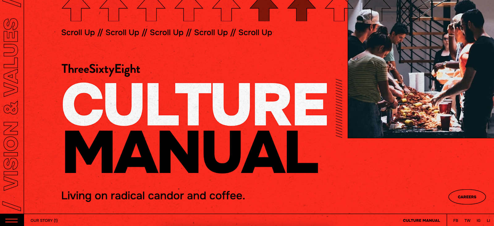
ThreeSixtyEight’s website features a vibrant red background and bold typography. Based on this visual style and the prominent tagline, “Living on radical candor and coffee,” audiences understand that ThreeSixtyEight is an outspoken brand. And this message appears accurately, regardless of screen size.
On desktop, the content spreads out with ample whitespace, while it becomes more vertical and compact to fit a smartphone’s screen. The tablet layout balances the two, providing a comfortable viewing experience across devices.
The typography also adjusts to all screens for readability. Font sizes and spacing automatically increase or decrease, ensuring text legibility on small and large screens. Meanwhile, scroll indicators and interactive prompts are visible and functional across the board, allowing readers to click with a mouse or tap using a finger. Together, these elements improve the user experience (UX) by helping visitors navigate the site.
2. Plantible Foods

Plantible’s homepage (created by We Met Before) has vibrant images and bold logos across devices, reinforcing brand recognition from the outset. The most crucial sections, like “Our Story” and “Applications,” are prominent in all views. And clear navigation labels ensure key messages remain in focus, encouraging people to explore.
While the visual identity stands out, the site doesn’t sacrifice functionality. The layout adjusts on smaller screens to accommodate the lack of space, with the menu button becoming an expandable hamburger menu on smartphones and tablets. Changes like this make the site more accessible without cluttering the screen.
The website also creates a visual hierarchy that draws attention to critical areas of the page. For example, the scrolling ticker at the bottom of the screen reads, “Plantible is a biology company unlocking the power of plants, for the health of people & planet — beginning with food.” This functional design choice gives viewers more information about the company and its goals, encouraging them to explore the whole page.
Discover the processes and tools behind high-performing websites in this free ebook.
3. Fable Homes
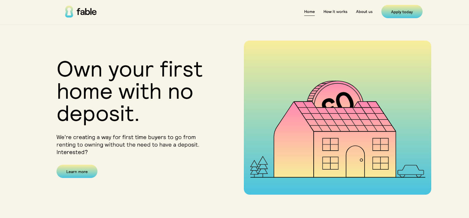
The Fable Homes website, created by Vimalan Vijayasekaran, uses soft pastel colors, two-dimensional visuals, and gradients. These inviting design choices encourage readers to spend more time on the site. To keep visitors engaged, Fable Homes immediately offers a value proposition: “Own your first home with no deposit.”
Action-oriented elements, like the “Learn more” and “Apply today” buttons, appear next to the menu at the top of computer and tablet screens. Placing CTAs at the top of the page catches readers’ attention and encourages them to click.
For smartphones, the menu turns into a collapsible hamburger arrangement to save space without compromising navigation. The CTA sits in the middle of the screen to make it more noticeable, which boosts interaction.
4. Hello Folk
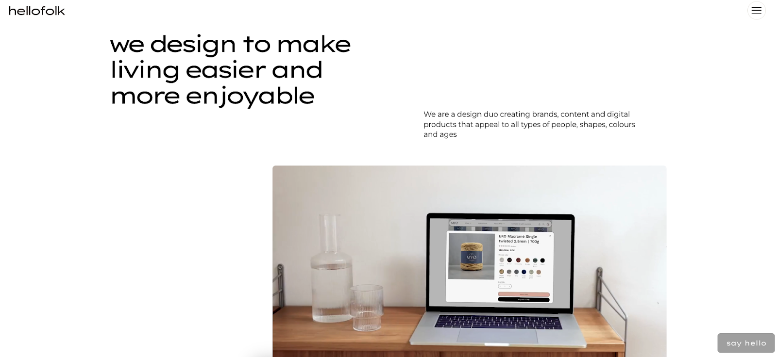
Despite the abundance of text on Hello Folk’s homepage, the agency’s in-house design team created a website with enough whitespace to keep the layout legible and spacious across devices.
Like most other sites on this list, the content has increased spacing between elements on laptops and desktops, with more compactness and verticality to fit smaller screens. The navigation bar also remains a hamburger menu for consistency.
The standout element, however, is the first multimedia that appears on the page: a looping video. Regardless of screen size or device, the video loads quickly, indicating a well-optimized site that doesn’t sacrifice speed or performance.
5. Raca Studio

Raca Studio's minimalist design and indigo overlays immediately fit the business’s style guide. Marcin Mikołajczyk created this responsive website with the bold “raca” and “Design Studio” text prominently appearing across devices, ensuring the company conveys its brand identity loud and clear.
Hovering over each case study removes the indigo overlay and reveals the image’s original colors on a desktop browser, while tapping and holding does the same on tablets and smartphones. Some projects have architectural blueprints instead of pictures, showing how Raca Studio’s designs translate to the real world.
Raca uses other interactive elements as well, such as hovering over the hamburger menu icon in the top-right corner to enlarge the button and make it white. Tapping and holding achieves the same effect on touch-enabled devices. These interactions help users understand exactly where they are on the site, improving usability and encouraging exploration.
With consistent color palettes and gestures, Marcin’s responsive design creates an aesthetically pleasing and functional brand portfolio.
6. Z1 Digital Studio
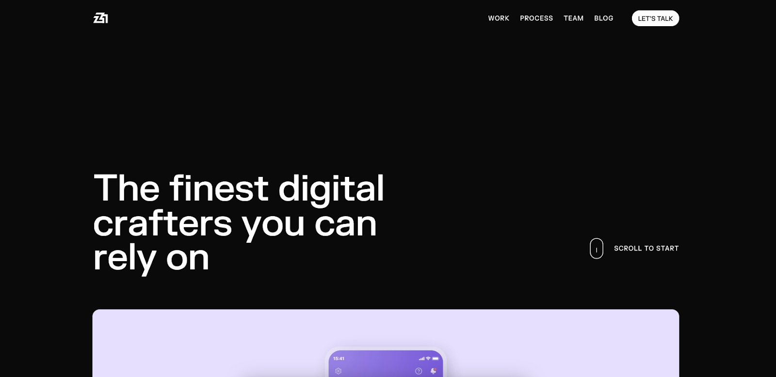
Z1 Digital Studio’s website has a dark theme, bold white typography, and high-contrast visuals. The multimedia behaves the same on all devices: fast-loading and engaging.
As the homepage loads, the text “The best digital studio you can partner with” rearranges itself to become “The finest digital crafters you can rely on.” A video montage of Z1’s prominent clients follows. These well-optimized animations effectively communicate the studio’s messaging and engage viewers.
The “Let’s Talk” CTA button is part of the navbar on the laptop and desktop versions, and it transforms into a dotted square that moves when interacted with. It expands into the full menu on tablets and smartphones. Moving elements like this and the CTA messaging encourage people to interact with the site.
7. History of Animation

The History of Animation website, designed by Hung Vinh, is a scrollable journey through the decades of animation’s evolution. Classic typography and visuals blend with modern parallax effects to create a three-dimensional perspective, regardless of screen size.
Scrolling reveals a hamburger menu in the top-left corner and social media links in the top right, allowing you to navigate to any page or share the site. The page also encourages you to scroll for more information. When navigation features are consistent across devices, it's more straightforward for people to use, no matter how they access it.
With plenty of negative space, Hung uses images, text, and animations across computers and mobiles without congesting the layout. For example, the font size and spacing adjust to ensure users can read the paragraphs on small and large screens.
8. Hello Bello’s State of Parenthood
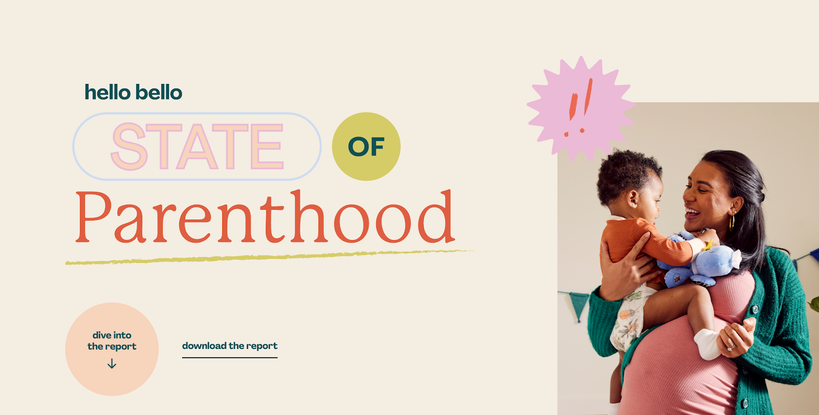
Hello Bello’s State of Parenthood website, created by Brains, highlights challenges for new parents. The creative agency’s brainchild combines a playful, pastel-colored design with versatile typography and line art animations. Each statistic pairs with a visual to make the design engaging and informative across devices.
The landing page banner fills a computer screen and reveals a left-sided panel menu. For smartphones and tablets, the menu adapts to become an expandable “Jump to a Section” bar at the top of the screen for convenient navigation.
Important action-oriented elements, like the “dive into the report” button and “download the report” CTAs, are in the same position across screen sizes. This visibility encourages you to click or tap the report, boosting engagement.
Build a website that works everywhere
A site that doesn’t adapt to different screen sizes leaves potential visitors behind. Building with responsive design principles in mind ensures your content looks great and functions well on any screen, at any time.
With Webflow, you can design one website that adapts to every screen size. Webflow's visual design platform makes it easy to apply responsive design best practices, so you deliver a seamless, accessible experience for every visitor.
Build websites for everyone in Webflow.
Build visually, publish instantly, and scale safely and quickly — without writing a line of code. All with Webflow's website experience platform.


