Maybe you’ve outgrown your website, and it’s holding your team back.
Whether you’re rebranding, shifting your market focus, or updating outdated functionalities, redesigning your website redefines how you interact with your audience. It’s an opportunity to refine your digital operations, boost your digital marketing, streamline processes, and declutter, making your website more user-friendly and functional for both your internal teams and external audience.
While this process brings excitement and potential for innovation, it also demands careful planning and thoughtful execution to ensure the final product reflects your vision and business objectives.
Here’s how to get your website redesign right the first time, as well as six mistakes to avoid when embarking on the journey.
How to redesign your website in 9 steps
Redesigning your website requires a structured approach, similar to initial website design, that’s focused on improvement and updating. Project plans help organize your efforts, define the scope, allocate resources, and set achievable goals and timelines. Detailed plans also help produce project documents and road maps that clearly communicate the process and objectives to ensure your team remains aligned and focused.
Check out these nine steps to build a project plan and successfully redesign your site.
1. Start with “why”
Starting a website redesign plan begins with understanding the core reasons driving change. A deep understanding of your business, its goals, and your current web presence can help you assess your existing website and articulate why you’ve decided on a redesign.
Key questions to determine the “why” for your redesign include:
- What’s your brand story?
- Are you rebranding?
- How is your brand currently perceived or performing?
- What are your company’s objectives for this year?
- What specific goals do you aim to achieve with this redesign?
- How does the redesign align with and support these goals?
Analyzing these aspects pinpoints the exact requirements of your website redesign and makes every change and update purposeful and aligned with your broader business. It also helps set a clear direction for the project so you can strategically plan each step to reach your desired outcome.
2. Set clear goals
After establishing the “why” of your redesign, use this understanding to articulate clear, achievable goals. The “why” helps you understand why you’re redoing your site, and goals establish what you want to achieve with the process by translating your broader organizational objectives into tangible redesign-specific targets.
For instance, if your current website doesn’t get much organic traffic, don’t just aim to address this issue broadly. Set a quantifiable goal, like implementing search engine optimization (SEO) tactics to boost organic traffic by 20% by the end of Q4.
Common website redesign goals include enhancing conversion rates, improving website performance, reducing bounce rates, or showcasing a rebrand. Whatever your goals are, defining and documenting them before you begin the website redesign helps guide the process and measure its success.
For example, Dell initially developed and maintained its website through an in-house team, but they moved to Webflow in search of a more user-friendly, responsive platform that could bridge the design-development gap. They had their “why” — increased user-friendliness and responsiveness — and their goal — find a web development and maintenance platform to get them there.
3. Create a plan to meet your goals
A project plan transforms your “whys” and goals into actionable steps, such as building new features, revamping existing ones, or refining certain design elements, like a hero section, while preserving the original site structure.
For instance, let’s say you want to increase web traffic with the specific goal of designing a site with built-in SEO features to increase organic inbound traffic by 20% by the end of Q4. With your goal clearly defined, you can break down the larger objective into smaller, more manageable tasks, like keyword research and on-page content optimization, and develop a project timeline that outlines when you should complete each task, setting specific milestones along the way. This systematic approach helps you track progress and adjust as needed, ensuring each step brings you closer to achieving that 20% increase in organic inbound traffic.
Regularly revisit and reassess your plan, and adjust it as needed to adapt to unforeseen challenges or emerging opportunities. Creating a detailed and adaptable project plan sets the stage for a website redesign that meets and exceeds your goals.
4. Establish a project team
Bring together individuals with specialized knowledge for a successful website redesign. Here are three key team members you should consider bringing on board:
- Project managers oversee timelines and tasks. They keep your project on track and ensure team members work together cohesively. For instance, a project manager might foresee potential delays in content migration during a website redesign and implement strategies to maintain the project’s momentum.
- Designers, including user experience (UX), user interface (UI), and graphic designers, craft the website’s user journey and focus on aesthetics and functionality. For a redesign, they might enhance the user interface to improve navigation and reduce user friction or update images and graphics to reflect a new brand identity.
- Developers build and support the digital infrastructure behind your website’s functionality and performance. They work on web development, problem-solve, and ensure the site’s performance meets current web standards. In a redesign, developers might implement new features, optimize site speed, and address coding conflicts to maintain the website’s functionality and performance.
5. Update website design elements
Part of a redesign is keeping up with design trends and standards. However, updating design elements isn’t just a cosmetic touch-up — it’s a process that involves understanding user behavior and preferences to create designs that capture and retain attention.
To do so, you’ll need to thoroughly evaluate existing design components — like color schemes, typography, imagery, and layout — and analyze their impact on the overall user experience. For instance, a color scheme should reflect your brand’s personality, while typography design choices must ensure readability and convey the right tone. Imagery should be relevant and resonate with your target audience, and the layout should be intuitive, with a visual hierarchy that naturally leads users through your websitFor example, a tech company might opt for a sleek, minimalist design with bold imagery and clear typography to convey innovation, while a children’s educational site might use bright colors and playful graphics to engage its young audience. By scrutinizing each element for its impact on overall interaction and engagement, you ensure every design decision purposefully contributes to a cohesive, captivating user experience.
6. Improve user experience and website functionality
Even though “design” is in the name, a website redesign doesn’t stop at aesthetic updates — it also focuses on improving your site’s overall usability and performance.
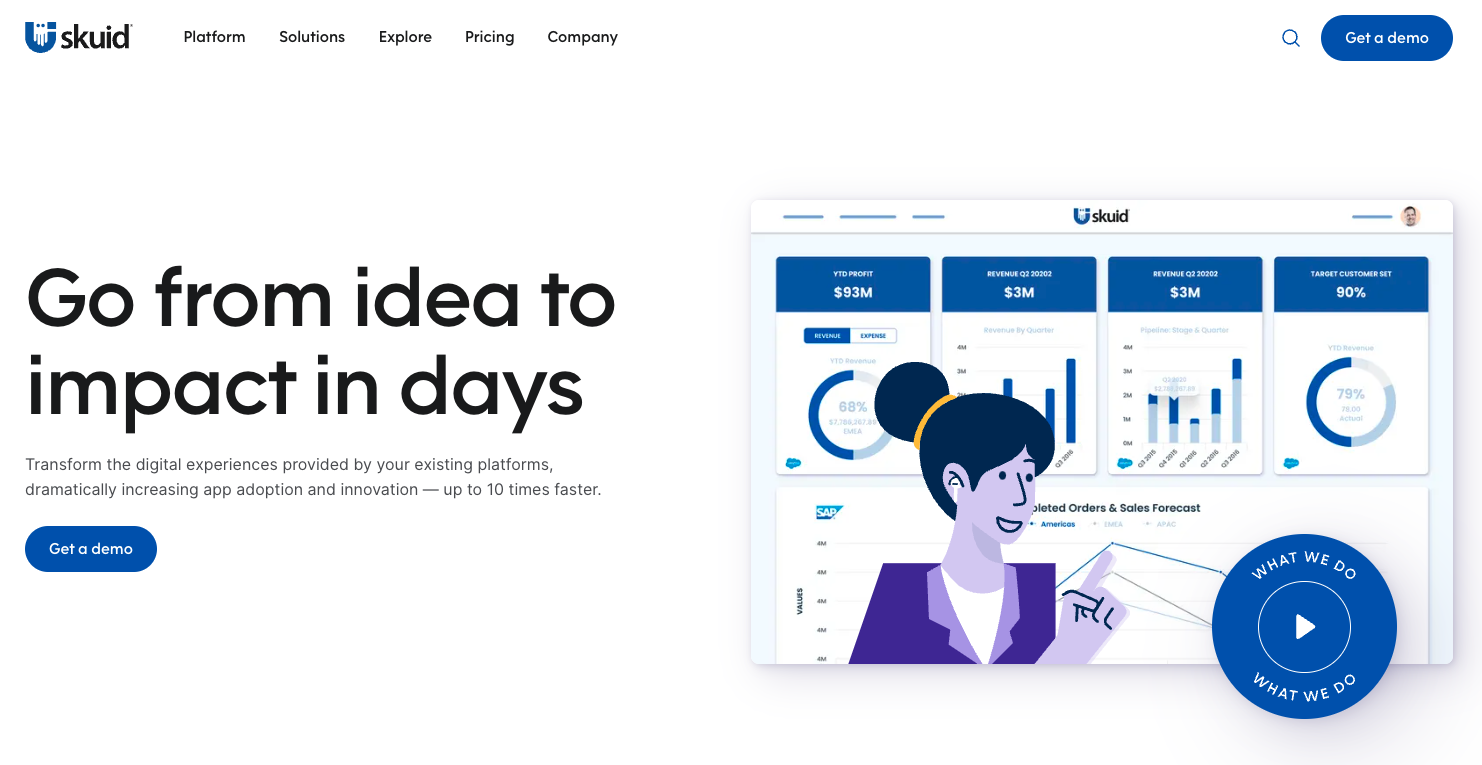
Look at how Skuid worked with creative agency Whiteboard to revamp their site. Before, the homepage displayed a “Get a demo” button. Now, a more positive “Start building for free” button replaces it with new colors that are more cohesive with the site. The design is also more generous with white space, letting bold text and statistics stand out to attract potential customers. Overall, the redesign adopts modern design trends through small tweaks without disturbing the brand’s visual identity.


In other words, don’t just make your website prettier — make it usable, too. To improve user experience, consider:
- Incorporating accessibility features like captioned videos and detailed alt text for images to make your site more inclusive
- Developing a robust search function that enables quicker access to information people are looking for
- Placing vital information prominently on the homepage or in the navigation bar for better user guidance
Since website performance also influences site functionality, your redesign should also address issues such as:
- Reducing slow page load times to improve user retention
- Ensuring mobile responsiveness for a seamless user experience across devices
- Strengthening security measures to protect user data and build trust
7. Build an SEO strategy
An effective website SEO strategy ensures your redesigned site ranks well in search engines, which enhances your site’s visibility and organic traffic. When updating your SEO strategy, it’s vital to:
- Benchmark current site performance using metrics like bounce rate, organic traffic, ranking keywords, backlinks, and domain authority to identify improvement opportunities and track your SEO efforts’ impact.
- Set up 301 redirects for old URLs and create a sitemap for efficient search engine crawling and indexing to ensure they’re discoverable in searches, maintain link equity, and improve site visibility.
- Ensure your site includes comprehensive management of SEO metadata, like meta titles, descriptions, and alt text, to enhance your site’s SEO and make it more likely to rank higher on search engine results pages (SERPs).
8. Craft a style guide
A style guide is a living document that’s a comprehensive reference for your brand’s personality and visual identity. It covers a wide range of things, including writing tone and specific design elements like button colors and shapes, ensuring all future content and pages align with your established brand aesthetic.
Maintaining a consistent design across your website is crucial. By sticking to your website style guide, you ensure that every page reflects the hard work you put into your website’s redesign.
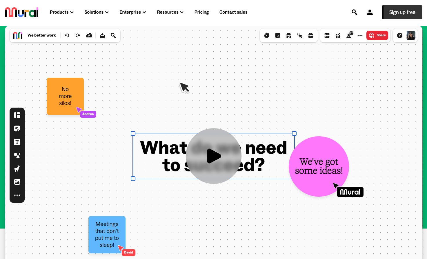
For example, before switching to Webflow, Mural’s team faced challenges in maintaining brand consistency without the help of a designer. To overcome this, Mural used CMS Collections to design templates that enabled their team to create landing pages that adhere to brand style guidelines without always relying on designers. This approach streamlines content creation and upholds brand consistency across the website.

9. Optimize site maintenance workflows
Optimizing website maintenance workflows is as crucial for your team as it is for your users. Streamlining processes like publishing blog posts or updating images improves organizational efficiency and helps you deliver a more resonant user experience to your audience.
For example, before Mural’s website glow-up, their marketing team had to loop in designers and developers for minor website updates. After the redesign, their content team can independently manage blogs and edits. This provides content management autonomy that speeds up the process and reduces the workload on design and development teams.
Incorporating such optimizations into your redesign can dramatically enhance your team’s productivity and website management. To cover all technical aspects of your website redesign, review our performance optimization guide and security checklist.


Build a better site experience
In our ebook, learn how to approach your next website redesign — from collaboration and trust-building to finding the right tools.
6 website redesign mistakes to avoid
A redesign is the perfect time to improve your aesthetic, rethink the tools you’re using, and optimize your team’s workflow. But as you assess your current site and decide what to keep or scrap, the process can seem daunting.
Here are six mistakes to avoid when you revamp your website.
1. Skipping planning for design
The first mistake that often happens in a redesign is diving straight into building your site without taking the time to plan. This can be especially tempting if you’ve just switched to a visual development tool like Webflow that empowers multiple team members to construct pages without consulting a designer or developer. Your final result will be better if you prepare first and set up systems to help your team collaborate.
Besides creating a project plan, as mentioned above, you’ll need to standardize a few technical elements. Consider standardizing class nomenclature by using systems like the block, element, modifier (BEM) method for clarity and consistency so any team member can jump into the project and understand what’s going on.
You also want to figure out what the basic building blocks of your pages will look like and how they will function. Consider elements like nav bars, buttons, columns, alerts, and inputs. Then, decide on a design system that gives your team a shared source to draw from. This preliminary organization will speed up development and maintain order throughout your site’s life span.
2. Assuming visitor preferences without user testing
Instead of redesigning your website based on assumptions about what your visitors want, turn to user testing and research. This approach helps you identify impactful changes that will actually optimize conversions and profits.
For instance, user research helps you create detailed personas that give you a deeper understanding of different audience segments. Follow this up with A/B testing tools to assess specific changes, like refining a call to action (CTA) that resonates more effectively with the target audience. This enables you to tailor your website’s features and content to meet their specific needs, ultimately enhancing user experience and engagement.
On a related note, ensure your tracking and analytics still work after you relaunch your site so that you can continue testing, tracking, and improving your site’s performance over time.
3. Starting a website redesign from the outside in
When you start a website redesign from the inside out, you prioritize your core content and landing pages — in contrast to starting from the outside in with the homepage or external elements, like branding and messaging.
While visitors typically encounter the homepage first when they land on your site, they’re often less critical to the user experience than the deeper, content-focused elements like individual landing pages or product information sections. The purpose of the homepage is to get visitors to that content as quickly as possible, so it doesn’t make sense to start building from your homepage before you know where it’s directing users.
For example, Edgar Allan’s website uses a content-first approach. The site’s portfolio section has several visually appealing example homepages on display, with a heading highlighting their design philosophy: “We believe our work should be story-first, but that the browser is a close second.”

4. Forgetting about your existing content
Make content strategy part of your website redesign to ensure you don’t end up breaking backlinks or losing content — both of which can negatively impact your SEO and domain authority.
To successfully port over your content, thoroughly audit your existing content. This includes listing all current URLs for setting up 301 redirects and creating a 404 page for broken links. A content management system (CMS), like Webflow’s, facilitates this process.
Additionally, use this opportunity to review your content for relevance, update or remove what’s outdated, and create evergreen content that remains valuable over time. This approach ensures content continuity and contributes to a stronger, more effective website.
5. Not managing site bandwidth upfront
During a redesign, adding unoptimized images to pages for quick design reviews might seem harmless. But it can result in slow-loading pages that frustrate users. To prevent this, optimize images and digital assets early in the process. Treat bandwidth like a budget and use it judiciously to ensure your site’s accessibility to users with varying internet speeds. This foresight in optimizing content and other resources ultimately contributes to a faster, more user-friendly website, enhancing the overall user experience.
6. Leaning too hard on trends
When redesigning your website, it’s important to balance trends with your brand’s identity. Chasing after the latest web design trends can be tempting, but they might not always align with your brand’s core values or resonate with your audience. An overreliance on trends can lead to a generic look or quickly outdated designs as the trend cycle evolves.
Still, a particular trend may be perfect if it compliments your brand story and identity. Your website should reflect who you are as a brand. Adopt design elements or trends with intention, ensuring they enhance the authentic representation of your brand to your audience.

Mural’s site design clearly aligns with their brand messaging: being a flexible and visual-first collaboration hub. The primary design element on the homepage is an interactive video — reflecting Mural’s visual approach — and the simple CTA button “Start a whiteboard” invites viewers to customize and collaborate on their platform. Plus, it has a modern, sleek appearance that aligns with today’s design trends.
Redesign with confidence
Website redesigns are involved processes that require cross-functional collaboration and a structured approach. Webflow is here to help you get started. Our visual development platform enables teams to collaborate quickly and securely, to launch redesigned websites that fit their brand needs.
Check out our design courses, layout tips, and perspectives from designers before getting started on your enterprise site redesign.

Migrate your site to Webflow
Unlock your site's potential with Webflow. Migrate to a visual web platform, powerful hosting, and unmatched performance.


