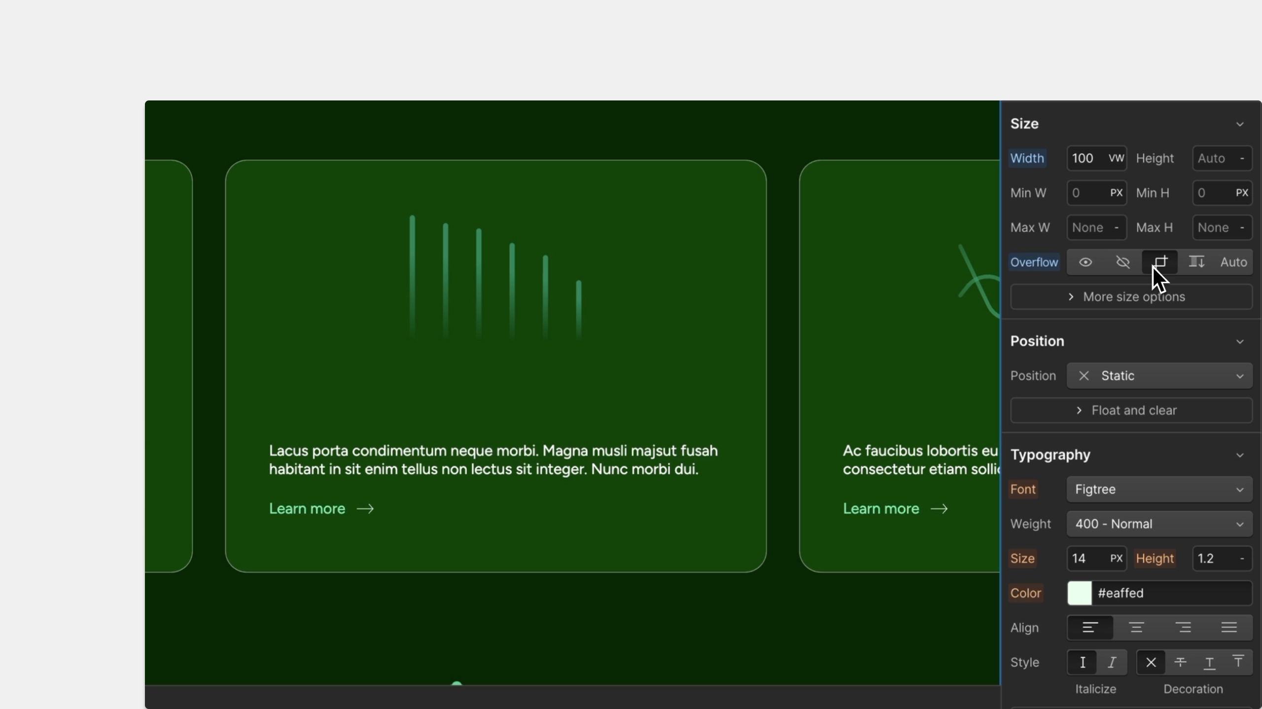
Today, designers have to include extra margin or padding when using the flex layout to establish the spacing between their elements on the canvas. This process is time-consuming and challenging to get right because you have to wrap and adjust the margin for each element in the layout. Although CSS grid is an optional layout for users, it can be considered overkill for one-dimensional (1D) layouts.
This is why we’re excited to share that starting today, everyone can now adjust the gap of a CSS flex layout from the layout section of the Designer, exactly like you would with CSS grid.

For more details on how to easily apply gap when using the flex layout, check out the newest article on Webflow University. If you need a quick refresher on the similarities and differences between flexbox and CSS grid to know what to use and when – head over to our Webflow University page for a quick tutorial.


.webp)


