

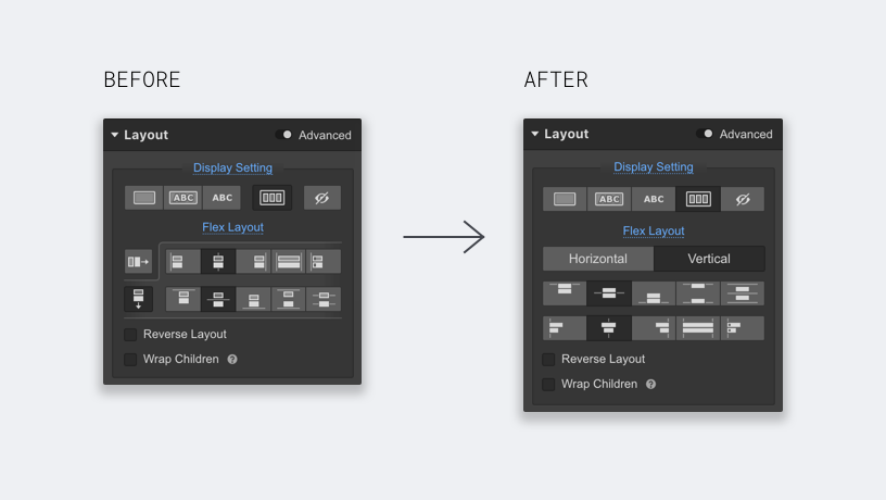
To bring things more in line with the recent style refresh in the Designer, and also to make flexbox a bit more intuitive for everyone, we've made a few changes to the flexbox control UI in the Styles panel.
Updates to flex container UI
Setting horizontal and vertical flex direction is usually the first and most important action, so we gave it dedicated space above the distribution and alignment icons. This also frees up some breathing room around the icons so they're easier to understand at a glance.
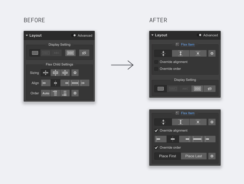
Updates to flex items UI
The more significant changes come when we start looking at the controls for flexbox items. Here's what's different:
- We moved the flex item controls above the display settings section. It's more specific to the selected element so we moved it higher in the list.
- We hid flex item alignment and order overrides under a checkbox, since they aren't used very often. Simplifying this section also helps differentiate flex item settings from flex container settings.
- We added a link within the flex item controls to highlight the parent flex container on the canvas, which should help you contextualize yourself a bit more. We will be applying a similar pattern for other components that have a parent-child relationship.
Launched on
April 6, 2017
Category
Layout & design


.webp)


