Unlock your site’s full potential with best practices vetted by our experts. Learn the Webflow Way.
“Now that we have control over our site, it’s really challenged us to push the status quo of what we’re doing and why. Instead of having 1 option for doing something, we can think about 2 or 3 or more and go down the path that we think is best.”

Time for a change
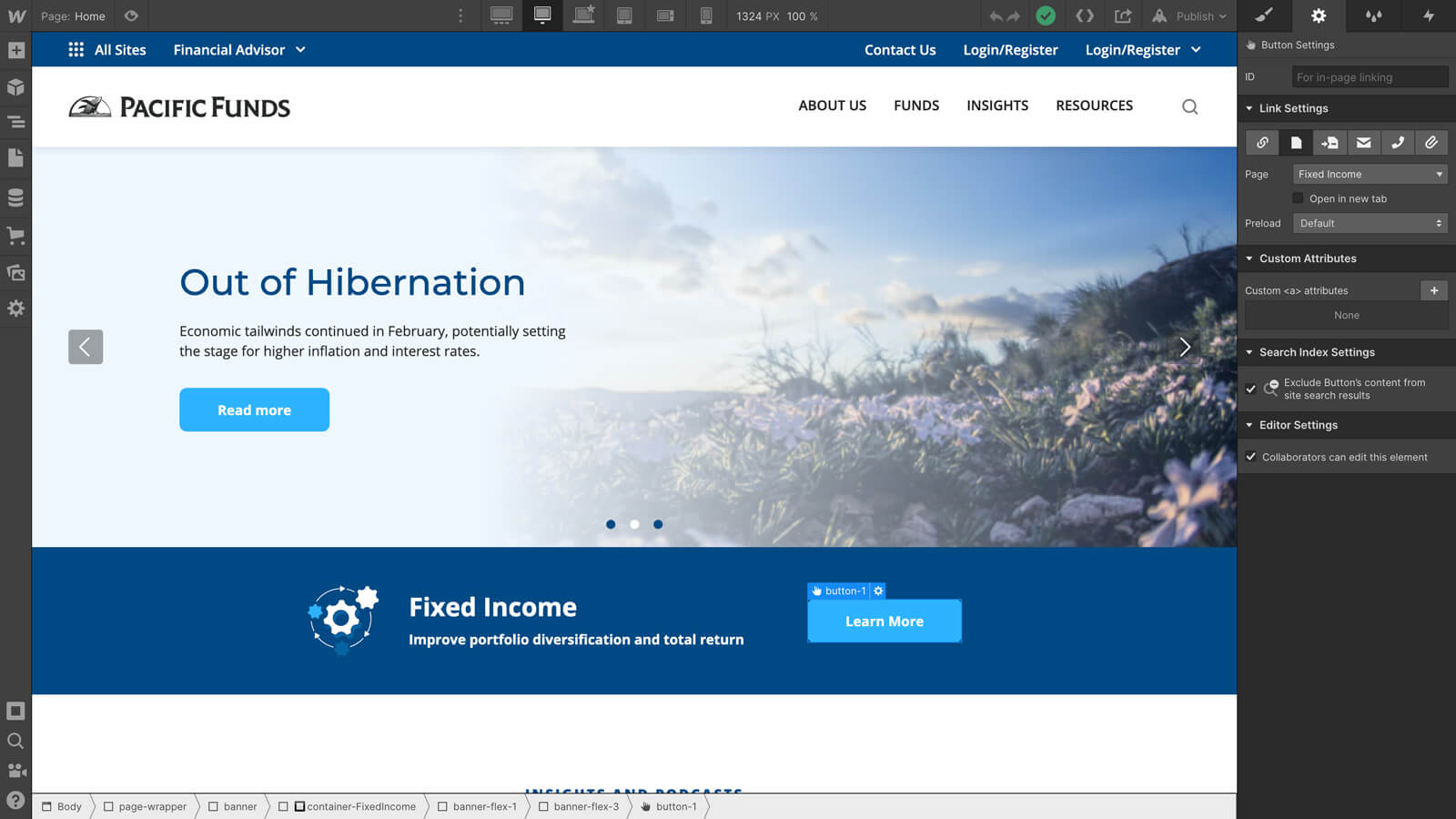
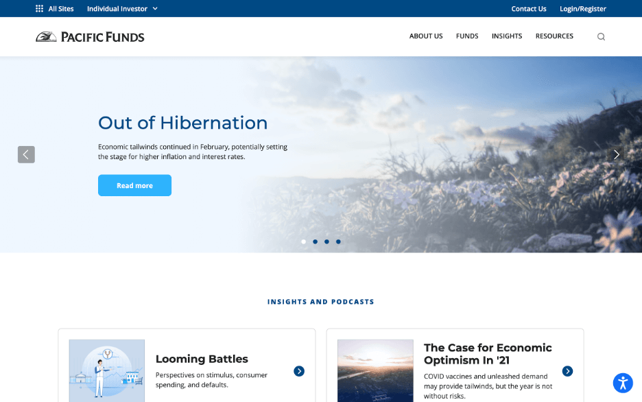
By the time Karen Yue joined the Pacific Funds team in 2019, their website was ready for an upgrade. As the primary marketing asset for their mutual funds offering, pacificfunds.com plays a crucial role in showcasing funds and also in helping their sales team communicate with their investors and advisors.
With the last major update nearly six years prior, the Pacific Funds team found several opportunities to:
- Optimize the user experience across tablets and phones. The website worked well on desktop, but not on smaller devices.
- Tune-up the content flow: The website needed to be simplified and streamlined by deleting duplicative content and obsolete pages.
- Refresh the branding and style. The website needed to reflect their updated brand and style guides.
Aside from the above, one of the Pacific Funds team’s major goals was to gain autonomy over their marketing assets so the team could gain more agility and be more creative as they deployed campaigns and created content. But they ran into obstacles in trying to get there.
Limited development resources
As they made plans to modernize their site, the Pacific Funds team faced several challenges, including:
- Limited bandwidth. The Pacific Funds team didn’t have the bandwidth to revamp their website on their own. Also, the company’s busy centralized team had limited bandwidth and taking on a new major project such as overhauling the entire Pacific Funds website would be a lengthy process.
- The need for autonomy. The Pacific Funds team wanted control over its website, which would provide the ability to make changes, especially to content, in real time. But the incumbent CMS didn’t allow for that independence.
- The desire for design freedom. The new designs that the Pacific Funds team wanted to implement couldn’t be easily duplicated using their existing CMS without development resources.
As they realized the depth of these issues, they decided to explore other options to solve all of their problems (and more): build the Pacific Funds website in Webflow.
The switch to Webflow
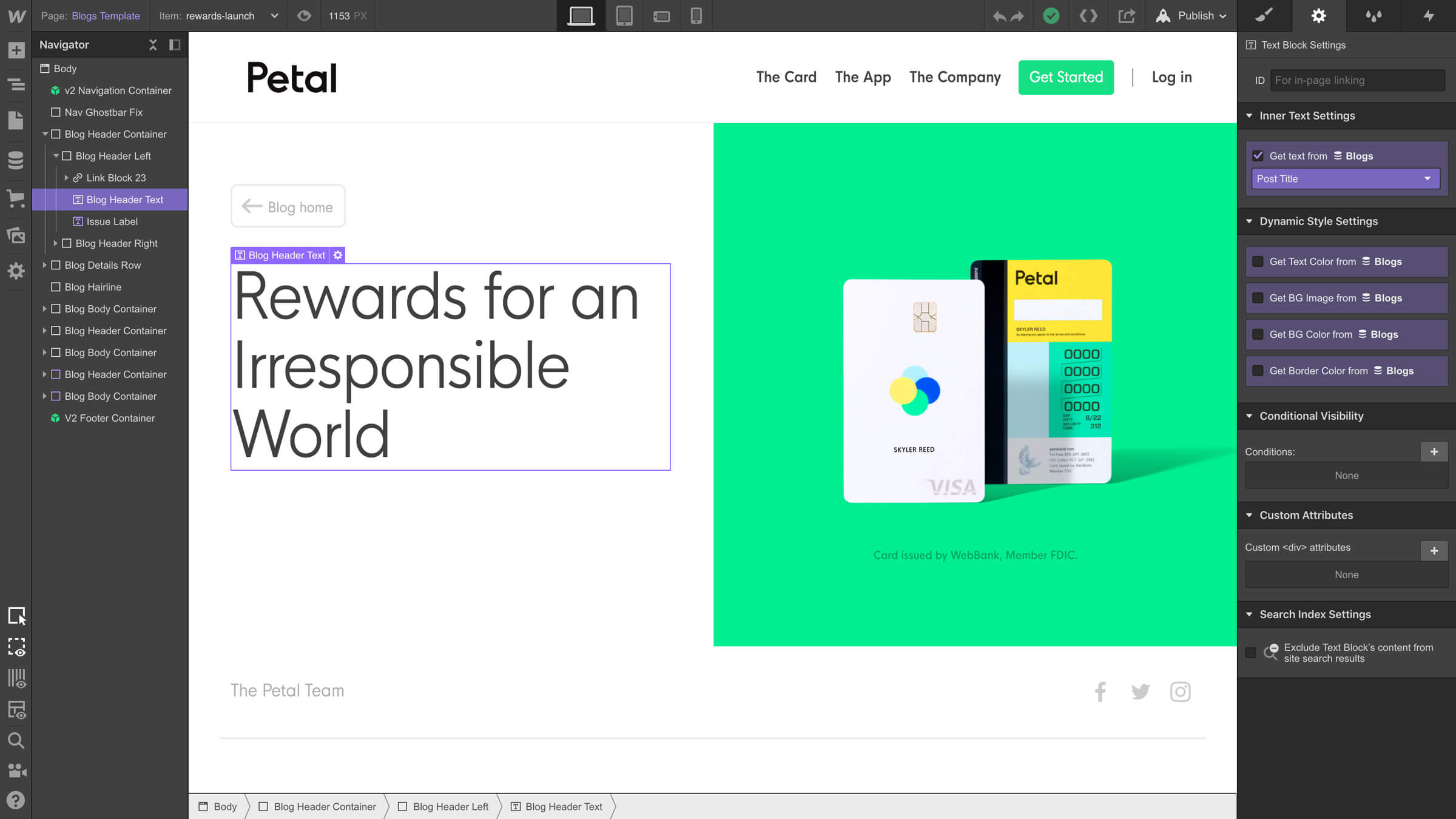
With Webflow, the Pacific Funds team could build their new site independently and exactly as they wanted it. In the process, they regained control over their most important marketing asset: their website. Webflow’s visual development approach empowered the Pacific Funds team to ship new designs and make changes much faster than the traditional development workflow.
As they worked with the Webflow Enterprise team to meet Pacific Funds’ security and procurement requirements, Karen and her team also partnered with Webflow Enterprise Partner Finsweet to execute on development and ensure they could achieve all the key functionality they needed on the site.
We were able to get a published, working version of the entire website live less than two weeks. And we didn’t have to compromise on our original designs.
Karen Yue, Director of Digital Marketing Technology
Once they made the switch to Webflow, the speed they gained was a game changer for the entire website redesign process. That speed allowed the team to spend more time refining and polishing the site so it was the best it could be.
Personalizing the customer experience
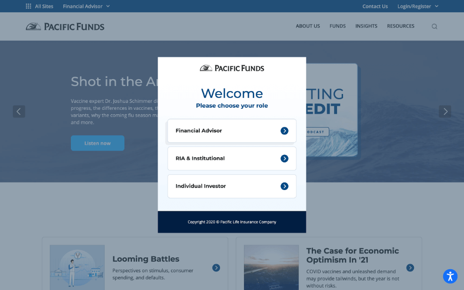
Pacific Funds partnered with Finsweet for a custom implementation to personalize the site’s content based on the visitor’s selections.
As a visitor enters the site, they’re presented with a modal to self-select their role. From there, the content on the homepage and subsequent pages promoting various mutual funds will adjust to show the most relevant content for them. Site visitors are also cookied accordingly so they don’t need to resubmit their role type after their first session.
With a new site comes new and improved autonomy
Now that the Pacific Funds site lives in Webflow — aside from making changes faster and staying true to their vision — Karen and her team can get more ambitious and creative with new content marketing projects, like their new podcast.
Now that we have control over our site, it’s really challenged us to push the status quo of what we’re doing and why. Instead of having 1 option for doing something, we can think about 2 or 3 or more and go down the path that we think is best.
Karen Yue, Director of Digital Marketing Technology
And as a final note, the team is proud of their new site. Not only does it look more in-line with their branding, but it makes a good impression on prospective investors and advisors and works beautifully across all devices.
Explore more Enterprise stories
Explore more stories
Get started for free
Try Webflow for as long as you like with our free Starter plan. Purchase a paid Site plan to publish, host, and unlock additional features.
Try Webflow for as long as you like with our free Starter plan. Purchase a paid Site plan to publish, host, and unlock additional features.


