How Ramp redesigned their website in just six weeks with Webflow
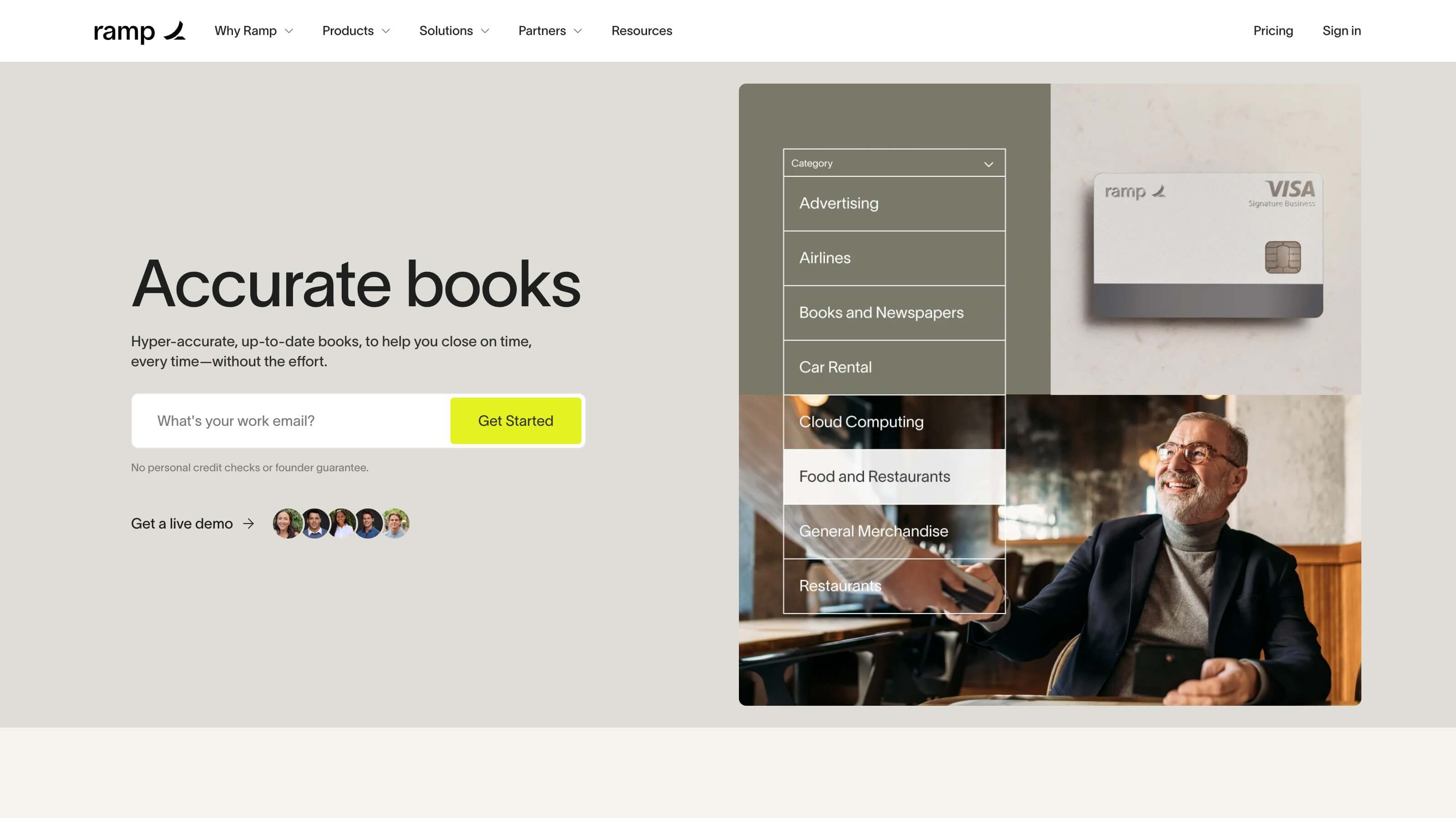
Amid hypergrowth, Ramp was looking to tell a more powerful visual story with a website redesign — and made the switch to Webflow to bring their vision to life and give their marketing team more autonomy.
Unlock your site’s full potential with best practices vetted by our experts. Learn the Webflow Way.
“With Webflow, the speed of execution ; our ability to push things out ; has been dramatically better. And our ability to collaborate has improved ; everyone now has the ability to contribute to the site.”

Ramp’s pursuit for more scalable content creation
Powering over $5 billion of annualized payments, Ramp is building the next generation of finance tools to help businesses save money and time. Named Fast Company’s most innovative finance company of 2022, Ramp automates practically every aspect of finance, from corporate cards to expense management, billing, and reimbursements — saving companies an average of 3.5%.
With some ambitious growth goals on the horizon, Ramp began to take a hard look at how they could free up developer time, how they could empower their marketing team, and how they could build a web presence that accurately told the story of who Ramp was and what they’re building toward.
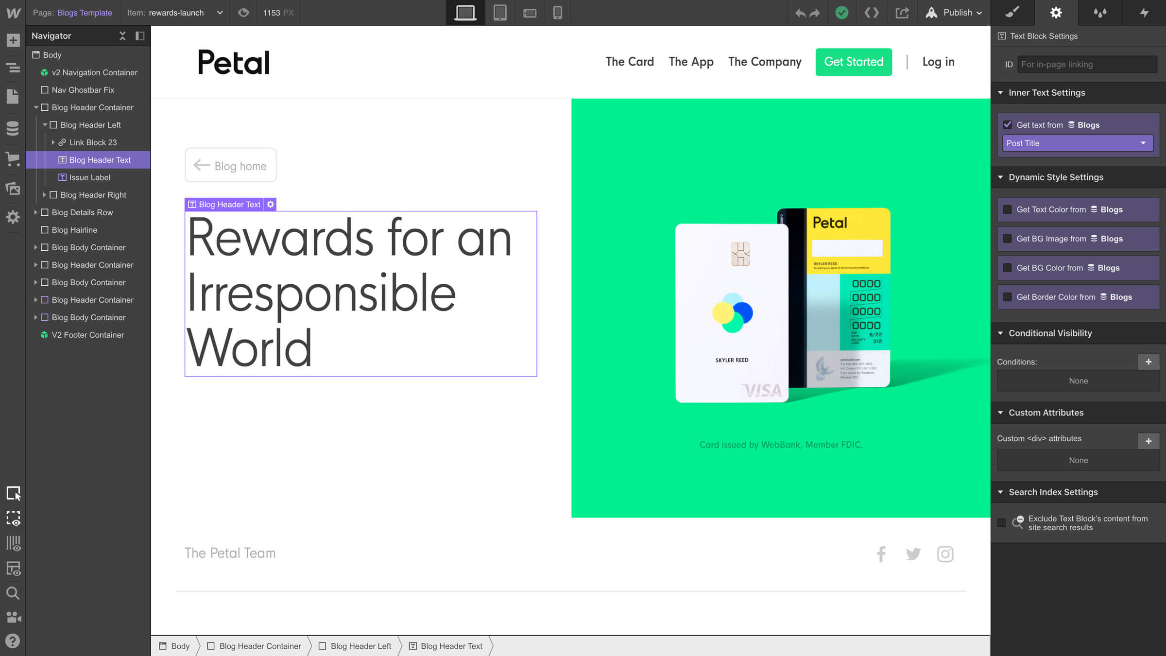
Before Webflow, ramp.com was a traditional React site. Every page had to be coded and each copy/image edit required a new pull request - an extremely laborious process for even the slightest changes.
Akash Wadawadigi, Senior Engineer, Ramp
Prior to using Webflow, the Ramp website was hard-coded. As a result, engineers were needed for even minor site changes, like swapping out an image. The team built out their initial website with just a handful of landing pages. However, as the company took off, they began focusing on — and investing more heavily in — their web presence.
To start, the Ramp team wanted to grow organic traffic by building a blog with an emphasis on SEO. When sketching out their must-haves, they wanted to build something they could maintain without relying on developers. They also wanted to give designers and content writers the freedom to edit and publish site content. Finally, they needed an easy way to build their own templates so they could scale the content creation process as their company grows. After evaluating a number of web development solutions, the team decided to bring their website vision to life with Webflow Enterprise.
Ramp’s need to address business needs with a redesign
Since its inception in 2019, Ramp has experienced hypergrowth, which in turn has put pressure on the team to optimize for speed on all fronts. For their redesign, they wanted:
- A visual look and feel that could accurately present them as the multi-billion dollar valued company that they are
- The opportunity to reframe and redefine its messaging and positioning as the fintech industry continued to shift
- To develop a new visual narrative rooted in its existing identity system that was both authentic and could better differentiate their brand in the fintech space
Together, these objectives became the “why” for tackling a redesign.
Timing is often a defining factor for organizations considering a website redesign. The Ramp team knew the redesign needed to take place ahead of a funding announcement that was just six weeks away — a tight timeline for tackling such an ambitious project. But they also knew this was the perfect opportunity for the company to roll out a fresh look and feel, as well as build a scalable design system and infrastructure.
How Ramp brought their brand to life through a redesign using Webflow
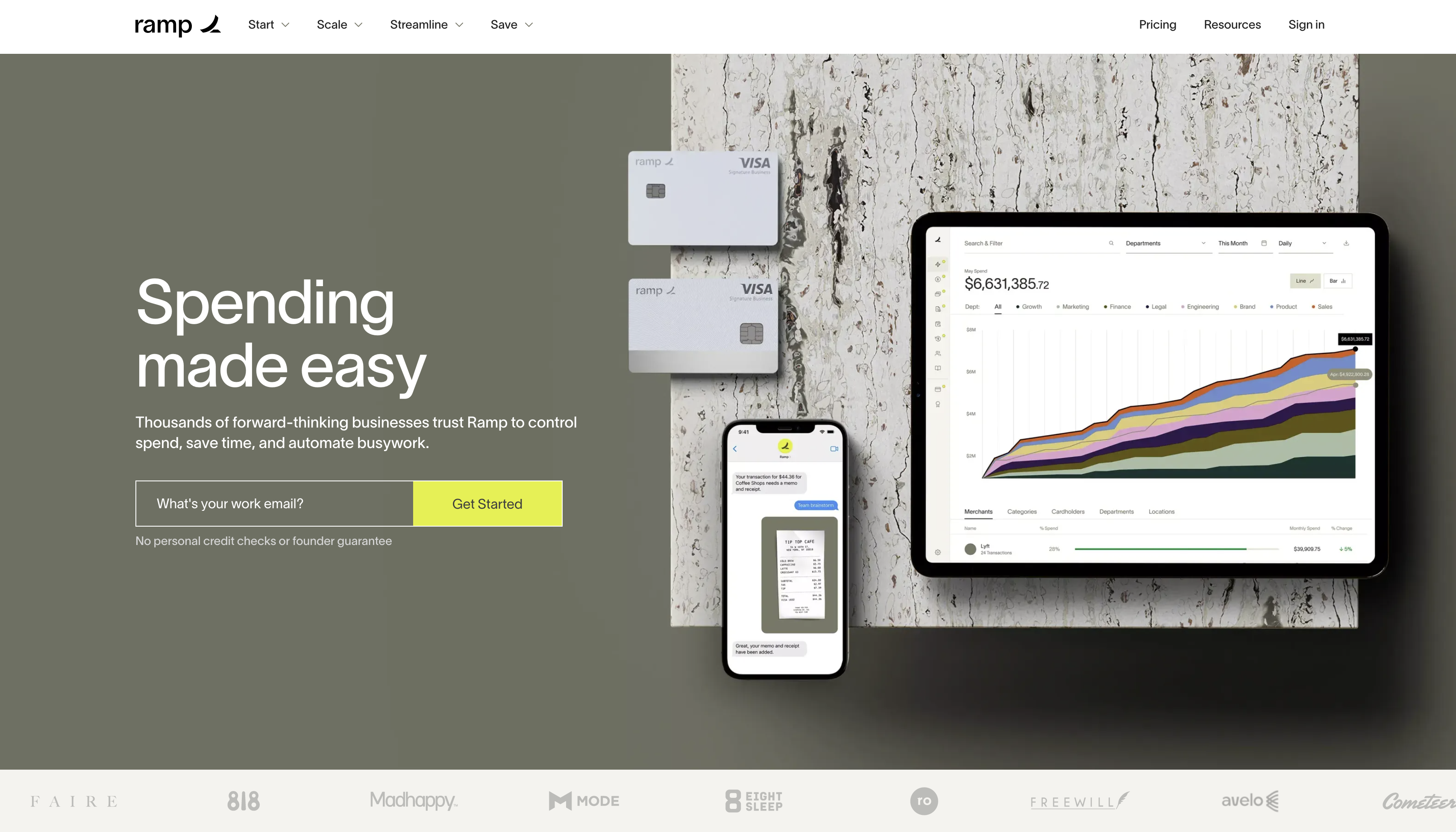
Ramp’s marketing, design, and engineering teams worked together to bring their vision to life on the website in just six weeks. Their core design goals included:
- Tactility through motion, interactions, and spatial design
- A stronger sense of voice through its messaging and copy
- High-quality photography and illustration language that accurately reflected their brand
- Premium renderings of physical products
- Creating consistency and patterns that scale to set the team up for long-term success
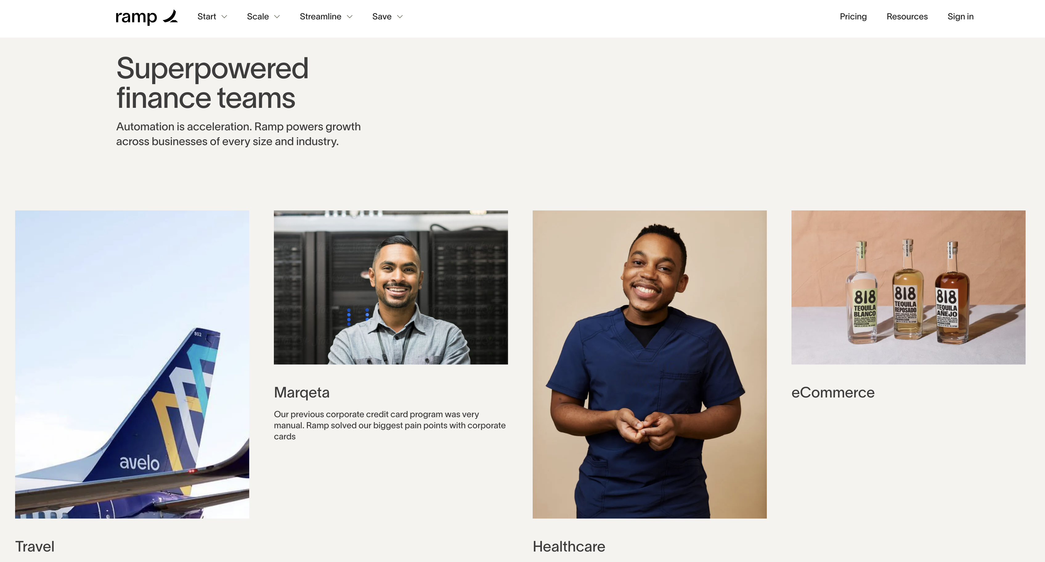
- Communicating breadth and social proof through a well-designed customer page
The team at Ramp evaluated a number of solutions and eventually decided to proceed with Webflow for a number of reasons, including the visual CMS, hosting, and the autonomy and control it could provide its marketing team with. After making the switch to Webflow, the team could operate at a speed they’ve never experienced before, even as they balanced so many moving parts and complicated design elements — like animations — on a tight timeline.
We were drawn to the CMS interface and the fact that Webflow takes care of hosting. Webflow's ability to handle most of the groundwork gave our small engineering team the leverage of a much larger one as we were able to build with less friction.
Akash Wadawadigi, Senior Engineer, Ramp
Webflow gave all involved members of the redesign project at Ramp the ability to collaborate and contribute to the site. This meant marketing, design, and engineering could work in parallel as they tackled their respective portions of the redesign. And now, as different teams express the need to spin up new landing pages or edit content on the site, they’re able to jump in without being held back by lengthy development timelines.
Webflow helped Ramp establish a design foundation built for scale
With Webflow, the speed of execution — our ability to push things out — has been dramatically better. And our ability to collaborate has improved — everyone now has the ability to contribute to the site.
Akash Wadawadigi, Senior Engineer, Ramp
In just two months, Ramp saw page views increase by 26% and pages viewed per-session increase by nearly 6% — signaling almost instantaneous positive effects that the redesign had on user engagement. And today, updating pages or making tweaks to styles is a breeze. Because Ramp took the time to build a strong design foundation in Webflow, the website has become a truly powerful marketing asset that they can continue to develop and grow as they reach new heights.
For a detailed look at how Ramp's marketing, design, and engineering teams collaborate to create high-value content at scale, watch them walk through their process in this webinar.
Explore more Enterprise stories
Explore more stories
Get started for free
Try Webflow for as long as you like with our free Starter plan. Purchase a paid Site plan to publish, host, and unlock additional features.
Try Webflow for as long as you like with our free Starter plan. Purchase a paid Site plan to publish, host, and unlock additional features.


