Unlock your site’s full potential with best practices vetted by our experts. Learn the Webflow Way.
“Our new designs didn't need to go through anyone else besides brand and marketing — no engineers needed. The freedom and flexibility we gained through Webflow was invaluable.”

How Attentive upleveled their site (and brand) with Webflow
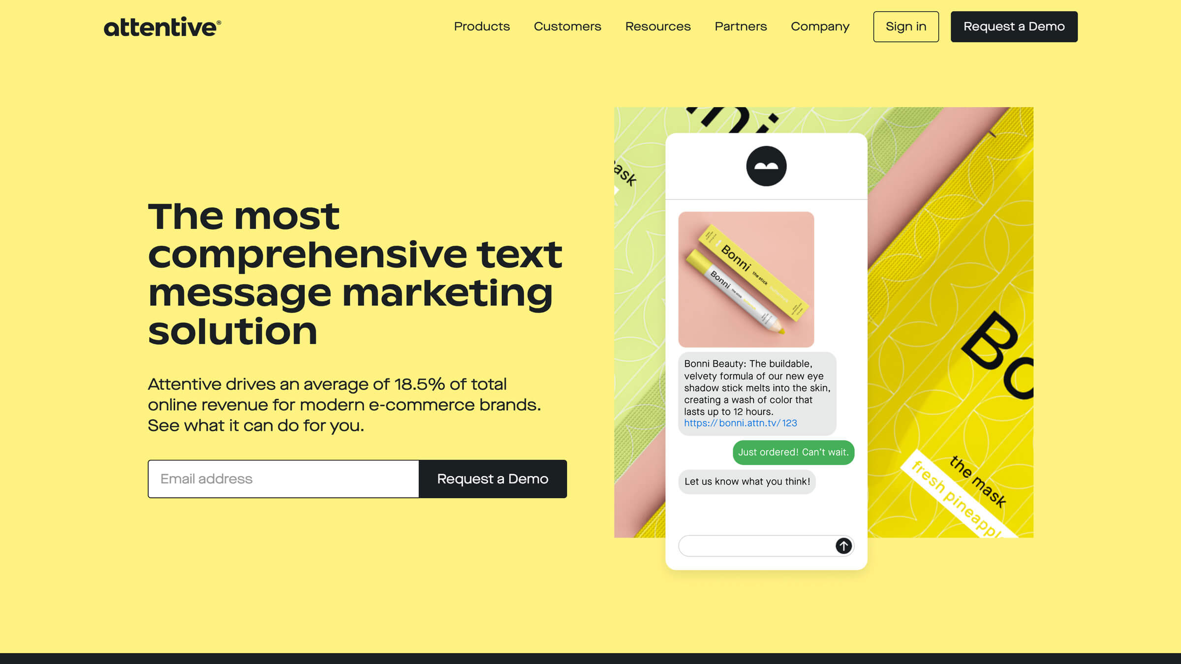
As text message marketing platform Attentive became more well-known — and innovative brands like Urban Outfitters, CB2, and Rebecca Minkoff were running successful programs through their platform — the design and marketing teams knew it was time to elevate their brand. And what started as a small refresh in WordPress due to platform constraints became a complete brand and website overhaul with Webflow.
Going into the rebrand, their website lived in WordPress. That meant any changes they wanted to make would need to go through their external agency, dramatically limiting their autonomy and speed. Plus, their design department couldn’t really be a part of the process.
Using Webflow as a catalyst to dream bigger
As designers, we're very critical of software. And when I use Webflow, I think, ‘that’s how I’d design it.’ There's nothing to critique about it. It does what it says it's going to do.
Elyssa Albert, VP of Design, Attentive
Initially, the Attentive team wasn’t planning on doing anything to the website except changing type and colors “because of the massive effort it took to work with an agency, and it took a ton of engineers to code everything,” Elyssa said. "Outside of accessibility improvements, any design changes we wanted to make weren't even worth the time and effort.”
Everything changed when Attentive’s SVP of Marketing presented Webflow to her as an alternative to WordPress.
Following the initial introduction to Webflow, Elyssa spent a weekend trying it out. “I don’t have any coding experience and it came to me naturally because of how intuitive it is,” she said. It only took two days to rebuild their blog in Webflow, showing her team the power and flexibility switching could bring them. From there, they started to dream even bigger for their rebrand.
With any website migration, questions and concerns are expected. But with the Attentive team, Elyssa said, there weren’t any. “Our fairly lightweight V1 site took months and months to build. So when I showed what I could do in just one weekend with Webflow, that’s all I needed to do to get the whole team on board.” And any questions or technical challenges were solved easily with the help of Webflow’s Customer Success team.
Breaking through the limits of their old site
Once they dug into the larger rebrand, the design and marketing teams managed the rebuild independently, without engineering. Because of this, they could keep it under wraps internally, effectively empowering their teams to do their best work autonomously.
Webflow allowed us to design and build new pages so quickly that, when we decided to add a number of new pages close to our deadline, we were able to easily finalize them in time for launch.
Emily TarBush, Strategic Design Manager, Attentive
Throughout the entire design and build process, there was a continual collaboration between the design and marketing teams. As they got closer to launch, Marketing spent significant time in the Editor building out the site’s content library, while the design team worked in the Designer to build out the site layout, design system, and templates.
Webflow enables the Attentive team to:
- Get more creative with interactions and animations
- Ensure their website meets AA accessibility standards
- Build a scalable, component-based design system
- Make site maintenance more efficient and scalable
Instead of building all new pages every time, Attentive repurposes basic layouts and elements across different pages. They used symbols to build out three different “mega navs” that dynamically change across tablet and mobile. And additionally, the ability to build complex animations in Webflow was a game-changer for the team. "I would play around with CSS to build animations and it took hours and hours just to figure it out. In Webflow, it was all already done through the forums, the YouTube channel, and templates," Elyssa said.
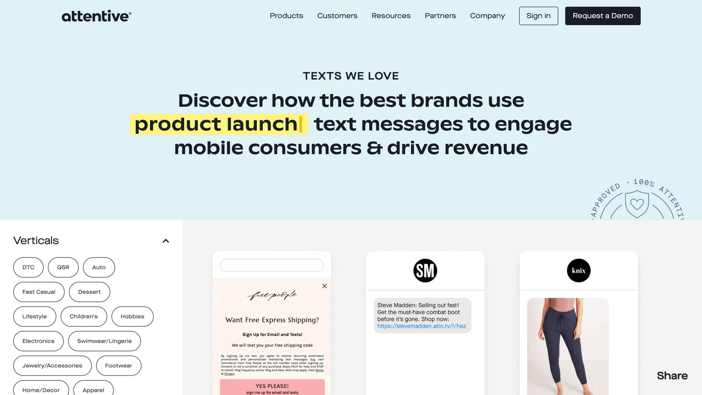
Texts We Love
The Texts We Love page, featured above, was built as its own site and was slated to launch before the larger brand reveal. When the team decided to include it in the larger site launch, it was transferred into the attentivemobile.com project — made easy by the fact you can copy and paste between projects.
“The design work for Texts We Love was heavily informed by the functionality of Jetboost — a third-party app — to build out the advanced filtering that’s integral to the content,” said Lauren Kolm, a Brand Design Manager at Attentive. “Webflow’s CMS collections made it easy to organize the large number of phone screens we wanted to highlight. Once we knew how to leverage these features, it was just a matter of applying our brand identity kit to the visual elements on the page.”
Accessibility in Webflow
Accessibility and compliance were a huge driving force behind our rebrand. We advocate heavily for ADA and TCPA compliance with our clients, so it’s of great importance for us to set a high standard for ourselves.
Elyssa Albert, VP of Design, Attentive
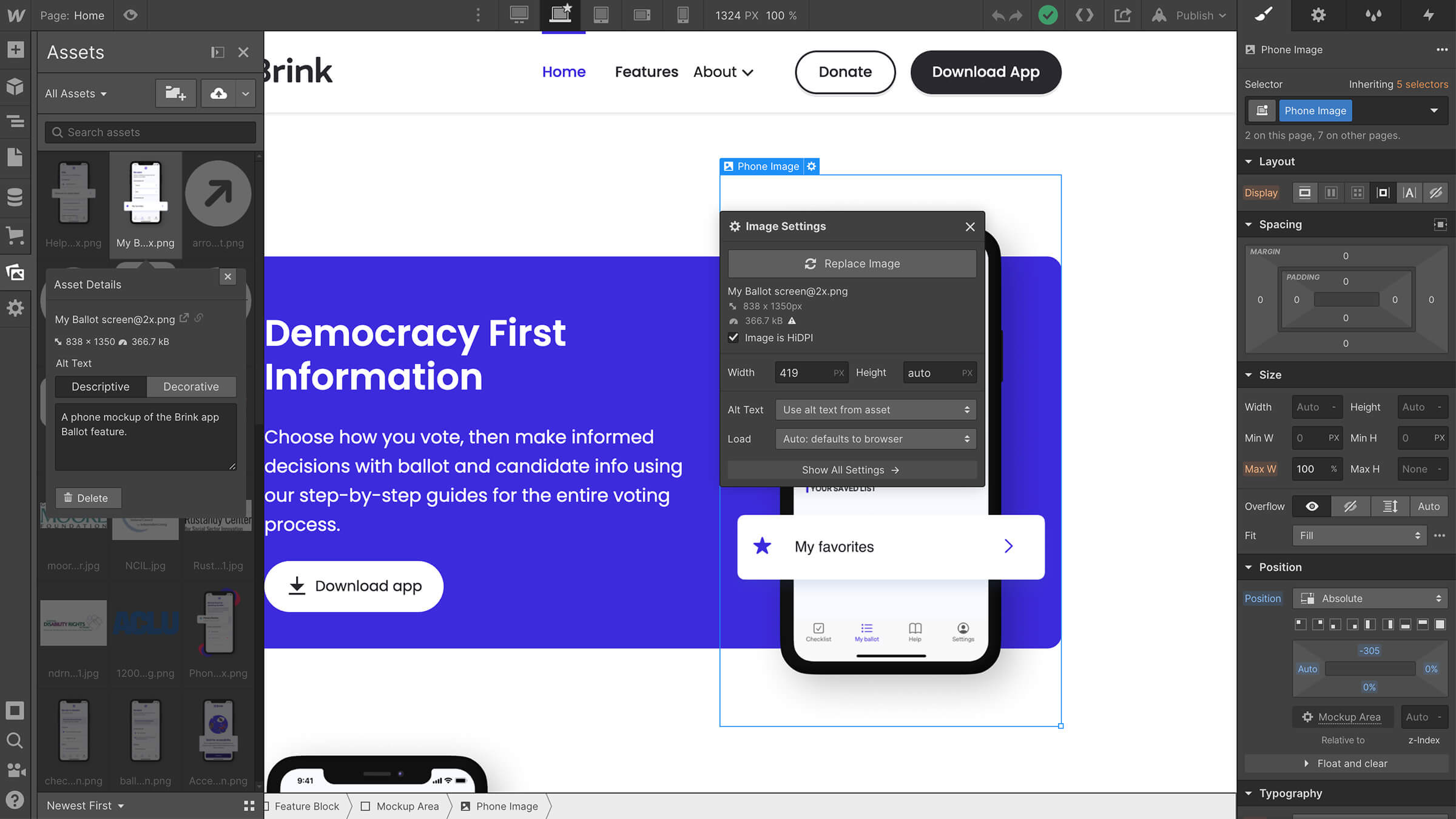
Accessibility improvements to the Attentive site in Webflow included making sure all copy on the site had acceptable levels of color contrast, made especially easy with the color contrast checker. Their content marketing team also took advantage of the ability to add alt text to all of their images, made seamless by Webflow’s asset panel and CMS Editor. Finally, they boosted accessibility even further with the ability to add custom attributes to elements such as aria-labels, roles, and titles.
Webflow for growth
Now that they’re using Webflow, the design and greater marketing team can make changes quickly, efficiently, and completely autonomously. Small changes to the site can take place in less than an hour and require little, if any, planning in advance.
With the help of Webflow, Attentive is planning on expanding their design team and “can’t wait” for their next web project — a far cry from how they felt about their site at the start of their rebrand.
Explore more Enterprise stories
Explore more stories
Get started for free
Try Webflow for as long as you like with our free Starter plan. Purchase a paid Site plan to publish, host, and unlock additional features.
Try Webflow for as long as you like with our free Starter plan. Purchase a paid Site plan to publish, host, and unlock additional features.


