How SmugMug used Webflow to relaunch their website
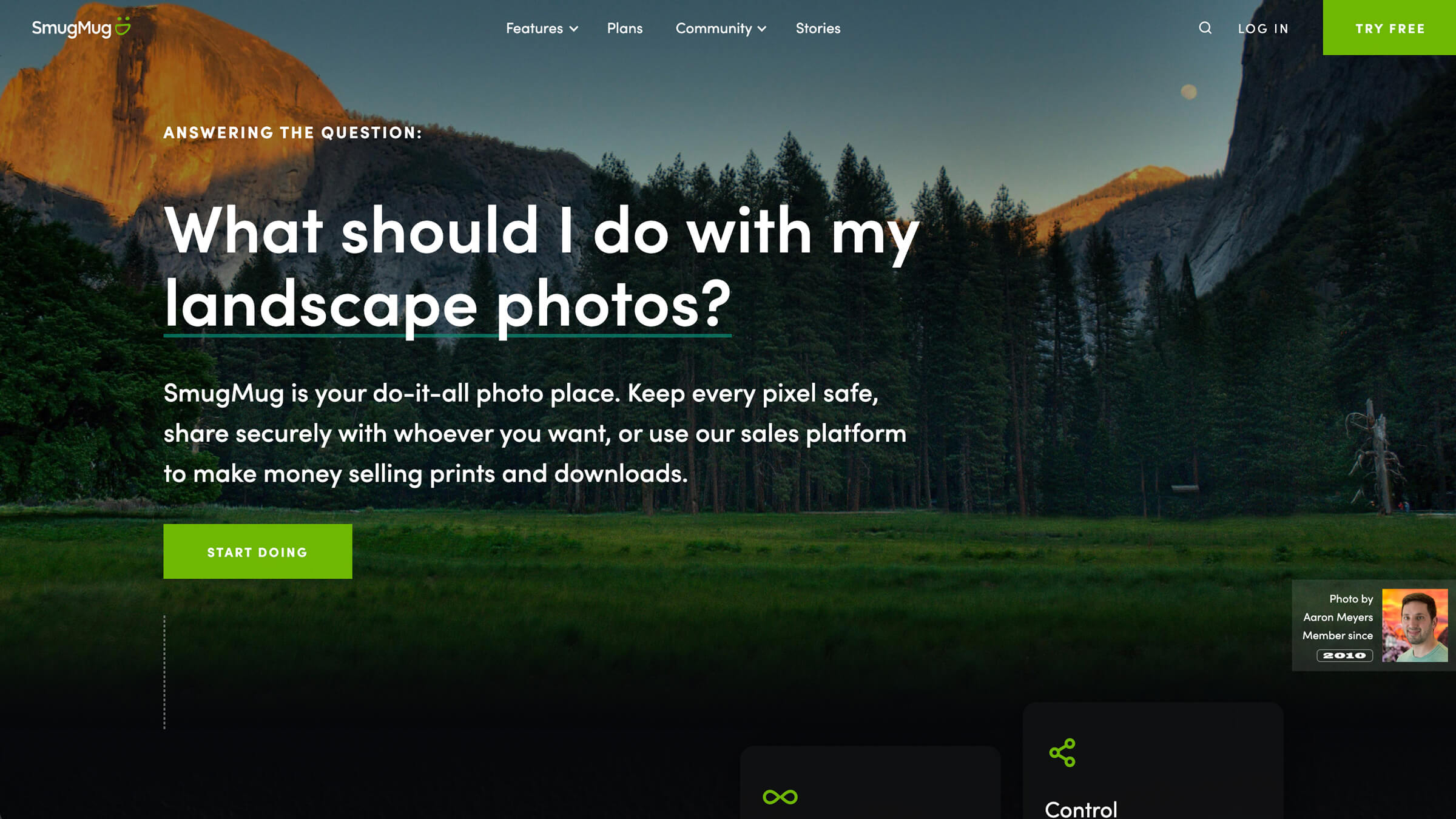
SmugMug, a platform for professional photographers, outgrew their first website — so they turned to Webflow. Find out how switching helped them refresh and redesign their site to better meet the needs of their customers and their teams.
Unlock your site’s full potential with best practices vetted by our experts. Learn the Webflow Way.

SmugMug is an end-to-end photography platform for storing, sharing, and selling photos. Their first website was self-hosted, with a front-end that was built in-house, and a backend powered by Contentful. Even though the product and engineering teams created the site with tools they were familiar with, once designs were implemented — taking two weeks or longer — the team found it difficult and time-intensive to make even the smallest of edits.
One time we had to change the copy on a button, and that alone took 3–4 days. We couldn’t experiment or test things out with the design in an agile way with those timeframes.
Michal Pechardo, Senior Designer, SmugMug
There wasn’t a single person on the SmugMug team who could dedicate themselves full-time to the website. Team members in engineering and product development were only able to work on it in their spare time, so the website wasn’t getting the attention and lift it required.
Once it became clear to Michal and his team that the website needed a redesign, he took the opportunity to also gain more freedom and flexibility with their website builder.
Michal already had some familiarity with Webflow, having used it for personal projects and freelance work. He knew it was easy to use, its knack for shortening build and ship timelines, and how much more experimentation it allows for. Based on his experience, he felt like Webflow was a good option for his company, but to make the switch, he needed buy-in.
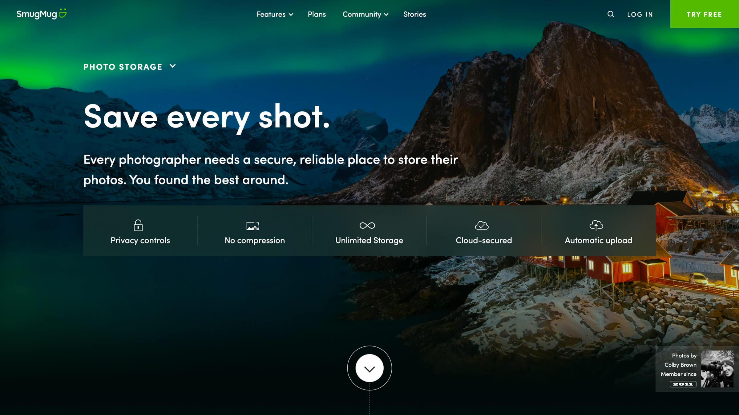
Pitching Webflow
After an unsuccessful two-month trial of Unbounce, instead of coming up with a lengthy pitch to convince his team to switch to Webflow, Michal let actions speak louder. He built out three pages to show the VP of Marketing and other stakeholders how easy it was to build layouts, put together interactions and animations, and publish changes with a click in Webflow.
Along with the case he made for using Webflow, they also worked with Webflow’s Enterprise team to prepare a presentation and answer any questions the marketing and engineering teams had. This meeting was the final step in showing the company that Webflow was the right move.
We did our research and due diligence, and Webflow hit every checkmark. It was a powerful and flexible platform that enabled us to do what we wanted to do.
Michal Pechardo, Senior Designer, SmugMug
Webflow ticked all the boxes for what they needed, including A/B testing, backup restoration, autosave, and the ability to publish any changes or pages fast.
Making the switch
The SmugMug team took a patient approach in the switch to Webflow, making sure they had a granular level of understanding of what they needed to create. By doing so, they entered into the build process well-prepared and were able to meet the ambitious one-month deadline.
Like any design project with a quick turnaround, there were a few bugs that popped up after the new SmugMug website went live. Instead of being a laborious task, addressing these bugs were a quick and easy fix with Webflow. What would have taken them weeks with their previous setup could now be knocked out before lunch.
Using the Webflow CMS for dynamic content
SmugMug takes pride in the creators using their platform, and wants to bring attention to their work in dynamic ways. In the SmugMug Films section of their website, interviews with selected contributors and modals with more information about their work is on full creative display.
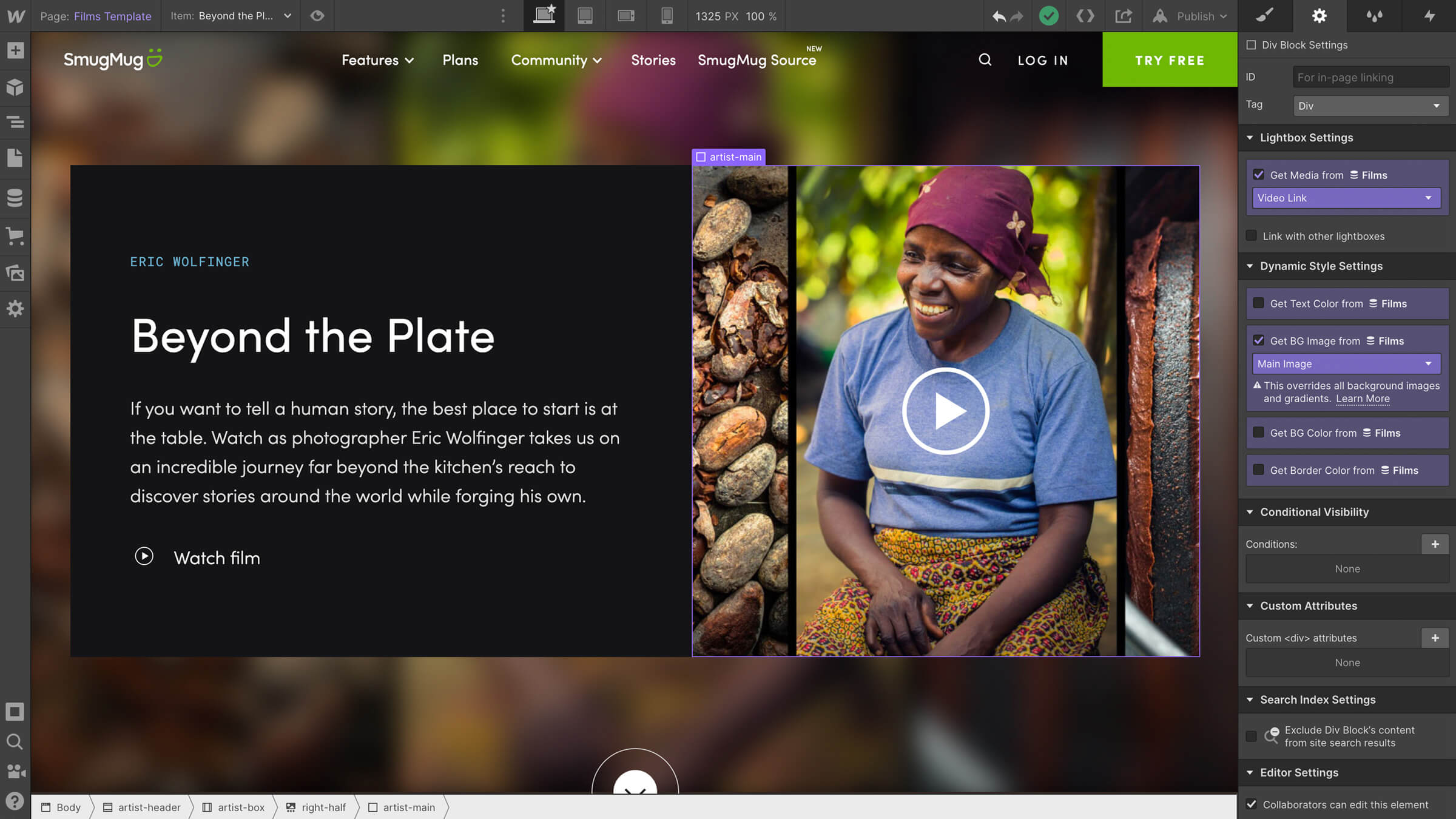
SmugMug uses the Webflow CMS to manage this dynamic content. Since adding new videos to the page only requires plugging and playing, the content team can add these on their own — no developer needed. The team also brings colors from the featured images into the CMS, making design customization and cohesiveness a breeze.
SmugMug’s Plans page also presents all of their plans and necessary information in an active, engaging way. Along with some custom Javascript, the team at SmugMug designed and built their Plans page to be a user-guided experience.
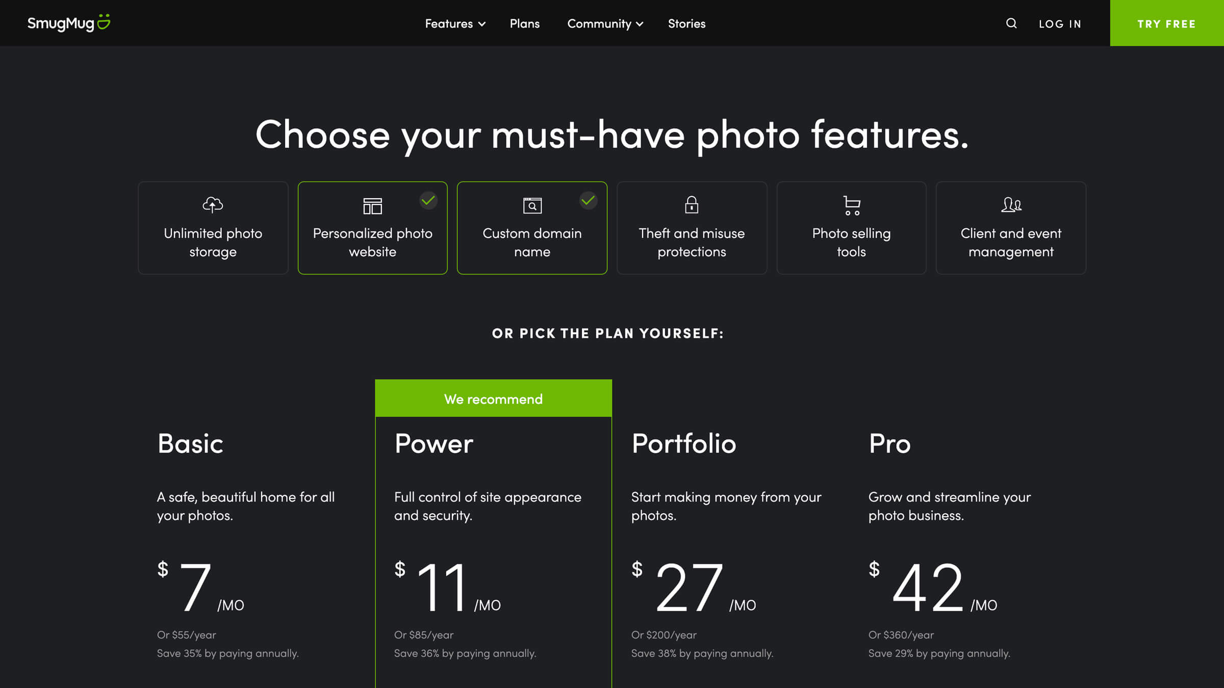
More options, more control, more wins
Making the move to Webflow has been a tremendous asset. Gone are the days of tracking down engineering resources when we want to quickly spin up a landing page for spur-of-the-moment advertising opportunities, or simply for fast copy edits. Our marketers are happy, our engineers are happy, and most important to me, our creatives are happy.
Andrew Tower, Creative Director, SmugMug
With the COVID-19 pandemic affecting so many facets of our work and personal lives, the lack of travel and social outings has had a huge impact on the photography industry. Despite these challenges, SmugMug was able to expand its online presence with the help of Webflow.
SmugMug’s new website brought in a noticeable uptick in signups and page views. Shortly after the switch, they saw an expansion of their organic SEO reach paired with a 44% decrease in bounce rate. Plus, a whopping 52% increase in conversions.
Most importantly, Webflow allows SmugMug’s teams to do what they do best. The marketing team no longer relies on engineering to edit content, designers can easily tweak and re-tweak branding as they grow, and anyone who needs to can edit and push out updates to the site in just one click. “Gone are the days of tracking down engineering resources,” said Andrew Tower, Creative Director at SmugMug. “Our marketers are happy, our engineers are happy, and most important to me, our creatives are happy.”
Explore more Enterprise stories
Explore more stories
Get started for free
Try Webflow for as long as you like with our free Starter plan. Purchase a paid Site plan to publish, host, and unlock additional features.
Try Webflow for as long as you like with our free Starter plan. Purchase a paid Site plan to publish, host, and unlock additional features.


