How Wave refreshed their website and gained more design flexibility with Webflow
Looking to convey their renewed brand personality to their core audience, Wave was ready to refresh the look and feel of their site — and Webflow gave them the ability to bring their true vision to life.
Unlock your site’s full potential with best practices vetted by our experts. Learn the Webflow Way.
“We were spending so much time and development resources on builds that, at the end of the day, just weren’t coming to life visually the way we intended.”

To make a bigger splash with small businesses, Wave was ready for a refresh
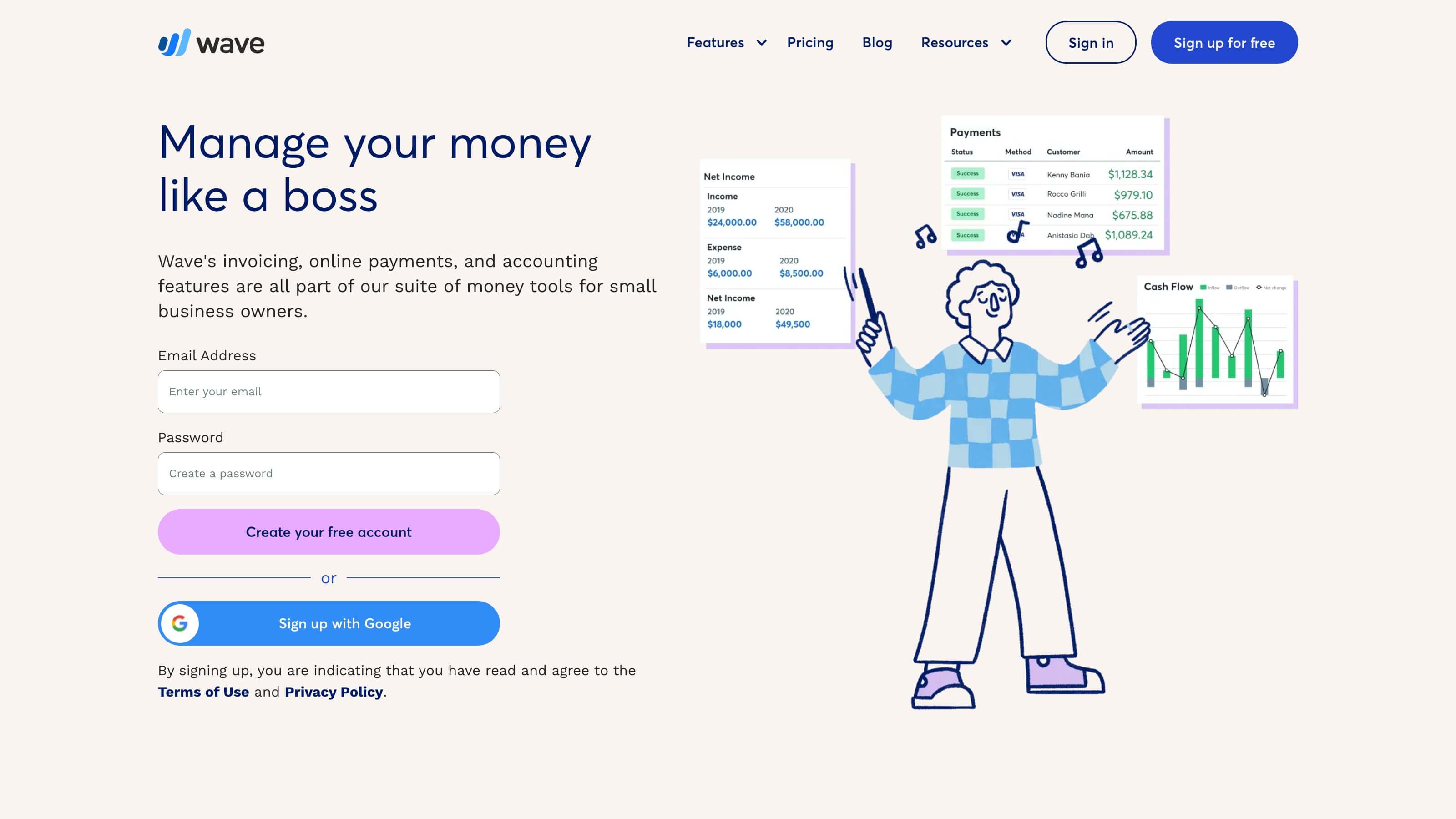
Toronto-based Wave knows bookkeeping isn’t the most desirable task for any business owner. On a mission to help service-based freelancers, contractors, consultants, and self-employed entrepreneurs take the fear out of handling business finances and better manage their money, the fintech company offers solutions for all things money—including invoicing, accounting, digital payments, payroll, banking, and 1:1 coaching. In the process, Wave has helped over two million U.S. and Canadian small business owners take control of their finances.
As the company continued to evolve, it looked to position itself as an integrated, one-stop money management solution and make their brand more approachable to specific audiences within the small business community. This included service-based microbusinesses with fewer than 10 employees, solopreneurs, freelancers, and more—all of whom are underserved when it comes to financial management and banking.
Their brand refresh included positioning their products and services as a suite of money management tools that can be used separately or together for maximum control, speaking about money in non-intimidating ways, and building a visual brand that was more approachable and unique. And in order to properly execute this refresh, their brand team needed a website solution that could offer them more design flexibility and would drain less engineering resources.
Even when we had all of the resources and were firing on all cylinders, it felt like our Figma designs never truly came to life on the website exactly the way we wanted.
Julianne Smola, Wave Sr. Director, Brand & Communications
Wave’s search for a designer-friendly, flexible CMS
Having worked with a few CMS solutions over the years, the team at Wave wanted to use this window of time before tackling their refresh as a chance to reevaluate their CMS. The team had a number of requirements they were looking for in a solution, primarily:
- A flexible tool that could truly bring the brand team’s Figma designs to life
- A solution that could give more of Wave’s team autonomy over the website to free up engineering resources
- An SEO and accessibility-friendly tool with built in guardrails that promotes industry best practices
The team at Wave evaluated two tools in addition to its existing CMS, mapping out how each stacked up against their core requirements, and considered any additional features they could leverage for the website. Eventually, the team decided to replace its current solution with Webflow Enterprise, and selected Webflow Enterprise Partner, 8020, to lead their site migration.
With our previous CMS, we weren’t set up to really support even small customizations to the website — it required a lot of manual effort and custom code. The idea of an engineer being able to do so much more with their limited time was really appealing to us.
Andrew Hull, Wave VP of Engineering
An all-hands-on-deck site migration
Knowing their hands were tied with their brand refresh, partnering with an agency was always part of Wave’s plans when it came to migrating to a new CMS. And after connecting with the team at 8020, Wave knew they were the trusted partners they could rely on for Webflow migration expertise, as well as content organization and management, process development, project management, and even design input and adjustments.
The team had a number of core marketing goals for the refresh and migration beyond positioning and look and feel, such as improving site speed and site accessibility, increasing scroll depth, and increasing site traffic and conversion. With a goal to launch during mid-summer, the Wave team began scoping and planning with 8020 before kicking off migration and design sprints in late January.
The Wave team paid special attention to the homepage design and experience. For example, they wanted to rally behind their suite of tools in a visually appealing way. Using Webflow, 8020 was able to build a sticky navigation menu with jump links that walks site visitors through six different Wave product offerings, changing the page color, visuals, and messaging upon scroll.
With Webflow, we have the ability to easily build interactions and animations across pages, which is really great.
Andrew Hull, Wave VP of Engineering
Because the team was juggling a website refresh and migration simultaneously, this project — with the help of Webflow University courses — was a huge, hands-on learning experience. Now, the team has two designers and a developer on staff who have had a ton of exposure to Webflow and who the rest of the team looks to as the experts.
From an engineer’s perspective and as someone who has worked with a lot of tools over the course of their career, I was a bit of a skeptic. But after seeing Webflow roll out consistent product updates, reading community testimonials, and hearing from our own marketing team, I’ve been converted.
Andrew Hull, Wave VP of Engineering
The new Wave way: a faster site with greater marketing autonomy
.png)
After successfully rolling out their refreshed branding and launching their new site on Webflow, Wave and 8020 had:
- Designed and developed 46 layouts
- Migrated 1028 total site pages
- Migrated 2444 pieces of dynamic content
This was 8020’s largest migration project to date, and Wave’s ability to simultaneously roll out a fresh new aesthetic was a success. Early performance results include:
- 3x improvement in site speed
- A 4% to 21% increase in organic traffic to key converting pages
- 6% increase in conversions from paid campaign landing pages
Today, content writers, designers, and SEO managers have the ability to work in Webflow and make updates and changes to specific content and pages they oversee. And since the migration, the team has brought on an in-house webmaster to own and continuously optimize the website as a whole.
From a design perspective, we’re careful about who we give access to. But it’s been extremely helpful to grant key marketing team members access to the Editor [to make small changes and updates]. It’s so user-friendly. And the cool thing about Webflow is no matter what role you’re in — design, development, SEO, copywriting — there’s an added benefit to you.
Julianne Smola, Wave Sr. Director, Brand & Communications
Explore more Enterprise stories
Explore more stories
Get started for free
Try Webflow for as long as you like with our free Starter plan. Purchase a paid Site plan to publish, host, and unlock additional features.
Try Webflow for as long as you like with our free Starter plan. Purchase a paid Site plan to publish, host, and unlock additional features.


