Beta
Designer
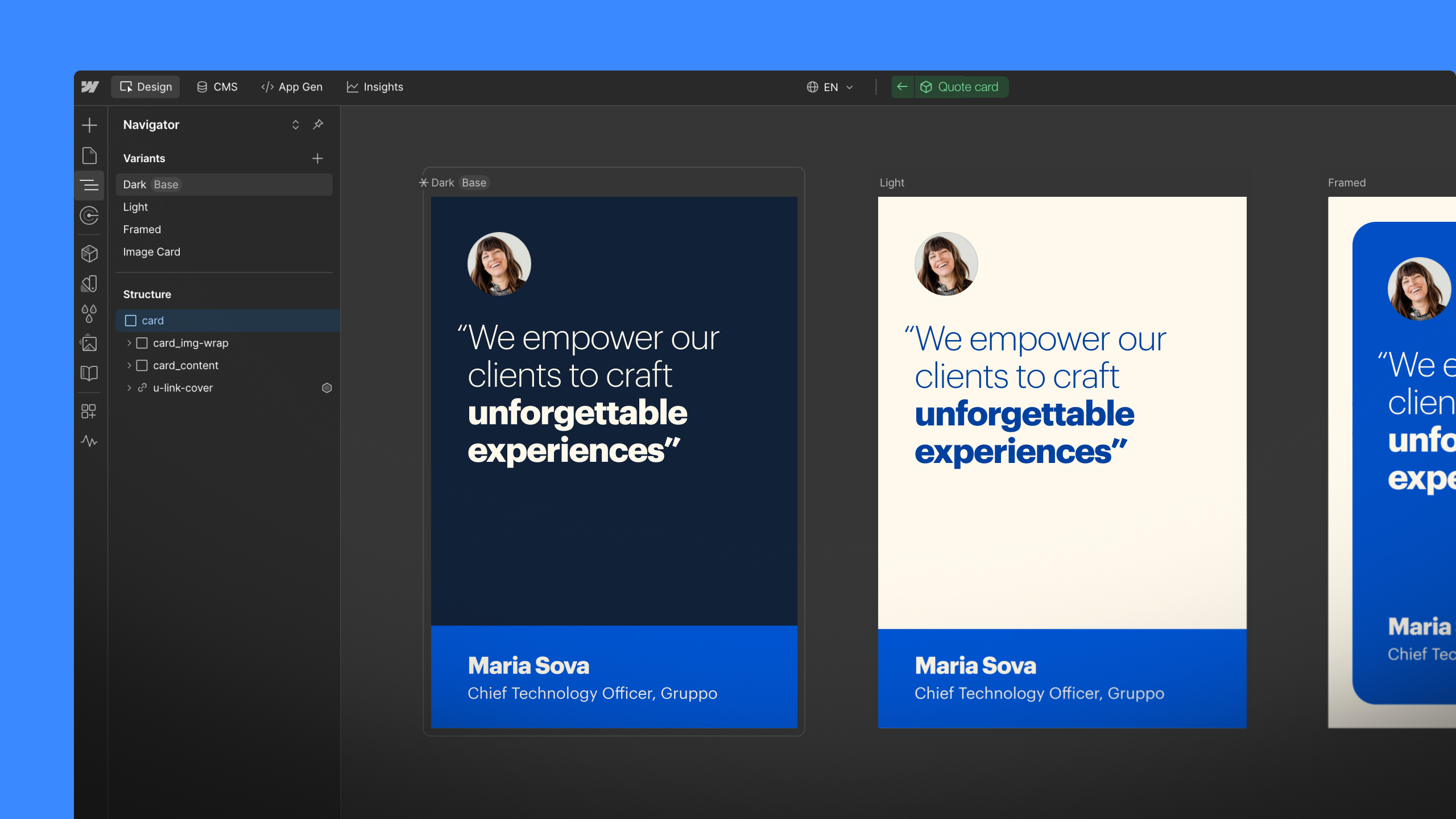
New navigator location
We’re moving the navigator to the left side of the Designer, and adding the ability to pin and resize it. Try it out in beta.
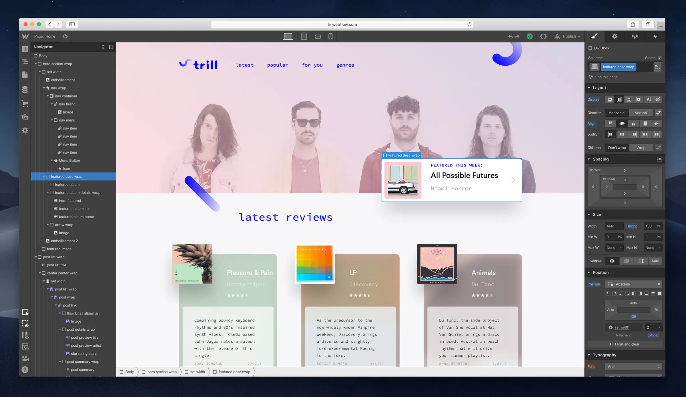
The navigator makes it easy to see the structure of your page elements as you’re building, but until now, it hasn’t been possible to look at the navigator at the same time you’re actually styling elements.
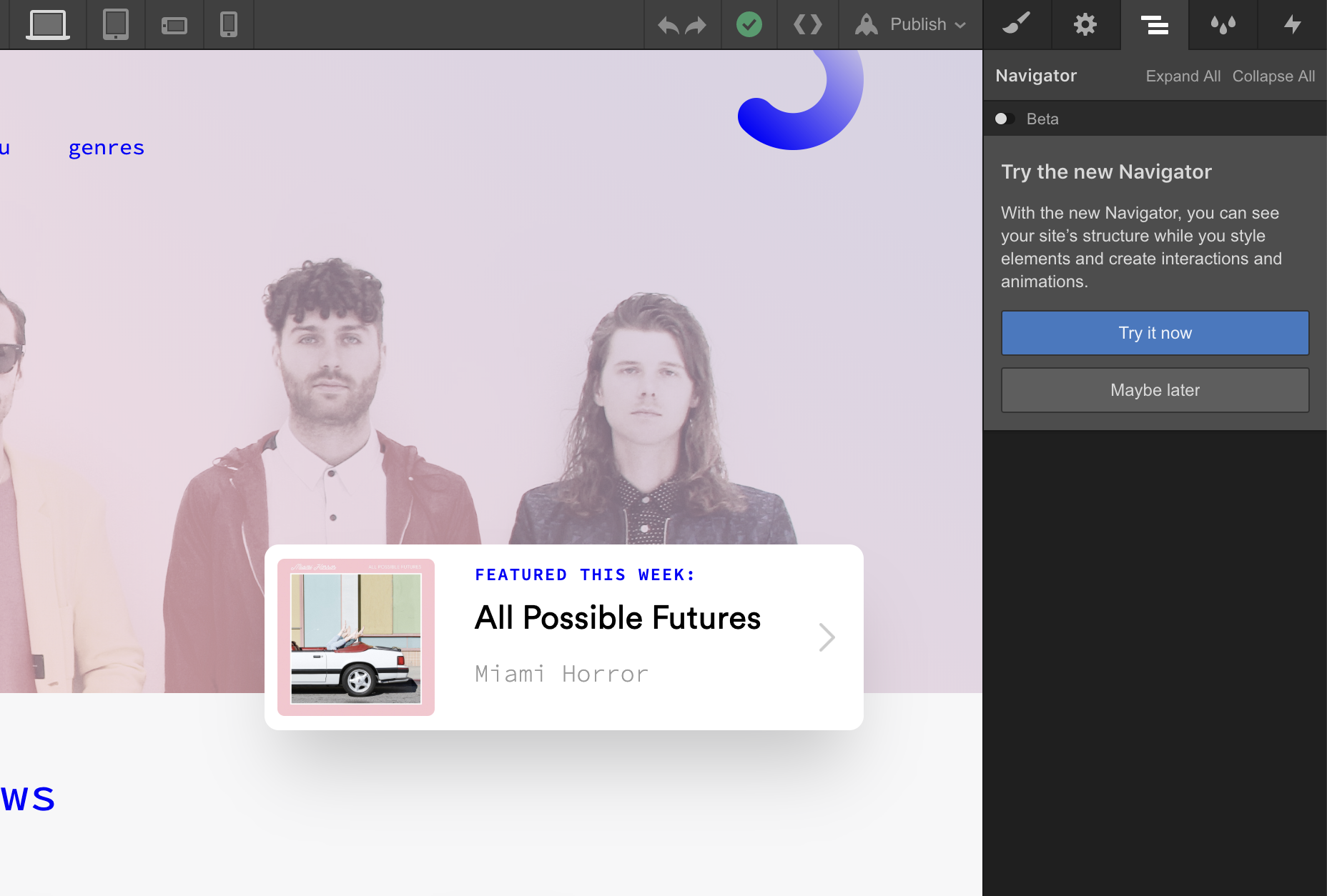
To solve that issue, and also to create a better experience for people using the Designer on large monitors, we’re making some changes to the positioning and behavior of the navigator — starting today in beta, and then permanently for everyone in a month (pending feedback and any fixes that are needed).
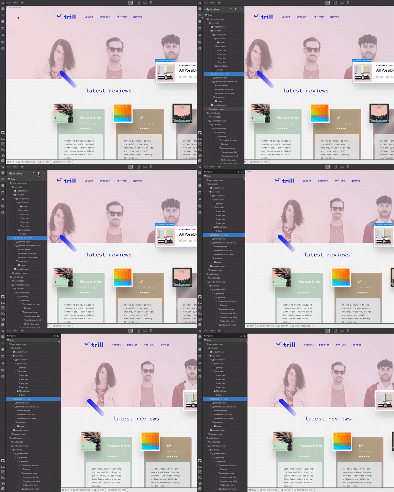
To play around with the new navigator, flip the beta toggle and watch it switch from the right side of the Designer to the left. Whoa! What a rush.
You’ll also notice a new option to pin the navigator and keep it open at all times — a feature that’s especially useful if you’re using the Designer on a wide screen and want to keep more information visible as you’re building.

The keyboard shortcut for this left side navigator is also different: now changing from F in its current state, to now Z for the left side version.
If you have questions or feedback on this new navigator, please post in our navigator forum category.
Related updates
Get started for free
Try Webflow for as long as you like with our free Starter plan. Purchase a paid Site plan to publish, host, and unlock additional features.
Try Webflow for as long as you like with our free Starter plan. Purchase a paid Site plan to publish, host, and unlock additional features.


.jpeg)


