

Enhancement
Designer
Cleaned up, more legible navigator
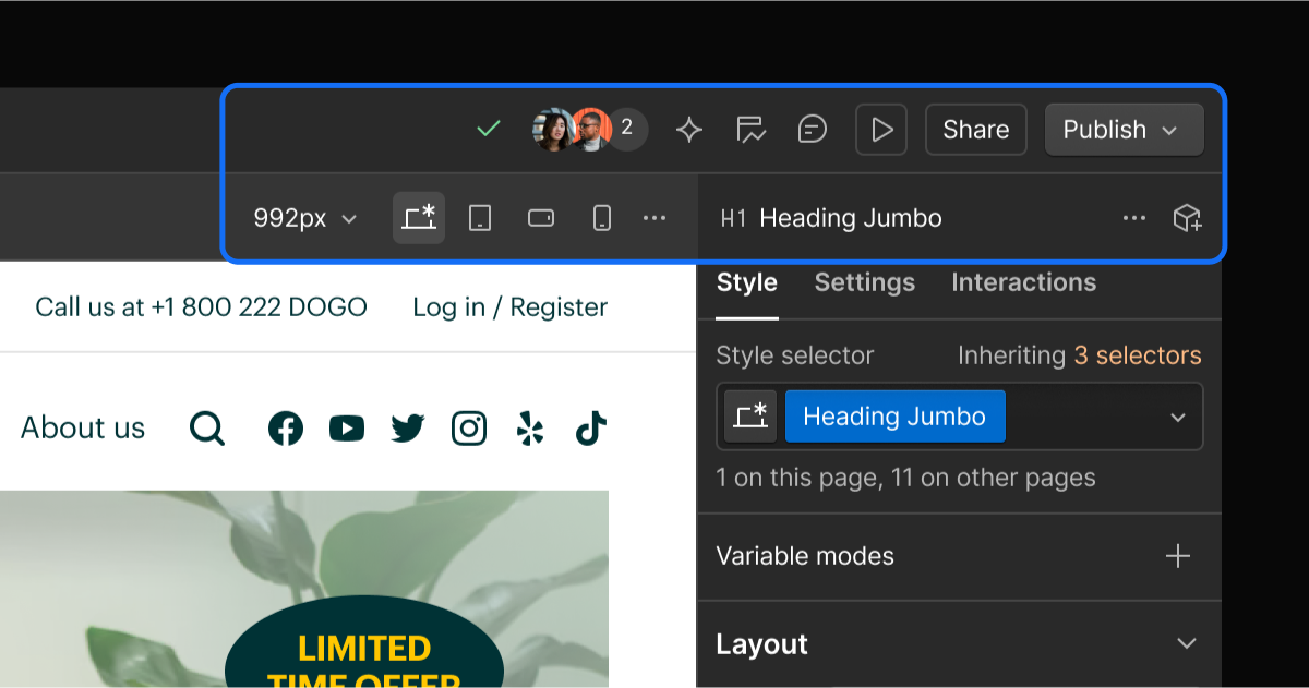
We’ve made some small tweaks to the navigator panel to make it easier to see the structure of pages, especially on more complex pages.

Because one UI redesign in a week wasn’t enough, we’ve also made some small updates to the navigator.
Why make the change? Well, the navigator is a great way to understand the structure of your page and see all elements in a single, organized place. But when your page structure gets complex, this view can get hard to parse.
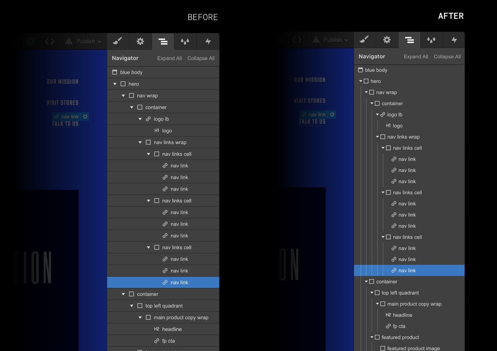
And so, to make this view more legible and organized, we’ve done a bit of cleanup. A quick rundown of the changes:
- More efficient use of horizontal space to decrease horizontal scrolling
- New vertical lines to more clearly mark the relationship between elements
- Removed horizontal lines to reduce clutter
You can also click on the arrow or the element icon to expand and collapse elements, instead of only the arrow. So that slightly larger click target should make life easier as well.
Hope you like it! Let us know what you think in the forum.
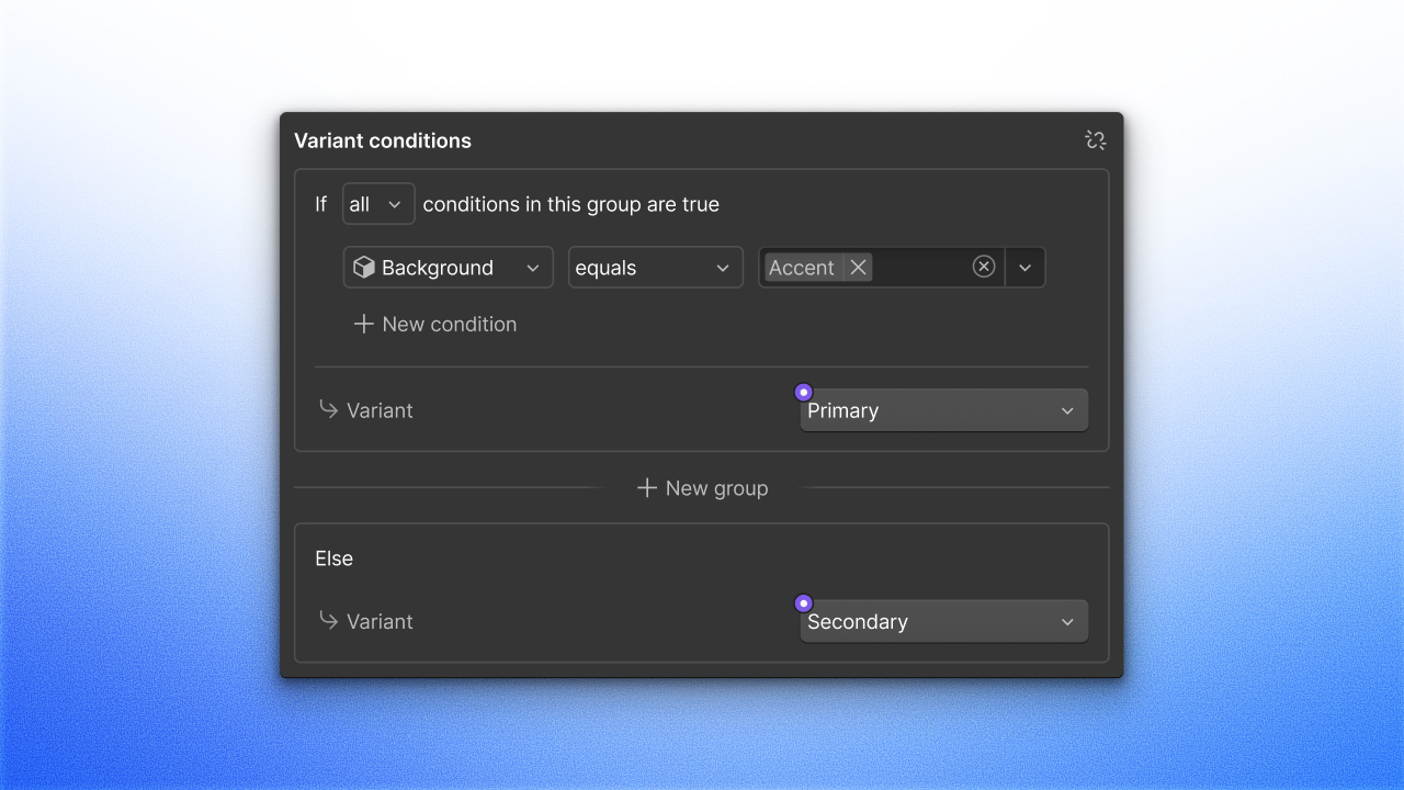
P.S. While we’re on the subject of element hierarchy, did you know you can use the up and down arrow keys to jump between the child and parent elements? And yep, you guessed it: you can use the left and right keys to jump between sibling elements.
P.P.S. We’ve got a ton more keyboard shortcuts. So get involved.
Related updates
.jpeg)


Get started for free
Try Webflow for as long as you like with our free Starter plan. Purchase a paid Site plan to publish, host, and unlock additional features.
Try Webflow for as long as you like with our free Starter plan. Purchase a paid Site plan to publish, host, and unlock additional features.