Feature
Designer
Introducing variable modes
Create sets of variable values that can be easily switched and applied throughout your site –unlocking responsive design across devices, efficient theming, and a more scalable design system.

In a continued effort to empower our customers with scalable design systems, we’re excited to announce the launch of variable modes, now available to all Webflow customers.
Variable modes let you define multiple values for individual variables, creating distinct sets of values (“modes”) that can be easily switched and applied across your site. This means fewer variables to create and manage, and significantly more efficient design workflows —from creating responsive designs across devices to applying different themes throughout your site.
What variable modes unlocks:
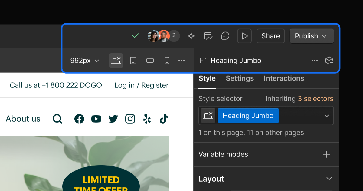
- Automatically responsive designs across devices. Variable modes let you set automatically responsive variable values for Tablet, Mobile Landscape, and Mobile Portrait breakpoints. This ensures a consistent and polished experience across devices, without needing to hunt through styles or make tedious manual adjustments in each breakpoint. When you update a variable, all its breakpoint-specific values are updated globally throughout your site.
- Streamlined theming across your site. Variable modes make it easier than ever to create and manage different design themes for your site. For example, you can create a “Brand - Primary” theme that reflects your site’s core branding with standard colors, typography, and spacing. You can also introduce an additional mode for a “Winter Holiday” theme with more festive colors that you can apply to specific pages, sections, or elements where relevant.
- Simplified variable management. : As your design system expands or becomes more complex, managing variables can get overwhelming. To keep your variables and variable modes organized and easily accessible for you and your teammates, you can now add them to different custom collections —like “Color Palettes" or “Typography”.

Visit our Help Center to learn how you can start designing with variable modes today.
Related updates
Get started for free
Try Webflow for as long as you like with our free Starter plan. Purchase a paid Site plan to publish, host, and unlock additional features.
Try Webflow for as long as you like with our free Starter plan. Purchase a paid Site plan to publish, host, and unlock additional features.


.jpeg)


