Feature
Designer
Improve keyboard navigation with outline styling and keyboard focus state
Our new outline styling and keyboard focus state options allow you to add a custom outline around an element — without impacting the layout of your site.

When you navigate a website with your keyboard, browsers often create a default focus ring on interactive elements like links and buttons. But what if you want to customize the look of that focus ring? Until now, you haven’t been able to do this in Webflow without custom code.
But now you can, with two new options:
- Outline styling — this effect allows you to set the style of the focus ring around an element without impacting your site’s layout, bringing the outline CSS property into Webflow. (Note: these new options differ from the borders property — outline styling and keyboard focus state won’t affect the size of an element, so they will not cause any layout changes.)
- Keyboard focus state — with this option the outline styling of an element will only be visible when a user navigates the page with their keyboard, but won’t show up for mouse clicks. In other words, this brings the focus-visible CSS property into Webflow.
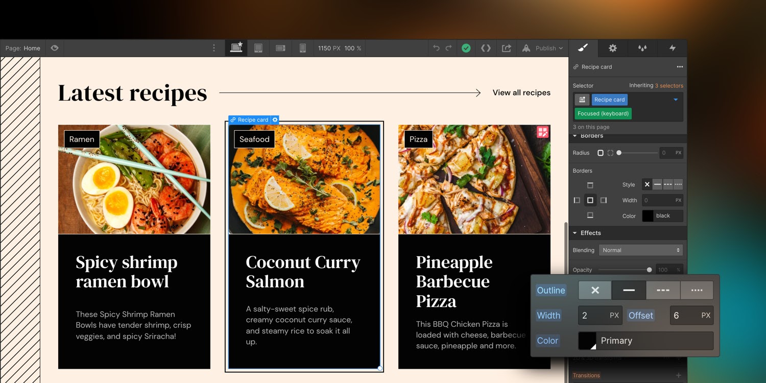

When used together, these two features allow you to better style a browser’s default focus ring to make it more noticeable, accessible, and inline with your site’s branding. Outline styling is called ‘outline’ in Webflow and is discoverable in the style panel under the effects section. Keyboard focus state is called ‘focused (keyboard)’ in Webflow and is discoverable in the style panel in the states dropdown menu.
For more in-depth information on these features, check out our Webflow University documentation for a closer look.
Related updates
Get started for free
Try Webflow for as long as you like with our free Starter plan. Purchase a paid Site plan to publish, host, and unlock additional features.
Try Webflow for as long as you like with our free Starter plan. Purchase a paid Site plan to publish, host, and unlock additional features.



.jpeg)


