
Building on the release of content overrides for Symbols and nestability, today we're introducing a handful of capabilities and key improvements, as well as evolving "Symbols" to "Components." This rebrand reflects the new power of this feature — and sets the stage for future investments toward reusability, optimizing your workflow, and additional control.
The new capabilities and improvements we announced today make progress in two key areas:
- Ease of use, so Components are more intuitive and accessible for you and your team.
- Additional power, so you have more flexibility to customize and reuse Components to fit different design scenarios across your projects.
Let's explore how what we released today falls under these two areas.
New intuitive controls
We've simplified how you create and manage properties on your Components so you can quickly modify them and move on to the next task at hand.
Define modifiable properties with one-click
You can select elements within a Components directly on the canvas and define properties that can be modified to customize each instance with unique content.

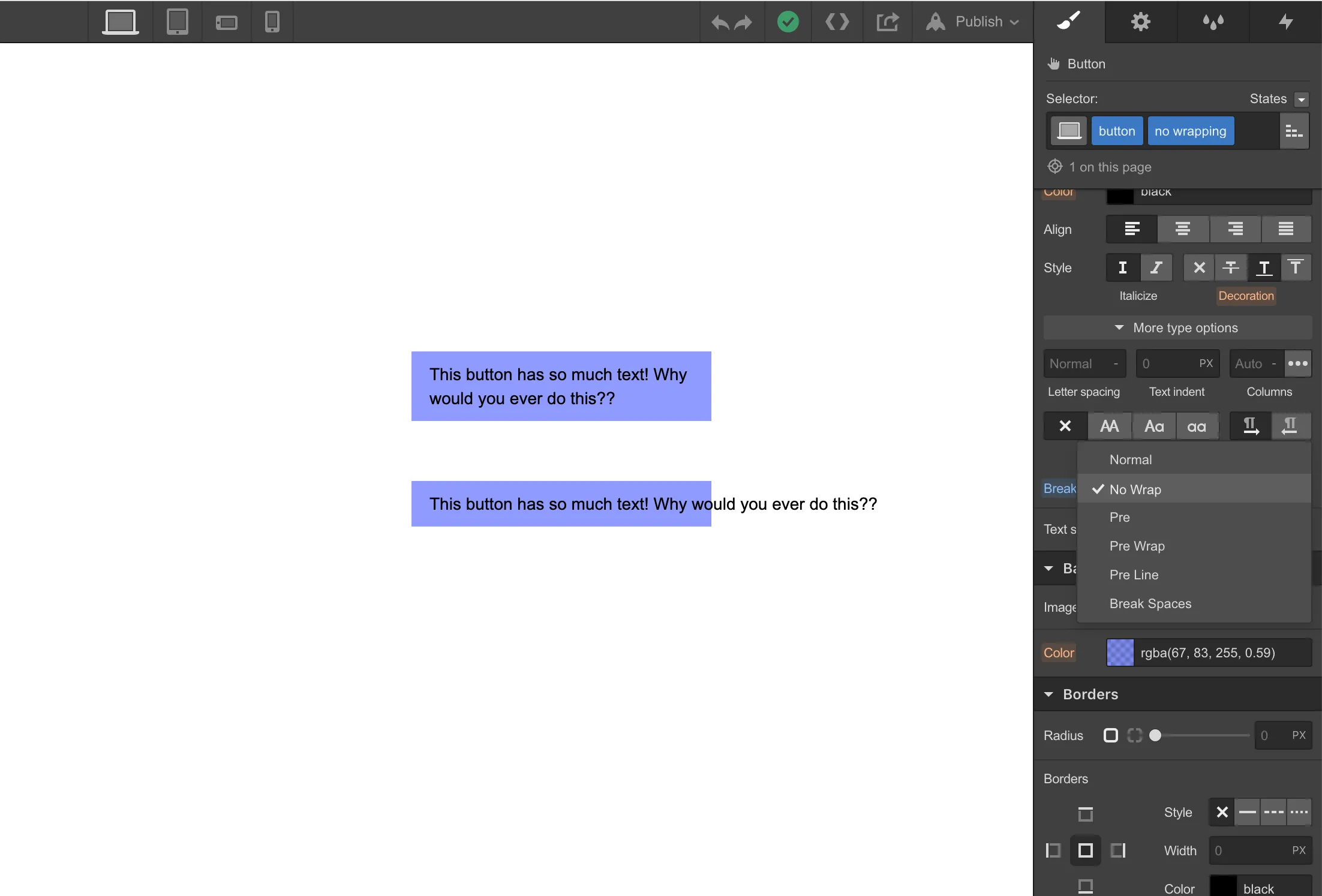
Modify text directly from the canvas
We’ve also made Components more intuitive for site contributors, like marketers and content editors, through the ability to edit content directly on the canvas.

Expanding what's possible with Components
Additionally, we’ve expanded upon scenarios in which you can use Components on your website.
Show or hide elements in Components
With visibility properties, we've made Components more flexible with the ability to show and hide elements in your component instances to configure any layout variation you can imagine.

Display CMS data in your Components
Reuse your Components across your different CMS Collection pages to preserve consistent designs. Just connect your CMS data to your component properties. Support for Components in Collection lists coming soon.

We’re just getting started
These new capabilities for Components (the artist-formerly-known as Symbols) will empower teams to build together while minimizing design inconsistencies as they scale their sites. Of course, this is only the first step – we're already working on a slew of additional features focused on how you can manage your Components better, fully connecting Components to the Collection fields you want, and the ability to share Components across multiple websites.
If you'd like to dig into how these new features work, read our latest Webflow University article for the latest and greatest. Otherwise, head over to the Designer today and try it out.
.jpg)
.jpg)


.webp)


.webp)


.webp)


.webp)

.webp)


.webp)

.webp)
.webp)


.webp)


.webp)